
Title: A Key to the Suite
Author: John D. MacDonald
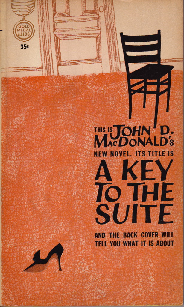
Cover artist: uncredited
Yours for: $24
Best things about this cover:
- File under "novelty cover." One of the most stylistically unusual covers I own.
- It's a meta-cover. A cover about covers. It's explaining the conventions of paperback covers to you. Instead of author / title / blurb, you get three very polite complete sentences. And a lot of loopy orange carpet. And a single shoe.
- Love how even the Gold Medal insignia is brought into odd color and design schema. Also, the font on the author and title is awesome-o.

Best things about this back cover:
- I guess I kind of like the all-caps typewriter font. And the way the back cover mimics an interoffice memo. That first paragraph is pretty gripping, too, as back cover copy goes. Granted, with the back covers we've seen so far, the competition isn't exactly tough.
Page 123~
He knew he was still a little bit drunk, but not very much, because the prolonged strenuous taking of the woman had boiled it out of his blood.
Many people love MacDonald's writing. That leads me to believe that sentences like this one are the exception in his writing, not the rule. "The prolonged strenuous taking of the woman?" Sound like something out of "The 19th-century Gentleman's Guide to Hunting and Calisthenics."
~RP
[Follow Rex Parker on Twitter]


11 comments:
I love it! It's like they didn't even bother. They're just like, yeah, this is a book cover. This is a title. This is what it's about. You're just going to have to read it, we can't do all the work here.
This is Dirt E. Diggler's
new comment. It's title is
A CUTTING OF
A KEY TO
THE SUITE
and the asterisks will
denote ridicule wherever tenable.
* The color of that carpet is: "Shag-a-delic, Baby!"
* Ah yes, it's always someone else's fault ... the "strange girl MADE him forget ... and TURNED him into just another conventioneer". He had nothing at all to do with it, therefore he wouldn't take responsibility. It was all her, you see.
* "Swift novels" make speed readers happy.
So that IS a shoe? Girl needs a cobbler, stat.
I actually love this cover - it's so unusual! Love the orange, love the font, and love love love the shoe (I would totally buy that, assuming I saw it in a store and it was part of a pair instead of just, you know, one shoe).
I also had no idea conventions were this exciting. None of the ones I've been to have been. Obviously I'm not attending the right ones.
Yeah, I'm another one loving this cover. I'd say that I'd love to see this kind of thing become a fad, but then it'd lose its appeal as something unusual and quirky (but also cheesy as hell).
Also, no comment on the name? Because, well, Floyd Hubbard. It's nearly as delightfully cheesy as the cover design (even for 1962).
This cover reminds me a little bit of the cover for XTC's old "Go 2" album:
http://publish.files.wordpress.com/2007/08/xtc_go_2_cover_500.gif
John D. MacDonald was pretty much the first real grown-up author that I read voraciously, and I cut a wide swath through his books, probably including this one. They seemed very worldly and packed with manly wisdom at the time. I read one of 'em a few years ago, though, and it didn't do much for me anymore. You reach a point when a private detective in a swank bachelor-pad houseboat no longer seems like an authority on the good life, know what I'm sayin?
I love the cover design; but it's kind of tragic that they've squandered it on a book set at a BUSINESSMEN'S CONVENTION, for Chrissake. You cannot make that sound exciting.
"A novel we had to print". God, that sounds begrudging.
"We're contractually obligated to publish this thing. Enjoy, whatever."
And I thought my carpet was ugly.
So, I'm the only one wondering what happened in that chair, or why the chair looks like a badly designed optical illusion, or what happens when you try to do, um, convention-type things* in a chair that looks like a badly designed optical illusion?
*like listening to boring papers
Twenty four bucks? I own this cover, and it's my reading copy. Now I'll never be able to afford to read it again.
Post a Comment