Showing posts with label John D. MacDonald. Show all posts

Tuesday, May 19, 2015

Paperback 882: Murder for the Bride / John D. MacDonald (Gold Medal R2116)

Paperback 882: Gold Medal R2116 (Unknown ptg, ca. late '60s)

Title: Murder for the Bride
Author: John D. MacDonald
Cover artist: Uncredited [some booksellers credit Milton Charles, whoever that is]

Estimated value: $8-10

[Donation to the collection from L. Gagne]

GM2116
Best things about this cover:
  • Pretty safe. Except for the shocking pink border, pretty safe.
  • She has Gibson Girl hair. Weird.
  • The lady was so bored by the cover concept that she fell asleep.
  • Gold Medal did this annoying thing starting some time in the '60s where it stopped giving printing information, including publication date :(

GM2116bc
Best things about this back cover:
  • Check box 1 for "Angel," box 2 for "Tramp" ... what? No, there are no other boxes, you tramp.
  • Hey, looks like John D. finally caught that fly on the ceiling that was bugging him. He looks so content.
  • I kind of want to disappear to a remote beachside hut and read only John D. MacDonald for like a week.

Page 123~

"Alligators bellering at night."

~RP

[Follow Rex Parker on Twitter and Tumblr]

Sunday, May 17, 2015

Paperback 881: Please Write For Details / John D. MacDonald (Gold Medal R1922)

Paperback 881: Gold Medal R1922 (unknown ptg, 1968)

Title: Please Write for Details
Author: John D. MacDonald
Cover artist: Uncredited [Mitchell Hooks]

Estimated value: $5-8

[Donation to the collection courtesy of L. Gagne]

GM1922
Best things about this cover:
  • Love how all those dorky guys are checking her out, but she's swiveled around to face you because, well, you're doing the same thing, big boy. She has the best "Like what you see?" face ever.
  • I am not familiar with MacDonald's comedy writing. Most everything else I have by him is Travis McGee stuff.
  • This book takes place at a "Mexican art colony," in case you're looking at the dorky guys and going "WTF?"

GM1922bc
 Best things about this back cover:
  • "Why, yes. Yes, I *do* enjoy those three things. You've piqued my interest. I *will* write for details. Thanks for your help."
  • That first sentence is an epic, loony, self-parodying masterpiece. Can you hitch your starload to a bent?
  • Great hyphen confusion. I read "love-lies" as "lies one tells about love"; but it's just "lovelies."
  • John D. MacDonald, still staring down that fly on the ceiling.

Page 123~

Torrigan had the usual ideas, all right, but he was a lot easier to handle. Hinting you could be a real hell of a painter if he'd let you learn all about Life from him. Always trying to load your drinks. And that tired game that goes I've-just-got-my-arm-around-you-because-I'm-just-a-big-friendly-guy. No trick in handling him.

Nothing like a good, withering take-down of a leering phony. I like the knowing, implicitly female perspective. This seems like it might be worth reading.

~RP

[Follow Rex Parker on Twitter and Tumblr]

Friday, November 14, 2014

Paperback 831: April Evil / John D. MacDonald (Gold Medal d1579)

Paperback 831: Gold Medal d1579 (1st thus, 1965)

Title: April Evil
Author: John D. MacDonald
Cover artist: Bill Johnson

Estimated value: $10-$15

GM1579

Best things about this cover:

  • The hot new book that finally answers the question: How many trenchcoated, fedoraed detectives does it take to find a lost contact lens?
  • You know what they say: April Evil brings May Bondage.
  • After looking at this picture, I wonder if it's not the "hold-up gang" that's "sleepy."
  • This is a fine, if weird, painting. Good use of small canvas. Her simple white top and blue skirt, surrounded by the lurking, drab frames of generic menace, make her really pop off the page.


GM1579bc

Best things about this back cover:

  • Ugh.
  • Don't you hate it when women choose the easy sluttish rut? Challenge yourselves, ladies!
  • How can you be "going to flab" while "losing something in the guts department"? Writing 101: don't let your stupid metaphors cancel each other out.


Page 123~

She smiled, and she felt cat-agile, rabbit-soft, mare-ready.

This was a vast improvement from a half hour earlier, when she had felt dog-tired, armadillo-hard, and lemur-unprepared.

~RP

[Follow Rex Parker on Twitter and Tumblr]

Friday, October 11, 2013

Paperback 708: Nightmare in Pink / John D. MacDonald (Gold Medal d1682)

Paperback 708: Gold Medal d1682 (3rd ptg, 1966)

Title: Nightmare in Pink
Author: John D. MacDonald
Cover artist: [Ron Lesser]

Yours for: $7 (yeah, I paid only $3, but ... inflation/postage — his books are being rereleased in $14 trade paperbacks ... why, WHY would you buy those when you can get beat-up '60s-era stuff, which is much cooler *and* much cheaper?)

GM1682

Best things about this cover:
  • Really hate the turn cover art took in the '60s—toward text/branding, away from full-page cover art—and I associate MacDonald's books most closely with that trend, to the extent that I almost blame MacDonald personally. Over the years, the girls get smaller, while the whole MacDonald/McGee Brand swells up and dominates. Probably smart marketing. But sucky from a purely aesthetic perspective. 
  • I do like the way Pink suffuses every corner of this thing.
  • Her hair is, frankly, terrible. 

GM1682bc-1

Best things about this back cover:
  • It's bad enough you've shrunk her and made her all modest on the front—this bland-and-white corner punishment is just degrading. Even John D's like "C'mon guys. Too far."
  • OK, I haven't read a sexier phrase than "sweetly wanton career girl, living alone in a Manhattan walk-up" in a Long time.
  • Not sure what is meant in this context by "Cafe Society," but I would like to join.
  • "And introducing ... LSD!"

Page 123~

Terry Drummond rapped at my door and I let her in. She wore fifteen thousand dollars worth of glossy fur coat. Her brown simian face wrinkled with distaste as she looked around. "God, what a scrimey hole!" The coat swung open.

This is the kind of passage that makes me wonder why I have not read more MacDonald than I have. Love it.

~RP

[Follow Rex Parker on Twitter and Tumblr]

Sunday, August 26, 2012

Paperback 553: One Monday We Killed Them All / John D. MacDonald (Gold Medal s1177)

Paperback 553: Gold Medal s1177 (PBO, 1961)

Title: One Monday We Killed Them All
Author: John D. MacDonald
Cover artist: Bill Johnson

Yours for: $18

GM1177.1Monday
Best things about this cover:
  • One of the greatest titles in pulp fiction history
  • Disturbing, fantastic cover. I have no idea what's happening. It's like the men are a loosely affiliated mob of zombie hunters who have decided to use the woman as a human shield. But the men seem kind of shambling and zombie-like themselves.
  • "On the seventh he rested"! – "Attention, Citizens of Brook City: Monday is the new Sabbath. Stop working immediately or We'll kill you all. . . thank you."


GM1177bc.1Monday
Best things about this back cover:
  • This copywriter is not good with the metaphors. I don't think walls harbor cores, and if the wall itself is made of hate, isn't the "steaming evil" inside kind of redundant? What did you expect to find inside the wall of hate? Bunnies?
  • Pictures says: "Yes, *that* John D. MacDonald" and "Don't hate me because I'm rugged" and "I think you mean Ross Macdonald, asshole."

Page 123~
Harpersburg State Prison erupted into overdue violence on the following Tuesday.
Tuesday? But what about Monday? I was promised killing on *Monday*!

~RP

[Follow Rex Parker on Twitter and Tumblr]

Thursday, January 19, 2012

Paperback 491: 24 Hours to Kill / James McKimmey (Dell First Edition B169)

Paperback 491: Dell First Edition B169 (PBO, 1961)

Title: 24 Hours to Kill
Author: James McKimmey
Cover artist: Robert McGinnis

Yours for: $10


DellFE169.24hrs


Best things about this cover:
  • Dishevelment, thy name is this lady.
  • I like the double entendre of this title: "She had 24 hours to kill ... everyone in the room!"
  • Let me answer the obvious question: yes, Robert McGinnis painted everything in sight from about 1957-64. Every paperback cover, every magazine cover, every line on every freeway, etc.
  • Her slip is behaving oddly ... in relation to gravity, I mean. It's somehow coming together in a lacy, snowflaky formation to prevent us from getting the upskirt view we all so richly deserve.
  • Her smirk is killer.

DellFE169bc.24Hrs


Best things about this back cover:
  • Paradox! The back cover copy writer's second-best friend after HYPERBOLE!
  • I want a business card that states my occupation as "Killer-hero of the state's young punks."
  • "Teen-age" my eye. I mean, look at her feet. Those bunions say a hard-worn 28, minimum.

Page 123~

He blinked, stunned. Then he said, "I'll be right down, Rod." He hung up and picked up the machine gun. "Stay here, Sue. Lock the door and don't leave this office under any circumstance." He strode out and down the marble steps, trying to control the wild anger surging in him. . . .

I find that when I'm trying to control my wild, surging anger, I'm more often successful when I'm *not* holding a machine gun.

~RP

[Follow Rex Parker on Twitter and Tumblr]

Wednesday, October 6, 2010

Paperback 359: The Drowner / John D. MacDonald (Gold Medal k1302)

Paperback 359: Gold Medal k1302 (PBO, 1963)

Title: The Drowner
Author: John D. MacDonald
Cover artist: Stanley Zuckerberg

Yours for: $25

GM1302.Drowner

Best things about this cover:
  • Lesson: brackish, green water—not for swimming.
  • Fantastically creepy cover. That dude pulling her down must have one powerful set of lungs. or SCUBA equipment.
  • Love the bubbles—nice touch to make sure they're coming from him (I assume it's a "him") as well as her. Also love the way the words cascade down the side of her struggling body. Accentuates the scary verticality of the whole cover.

GM1302bc.Drowner

Best things about this back cover:

  • This I like less.
  • Without the struggling lady to complement them, the vertically arranged words here just look stupid and purposeless.

Page 123~

If the fork hesitated on its way to the healthy mouth, it was a faltering so minor he was unable to detect it. But she looked considerably less friendly.
~RP

[Follow Rex Parker on Twitter]

Wednesday, July 29, 2009

Paperback 268: The Girl, the Gold Watch & Everything / John D. MacDonald (Gold Medal s1259)

Paperback 268: Gold Medal s1259 (PBO, 1962)

Title: The Girl, the Gold Watch & Everything
Author: John D. MacDonald
Cover artist: uncredited

Yours for: $23


Best things about this cover:

  • "IT'S 9:30, STEVE. TIME TO GIVE BACK THE GIRL!" / "Aw, but we were goin' to a clam bake ... that didn't feel like a three-year harem lease at all!"
  • That analogy makes one wonder: how many times can Bonny Lee fuck in one day? Do the math. Even if you're getting it from your entire harem only once per day, in three years, that's still well over a thousand times. And Bonny can do that in one day? No wonder the cover's on fire. The friction alone...
  • More font awesomeness, though here we're pushing the wackiness factor a little hard.

Best things about this back cover:

  • "If you've ever had a yeasty yearning ... please, see your doctor."
  • YEASTY is, very coincidentally, a word in today's NYT crossword puzzle.
  • Apparently John D. MacDonald books like to get cheeky. First there was the metapaperbackery of "A Key to the Suite," and now there's the cliche-subverting and self-erasure of "The Girl, the Gold Watch & Everything."
  • "Sheesh!"
  • If you don't know who Thorne Smith is, see this. More to come in future Pop Sensation installments.

Page 123~

He looked at her, sitting erect, six feet away. Her back was arched, her shoulders good, the waist slender, the lime slacks plumped to the pleasant tensions of her ripeness.

I laughed out loud at "her shoulders good." What is he, a caveman? "Ugg want woman. Ugg want that woman. Hair pretty. Shoulders good. Slacks plumped. Ugg want."

~RP

[Follow Rex Parker on Twitter]

Thursday, July 23, 2009

Paperback 263: A Key to the Suite / John D. MacDonald (Gold Medal s1198)

Paperback 263: Gold Medal s1198 (PBO, 1962)

Title: A Key to the Suite
Author: John D. MacDonald
Cover artist: uncredited

Yours for: $24


Best things about this cover:

  • File under "novelty cover." One of the most stylistically unusual covers I own.
  • It's a meta-cover. A cover about covers. It's explaining the conventions of paperback covers to you. Instead of author / title / blurb, you get three very polite complete sentences. And a lot of loopy orange carpet. And a single shoe.
  • Love how even the Gold Medal insignia is brought into odd color and design schema. Also, the font on the author and title is awesome-o.

Best things about this back cover:

  • I guess I kind of like the all-caps typewriter font. And the way the back cover mimics an interoffice memo. That first paragraph is pretty gripping, too, as back cover copy goes. Granted, with the back covers we've seen so far, the competition isn't exactly tough.

Page 123~

He knew he was still a little bit drunk, but not very much, because the prolonged strenuous taking of the woman had boiled it out of his blood.


Many people love MacDonald's writing. That leads me to believe that sentences like this one are the exception in his writing, not the rule. "The prolonged strenuous taking of the woman?" Sound like something out of "The 19th-century Gentleman's Guide to Hunting and Calisthenics."

~RP

[Follow Rex Parker on Twitter]

Sunday, August 24, 2008

Paperback 130: You Kill Me / John D. MacDonald (Popular Library - Eagle Books G507)

Paperback 130: Popular Library - Eagle Books G507 (2nd ptg??, 1961)
Title: You Kill Me
Author: John D. MacDonald
Cover artist: uncredited

Yours for: $12


Best things about this cover:

  • The former title - which tells you everything about the difference between selling hardbacks and paperbacks. "You Live Once" = subject intransitive verb adverb = "zzzzzzz," whereas "You Kill Me" = subject transitive verb object = entire lurid plot in three words = sales gold
  • She has a wasp waist and is wearing vaguely waspish colors
  • "I am crazy for the salsa dance!"
  • She has that ambiguous look of reckless abandon / sadistic glee
  • John O'Hara is straight-up awesome - many paperbacks by him in my collection, some we've already seen.

Best things about this back cover:

  • Well, not much. Another image retread.
  • For once, the copy writers got it right: "a go-to-hell" look. Nice.

Page 123~

"I put my shoes on and stood by the car in the darkness. Soon I heard the sounds of his dying."


~RP

Thursday, May 8, 2008

Paperback 93: Darker Than Amber / John D. MacDonald (Gold Medal R1957)

Paperback 93: Gold Medal R1957 ([3rd ptg], [1968])
Title: Darker Than Amber
Author: John D. MacDonald
Cover artist: Ron Lesser

Yours for: $5


Best things about this cover:

  • "He'd seen a lot of girls, but nobody ... DARKER THAN AMBER"
  • Not surprisingly, this book has some racial issues (see back cover)
  • OK, is her name Amber, or is she just "amber-eyed?" And I thought you said "Darker than Amber." What gives?
  • I'm pretty sure it's an impossibility, or at least a paradox, if your "lily-white maiden" has "round heels."
  • This girl is deep in the middle of a boob-pointing contest - the object: stand on your tiptoes, and then point your boobs toward the sky without falling over. Closest to straight heavenward wins. She's working on a 45 degree angle here (not bad).

Best things about this back cover:

  • His pictures says: "What do you goons want?" or "Yes, I'm Professor McGrady. Can I help you?" Or "That damned roof is leaking again" or "How about now? Do I look like Popeye now?"
  • A "Wounded Spook" is not (thank god) what it sounds like.
  • "She chunked into the water..." That's more detail than I need.
  • Technically, at the end of that second paragraph, "cop" should have quotation marks around it. I'm just sayin'.
  • "Eurasian beauty" - awesome. We just don't have this rich, insane racial vocabulary anymore. Now ... we have three possibilities for the meaning of "Amber" - her eyes, her name, and her skin.
  • "... a heart like an ancient gutter"??! Full of ... relics? Vomit from the many vomitoria? Maybe if she gave up chunking into the water ...

~PAGE 123

"She was about twenty-five?"
"Twenty-six."
"What did she do?"
"She'd been a prostitute for twelve years."
Merrimay's brown eyes widened. "My word, that's quite an early start, isn't it?"


~RP

Thursday, November 22, 2007

Paperback 46: Fawcett / Gold Medal M2268

Paperback 46: Fawcett / Gold Medal M2268 (3rd ptg, 1971)

Title: The Crossroads
Author: John D. MacDonald
Cover artist: Uncredited


Best things about this cover:

  • "Look at my shoulder holster! Look at it! Yeah, that's right. You better be afraid!"
  • Floating Head says: "You dance funny, little man."
  • This book has much better cover copy than it does art. See back cover...

Best things about this back cover:

  • Centeredness makes back cover copy look like a poem - an awesome poem. Not sure which is my favorite phrase here: "sadistic chiseler" or "musclebound lover-boy." Probably the latter. Also, I love Anything having to do with a motel. Motels are my second-biggest thematic obsession, after Revenge.
  • Ridiculous, arbitrary formatting - the gun-toting fist breaks up the text in absurd ways. It's like someone opened up a little door in a wall and is now about to shoot through it blindly.
  • John D. MacDonald looks like the biggest Poindexter ever. His glasses are positively Asimovian. Awesome.

RP

Wednesday, August 15, 2007

The Great Paperback Project - Paperback 4: Gold Medal k1405

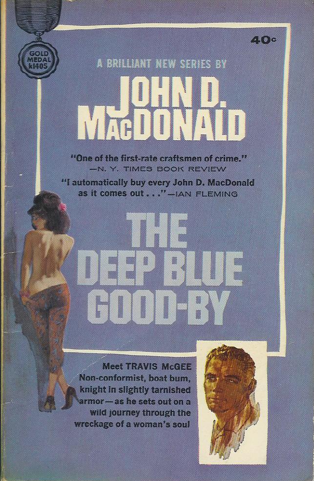
Paperback 4: Gold Medal k1405 (unknown, but not a true PBO, 1964)

Title: The Deep Blue Good-By
Author: John D. MacDonald
Cover artist: Ron Lesser (unconfirmed)

Yours for: $8


Best things about this cover:

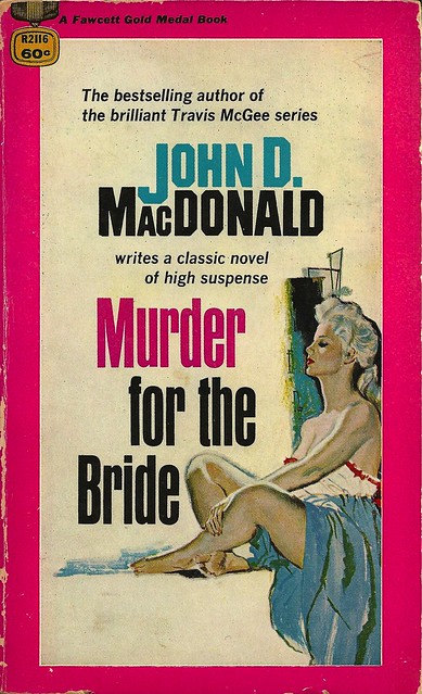
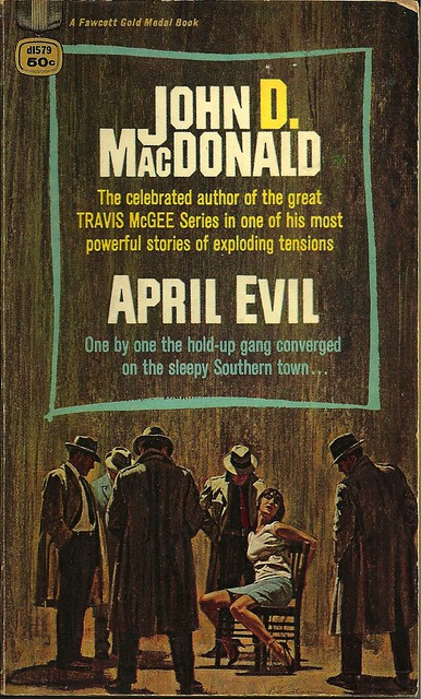
This seems as good a place as any to talk about the demise of the mass market paperback as a species of popular art. Compare this cover to the last two paperbacks I have featured - the late 50's Gold Medals - and you can see instantly some major differences, none of them good from an artistic standpoint (but very good - crucial - from a marketing standpoint). We see the cover art, formerly the showpiece of the paperback cover, now relegated to a mere artistic gesture, an afterthought, as the author's name and Travis McGee's mug get special highlighting. Note how the girl, and even the title, sort of blend into the purplish background, while the author's name and the McGee portrait pop out because of the use of white. Gold Medal is discovering the secret to book merchandising. Art is nice and all, but we are gonna sell books by name recognition and branding - put the author's name front and center and then create a re-usable icon, rather than an original work of art, to represent the work visually. The girl is nice eye candy, but drawn to a scale too small to be truly hot. Next time you see best-sellers out at Barnes & Noble or wherever, note how many (Danielle Steele, Stephen King, etc.) have the author's name superbig, and maybe even a full-page photograph of the author on the back. Authors' names sell books - hot cover art does not (or not as much - it sells books to dorks like me, but there aren't enough me's in the world to keep a publisher solvent).

So advances in marketing mean disasters in artistry. Brand and replicate. Brand and replicate. It's the fast food model of marketing. Consistency. Familiarity. From a book lover's / collector's standpoint, it's all a bit sad.

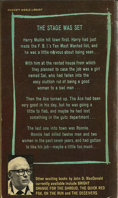
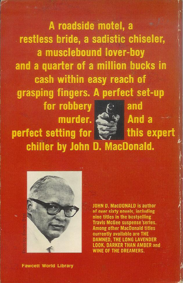
John D. MacDonald is one of the first real stars - big sellers - of the P.I. genre, and he has his many, many fans, though I'm not exactly one of them. His plotting is good, but he overwrites, and doesn't have an authorial voice I find appealing. This book is the first in the very popular Travis McGee series. Here's a link to a gallery of covers of John MacDonald's other paperback books.

RP