Title: Our Flesh Was Cheap
Author: Eve Linkletter
Cover artist: Uncredited
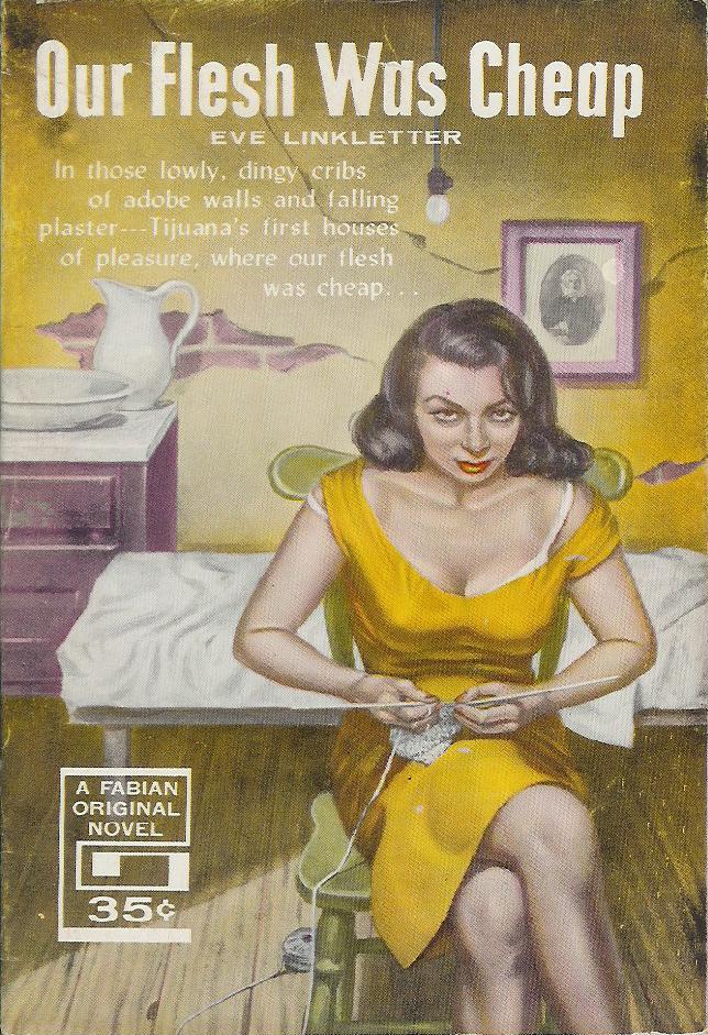
Best things about this cover:
- "Are you depressed? Is your apartment a dank, run-down hovel? Is your flesh, well, cheap? Then why not join the movement that's sweeping the nation - Knit Your Way to Happiness!"
- This cover is decidedly unsexy. Coverless bed, cracked walls, naked lightbulb, portrait of Dear Old Grandma (or Man With Enormous Beard). And yet some kind of Cézanne-esque still life appears to have broken out on the book's western border...
- "Our Flesh was Cheap" - starring Illeana Douglas!


Best things about this back cover:
It's the same as the last back cover - clearly the country was in the grip of Eve-mania.
RP