
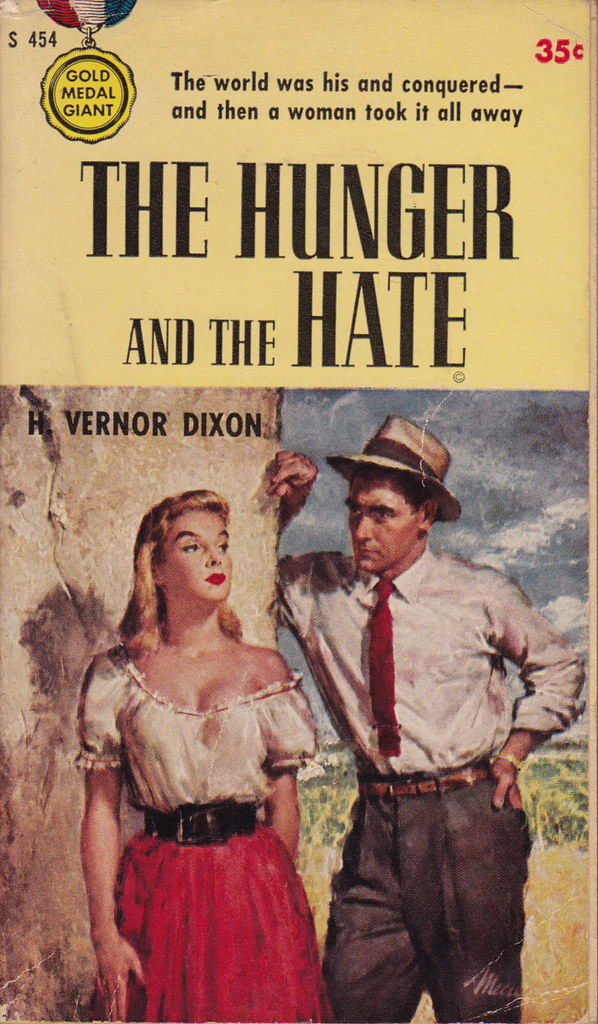
Title: The Hunger and the Hate
Author: H. Vernor Dixon
Cover artist: James Meese
Yours for: $11
Best things about this cover:
- "I'm hungry." "Well, I hate you." The End.
- His hat is fabulous but his tie looks like something he ripped off an early-80s New Wave keyboard player.
- "The world was his and conquered" has to be one of the most inelegant and awkward opening gambits in mainstream paperback cover copy history. "The world was his ... and then a woman took it all a way" would work. So would "He conquered the world ... but then a woman took it all away." So would "He was a traveling salesman with a hankering for Mexican restaurant waitresses..."
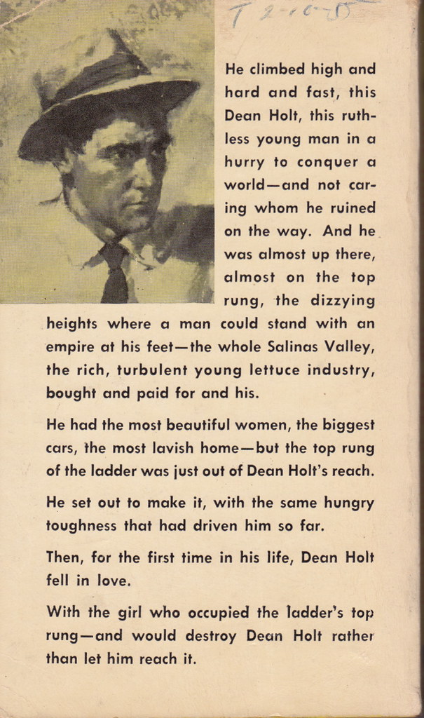
Best things about this back cover:
- Crop. Zoom. Reverse image. Change to B&W. There. Now you can really feel the Hunger. And the Hate.
- Jeez, it's a whole frickin' short story back here. Concision!
- What's his name again? I forgot ... you only said it four times.
- "Hey, ya know what a good place for a paragraph break would be? The middle of a sentence." (see last two "paragraphs")
Page 123~
He thought of Truly and dissected her in his mind and liked little of what he found and wondered why he had been such a damned fool as to accept her invitation.
Strangely, the part of this sentence I hate most is "as to."
~RP
[Follow Rex Parker on Twitter]


