Showing posts with label roulette. Show all posts

Monday, July 4, 2016

Paperback 958: Top of the Heap / A. A. Fair (Erle Stanley Gardner) (Dell D309)

Paperback 958: Dell D309 (1st thus, 1959)

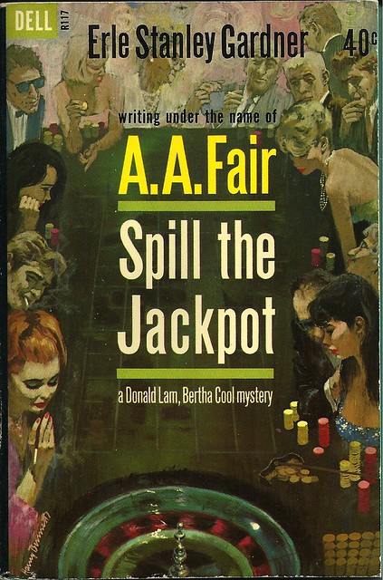
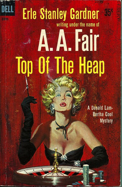
Title: Top of the Heap
Author: A.A. Fair (Erle Stanley Gardner)
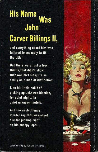
Cover artist: Robert McGinnis

Estimated value: $8-10
Condition: 8/10

DellD309
Best things about this cover:
  • Well, *not* the hair. That's some full-on Cruella Deville nonsense.
  • If you stare at her boobs (and why not?) it's like you're looking at a very fancy black cat waiting to pounce on the spinning ball.
  • I've seen some opera gloves in my time, but those are the operaiest.

DellD309bc
Best things about this back cover:
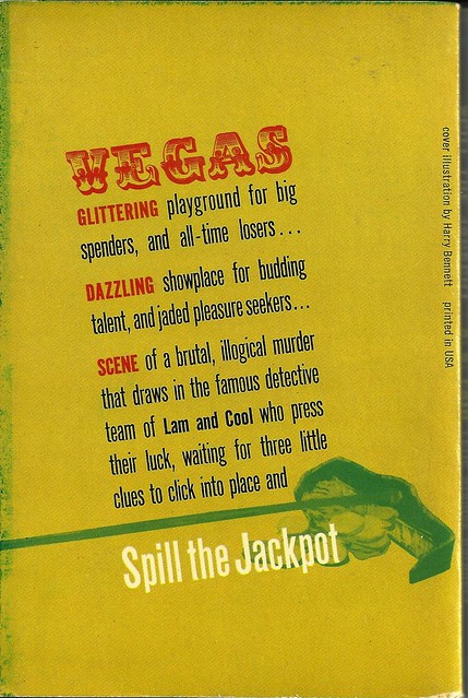
  • Oh, there she is again.
  • "Was" ... and the reason we dropped the "Was" was ...?
  • Is this a poem. This feels like a poem. I mean ... it's not Roethke, but it's OK.

Page 123~

"How was the money secured for the development work?"

I swear to you that that is the most exciting line on this horribly boring page. It was that or "Something about the name appealed to the investing public." Or, "Permission was given to sell the stock at par value zzzzzzzz..." etc.

~RP

[Follow Rex Parker on Twitter and Tumblr]

Thursday, June 23, 2016

Paperback 953: Spill the Jackpot / A.A. Fair (Dell R117)

Paperback 953: Dell R117 (1st thus, 1962)

Title: Spill the Jackpot
Author: A.A. Fair (Erle Stanley Gardner)
Cover artist: Harry Bennett

Estimated value: $10-15
Condition: 9.5/10

DellR117
Best things about this cover:
  • So. Great. It's like a rogue's gallery of hot and shady '60s people.
  • Redhead's cigarette is freaking me out. Like some sixth finger that got horribly bent backwards.
  • Just genius to use the margins of the cover this way. The encroachment of text, to the point of total visual dominance, is of course one of the most lamentable trends in paperback history. This cover responds to that trend not by shrinking the art (which often happened) but by incorporating the text into the art, making the margins the place of real action. It's superior cover design.

DellR117bc
Best things about this back cover:
  • Man, that "VEGAS" font is god-awful—totally out of sync, period-wise, with the cool-modern front cover.
  • Oh wow, that's a rake. I had to look at that visual element very closely to figure that out. This back cover is the Bizarro version of the front cover, i.e. it's Terribly designed.
  • "Jaded pleasure seekers"! I relate to these people. JPS4LIFE!

Page 123~

Somehow, looking at her, you felt she hadn't been to bed and that she wasn't accustomed to going to sleep before daylight.

Coincidentally, Vampire Weekend was playing on the radio when I typed this out.

~RP

P.S. I found this immaculate Detective Book Club offer card sleeping safely in the pages of this book.


[Follow Rex Parker on Twitter and Tumblr]