Showing posts with label Dell. Show all posts

Friday, September 4, 2026

Paperback 1175: For Bond Lovers Only / ed. Sheldon Lane (Dell 2672)

Paperback 1175: Dell 2672 (PBO, 1965)

Title: For Bond Lovers Only
Editor: Sheldon Lane
Cover artist: [photo of Ursula Andress]

Condition: 8.5/10
Value: $12

[acquired in Encinitas, CA, Aug. 2026]

Best things about this cover: 
  • Sale Forbidden to Non-Bond Lovers! Yes, she's very sexy, but put the book down and leave the store immediately, you impostor. You know you haven't seen Thunderball!
  • The title appears to be a play on For Your Eyes Only, which at this point (1965) had not been made into a movie. It was merely the title story of a short story collection (1960), meaning you really *would* have to be a Bond Lover to appreciate the (admittedly weak) wordplay.
  • I like how Andress is wearing a shirt. "If, uh, we could get a little more skin, Ms. Andr-" "Fuck you, it's cold, just take the picture!" "Yes, ma'am." (actually, it seems this photo was actually taken by Bunny Yeager, so the dialogue was probably more professional / less objectifying)
Best things about this back cover: 
  • There should not be a comma after "elegant." I want to love the man as much as you want me to love him, but ... punctuation!
  • If they're "girls" (and they're always "girls"), shouldn't he be a "girlizer"?
  • I get what they're doing with "bedridden" but it makes him sound sickly.
Page 123~
    "Bond is a dangerous man," said Chandler. "Dangerous to his enemies. Dangerous to himself. In real life, I suppose Bond would not last more than twelve months. His enemies would combine to see that.
    "Philip Marlowe, now—he'll probably end his days in a street accident. The American crime syndicate would never really go out of their way to bump him off. He's not dangerous enough to them."
~RP

[Follow Rex Parker on BlueSky and Letterboxd]

Thursday, March 5, 2026

Paperback 1160: Visions and Venturers / Theodore Sturgeon (Dell SF 12648)

Paperback 1160: Dell SF 12648 (PBO, 1978)

Title: Visions and Venturers
Author: Theodore Sturgeon
Cover artist: Wayne Barlowe (illus. by James Odbert)

Condition: 7
Value: $5

Best things about this cover: 
  • The Man Who Shot Fire From His Nipples!
  • This cover is disorienting. The man is apparently part of some illustration that has been torn open to reveal a vibrant green spacescape of some kind. But what is the illustration an illustration of? What on god's green planet is happening there on the left, under the title and author. An inscrutable sepia jumble.
  • Now that is an artist's signature! Dated and everything. Of course the book itself doesn't credit the cover artist (only the interior illustrator), but that signature is clear and unmistakable (thanks to the isfdb for the identification—what a resource)
Best things about this back cover: 
  • "Sturgeon's People" sounds like a public access show featuring interviews local freaks, weirdos, cranks and crackpots
  • I have some questions for Dad (if that is your real name...). Namely, what have you done with my peanuts?
  • I like when characters throng a story. None of this meek "inhabit" or "populate" bullshit! Throng or move along!
Page 123~ (from "Won't You Walk—")
He kept the bathrobe they gave him pulled snugly over his amplifier, and under a hot towel he reached almost the euphoric state he had been in last night.
"His amplifier" sounds like some kind of euphemism, so I don't really want to know what's going on under that towel, thank you very much...

~RP

[Follow Rex Parker on BlueSky and Letterboxd]

Tuesday, February 17, 2026

Paperback 1155: Poirot Loses a Client / Agatha Christie (Dell 6984)

Paperback 1155: Dell 6984 (1st thus, 1974)

Title: Poirot Loses a Client
Author: Agatha Christie
Cover artist: [William Teason]

Condition: 8/10
Value: $5

Best things about this cover: 
  • Found her!
  • Rube Goldberg's grandma-killing machine—surprisingly effective
  • Well, the bad news is that grandma has come back from the dead. The good news is that her flexibility has improved considerably!
Best things about this back cover: 
  • Who Would Want to Kill a Nice Old Lady? A novice murderer, probably. Someone who's only just taken it up. An old lady seems like a good starter murder.
  • Why are there always seven people and why are they always at a manor? You'd think they'd all have some kind of inkling, like "hey ... this feels ... kind of murder-y, right?"
  • I want to read this just to find out why Poirot was (apparently) so horny for this client. "Poirot channels his sexual frustration ... into justice!"
Page 123~
"Poirot," I said, "I'll begin a sentence with 'Are you sure?' Are you sure you are not being carried away by professional zeal? You want it to be murder and so you think it must be murder."
To which Poirot replied, "Now I'll begin a sentence with 'Fuck off, you insufferable twit,' ..."

~RP

[Follow Rex Parker on BlueSky and Letterboxd]

Monday, December 15, 2025

Paperback 1152: Murder on the Links / Agatha Christie (Dell 454)

Paperback 1152: Dell 454 (1st ptg, 1950)

Title: Murder on the Links
Author: Agatha Christie
Cover artist: Al Brulé

Condition: 7/10    
Value: $10

Best things about this cover: 
  • I'm sorry but the freakiest thing about this cover isn't Poirot standing in the doorway, it's whatever that get-up is that she's got on, holy cow.
  • Carhop? Ballerina? Working as a waitress in a cocktail bar?
  • Those are the gapingest fishnets I ever did see. Reasonable-sized fish could escape through those holes.
  • Classic Fear Hand! Or else she's telling Poirot, "Just give me five minutes, you impatient Walloon!"
  • In other news, I think 2026 might be My Christie Year. I know a year isn't nearly enough to read all her novels, but I'm hoping maybe I can polish off a dozen, at least.
Best things about this back cover: 

  • Mapback!! Paperback design peaked with the mapback. All downhill since then. Every book should have a map on the back. If I started a publishing co., this would be the one and possibly only thing I cared about.
  • Look at the detail. Tiny cabanas and beach chairs and umbrellas and everything.
  • LOL "Bench." Thanks, map!
  • Love the perspective on this one, with Calais visible in the far distance. And clouds! It's lovely, really.
  • "Copes" is a weird word to describe what Poirot does. He's solving a case, not surviving a week-end with his in-laws.
Page 123~
    But at that moment a stir and bustle was heard outside, and our old friend, the examining magistrate, accompanied by his clerk and M. Bex, with the doctor behind them, came bustling in.
OK, a couple things. First, M. Bex, cool name. Second, was there no editor to say "absolutely not" to the repetition of "bustle"? "Bustling" almost seems like an intentional comical callback to "stir and bustle," but if that were so, I'd expect all the people to come "stirring and bustling in." "Bustling" on its own gives the appearance of laziness (both authorial and editorial).

~RP

[Follow Rex Parker on BlueSky and Letterboxd]

Thursday, October 23, 2025

Paperback 1149: Mr. Parker Pyne, Detective / Agatha Christie (Dell 550)

Paperback 1149: Dell 550 (1st ptg, 1951)

Title: Mr. Parker Pyne, Detective
Author: Agatha Christie
Cover artist: Rafael de Soto

Condition: 7+/10
Value: $8

[Autumn Leaves, Ithaca, NY, summer '25]


Best things about this cover: 
  • Hey, alright, balding middle-aged bespectacled guy gets to be semi-heroic. You don't see that every day.
  • This lady is really bringing the hand action. Fear Hand™ reaching out toward us, while the other hand clutches her throat. Meanwhile, the guy's hands are also pretty busy, one of them holding and guiding the young woman, the other holding a handkerchief to his face (surely a more effective survival strategy than self-strangulation)
  • I assumed they were fighting their way through poisoned gas, but maybe it's just a smoke from a fire. But if it was a fire, I assume we'd be getting more clearly FIRE iconography. Where are the flames? Since when do fires give off a kind of mauve miasma?
  • Rafael de Soto was one of the artists who jumped from pulps to paperbacks, and you can really see the pulp expertise here. So good at conveying drama and action, so many nice little details—the wrinkles in his brow, for instance, or her bracelet, or his surprisingly stylish purple tie. If he's gonna die, he's gonna die in style! 

Best things about this back cover: 
  • Mapback! God bless Dell for the Mapback period. Every back cover a cartological adventure!
  • If ever there was an image of imperialism ... Great Britain is barely on this map, but the Houses of Parliament, seem to have invaded and absolutely crushed eastern Europe and Russia.
  • The iconography is perfect. Paris has the Arc de Triomphe, Britain has Parliament, Turkey's got minarets, Egypt's got pyramids, and then there's Iraq, which is represented, of course, by its world famous bus.
Page 123~
    "Oh, yes! Edward's a perfect angel." She hesitated. "Not, perhaps, very much go to him. Just a little—well, I'd call it strait-laced. Lot of Puritan ancestry and all that. But he's a dear," she added hastily.
"Where oh where did my go go? Why is it so low? I'll never know"—Edward

~RP

[Follow Rex Parker on BlueSky and Letterboxd]

Friday, October 17, 2025

Paperback 1148: Murder at Hazelmoor / Agatha Christie (Dell 937)

Paperback 1148: Dell 937 (1st ptg, 1957)

Title: Murder at Hazelmoor
Author: Agatha Christie
Cover artist: Milton Glaser

Condition: 8/10 
Value: $12

[Part of my Big Christie Haul from Autumn Leaves, late summer '25]


Best things about this cover: 
  • Look, I know there's not a lot going on in this painting, but the more I look at it, the cooler it gets. It's by legendary graphic designer Milton Glaser (creator of the I 🩷 NY logo among many other iconic images), and the composition and details are really compelling if you give them the time of day.
  • I love the tiny details, like the fringe on the rug, and the two little untied laces. The tread on the heels of those shoes is also amazing. Those shoes seem expensive, as do those (exquisite) socks.
  • The dude's pants, though, are the coup de grâce. They are perfectly, stiffly triangular. No wrinkles, no folds, an impossible fabric that defies gravity and gives the whole picture an air of whimsy (and despite all the murder in Christie stories, whimsy is never far off)

Best things about this back cover: 
  • Oh hell yes, Mapback (advent calendar edition)!
  • Look at those damned trees. The little stylized trees holding up perfect little arcs of snow. Where do you find those? Probably the same place you find those pants on the cover. And the little gingerbread houses, and the stars. Gorgeous.
  • I know (from the cover of another version of this same paperback) that there's a seance involved, and I'm newly obsessed with seances and hauntings and ghosts and people's belief in ghosts, so I think I'll put this away and save it for a nice midwinter read. Something to lighten the gloom of midwinter.
Page 123~
    "The only other person in the village is Captain Wyatt. He smokes opium, I believe. And he's easily the worst-tempered man in England. Anything more you want to know?"
    "I don't think so," said Emily. "What you have told me seems pretty comprehensive."
Disagree. I need to know more about Captain Wyatt right now. He sounds fascinating.

~RP

[Follow Rex Parker on BlueSky and Letterboxd]

Monday, August 11, 2025

Paperback 1131: The Company She Keeps / Mary McCarthy (Dell 824)

Paperback 1131: Dell 824 (1st ptg, 1955)

Title: The Company She Keeps
Author: Mary McCarthy
Cover artist: Robert Maguire

Condition: 7/10
Value: $10

[Newest addition to the Doug Peterson Collection]


Best things about this cover: 
  • I took one look at this and said "Maguire" so fast, I surprised even myself. Utter certainty. The guy had a style, and that style was Quintessential GGA (Great Girl Art). Robert McGinnis has probably the most recognizable style of all paperback cover artists, but for me, Bob Maguire is undefeated. Best of the best. He doesn't even have a lot of room to do his magic here, and yet that face, those lips, those (perfect) hands—unmistakable.
  • Every time I look at this cover—every single time—I see an empty coupe glass in her right hand. And then I see that it's just an illusion created by the corner of the train (?) window behind her—an illusion reinforced by the bottle of booze on the ledge behind her.
  • Just put some a cigarette, some booze, and a world-weary dame on your cover and I am happy. If she's on a train, even better.
  • I love how paperbacks sexed up everything by the mid-50s, even "literary" fiction like this. Mary McCarthy is not exactly slinging sleaze, but there's no reason she can't look like she is. There are very few books that could be improved, looks-wise, by The Maguire Treatment.

Best things about this back cover: 
  • She's like the antithesis of the woman on the cover, all brightness and smiles. She seems lovely, but I yearn for the down-and-outness of the flip side of this book.
  • "Writes like a man"—ugh, these midcentury critics who are still startled to find a woman writer who is good and also frank about sex. Speaking of frank ...
  • "Frank!" My favorite cover copy adjective. Feels like it's been a long time since I've seen "frank." I have a "Frank" tag for this blog and everything. Welcome back, old friend. I love "frank" because it's like the book's winking at you, like "psst ... it's dirty, c'mon, read it! You know you wanna..."
Page 123~
He made you think of Boy Scouts and starting a fire without matches and Wesley Barry and skinning the cat and Our Gang comedies and Huckleberry Finn. If he had ever been hard up, he could have been a photographic model, and one could have seen his pleasant, vaguely troubled face more often in The Saturday Evening Post than in Esquire. He might have done well as the young man who is worried about his life insurance, the young man who is worried about dandruff, the young man whose shirts won't fit him, the young man who looks up happily from his plate of Crunchies, saying, "Gee, honey, I didn't know breakfast food could taste so good!"
Frankly, this is great. It goes on like this (the chapter is called "Portrait of the Intellectual as a Yale Man"), and it doesn't get worse. I've never read McCarthy before, but I might have to give her a try.

~RP

[Follow Pop Sensation on BlueSky]

Tuesday, July 1, 2025

Paperback 1120: Long Shot / David Mark (Dell D300)

Paperback 1120: Dell D300 (1st ptg., 1959)

Title: Long Shot
Author: David Mark
Cover artist: Bob McGinnis [apparently misattributed] Mitchell Hooks

Condition: 6.5 or 7/10
Value: $8-10

[from Stomping Grounds bookstore, Geneva, NY (6/24/25)]


Best things about this cover: 
  • God bless my wife for discovering that the bookstore we were rummaging around last week in Geneva, NY had cabinets running the length of the floor (closed!) that contained $1 books. We both of us dropped to our knees and started combing over the inventory. We emerged with five good-to-great books, absolute steals at $1. This is one of them, maybe the best of them, where the cover is concerned. You can't go wrong with McGinnis [I'm told the attribution to McGinnis is a mistake, and that the artist is actually Mitchell Hooks ... whom you also can't go wrong with]. This is top-shelf GGA (Great Girl Art). Her smoky sideways glance and akimbo arm (not to mention her Fantastic green dress and orange coat) give this cover tremendous curb appeal.
  • The contrast between her (foreground) and the shadowy dude at the betting window (background) creates great dynamic tension in the cover. Doubt it would work half so well if *he* were in the foreground.
  • Who needs a silly thing like decency when you've got a rotten little tramp and the sick excitement of a gambling addiction!
  • Long Shot is so much better than The Long Chance (the original title). Whoever was in charge of marketing at Dell really knew what they were doing here.
  • Seriously, her ensemble is on fire.

Best things about this back cover: 
  • I'm sorry, is his name really "Loeser?" Kind of on-the-nose for a noir-style sap, don't you think? 
  • HUSBAND ... LOVER ... BELOVED? I think I get what's going on with Ruth and Katy, but Carol ... I have questions about Carol.
  • I have this nagging feeling that things don't end well for Mr. Loeser. That description of what it feels like for him to be at the track is striking, and strikingly like the feelings associated with other addictions, notably alcoholism.
Page 123~

    "Fight back!" roared the straight-backed man with the gray mustache (why did everyone have to roar?), "you have to learn to fight back."
    "Yes, sir."
    "You want to be a man, don't you?"
    "I guess so."
    "You want to be a good soldier, don't you?"
    "I don't think so."
    "Well, speak up, lad, what do you want to be?"
    Rick tried again. "Alive," he said.

~RP

[Follow Rex Parker on Twitter and BlueSky]

Wednesday, June 18, 2025

Paperback 1117: Night and the City / Gerald Kersh (Dell 374)

 Paperback 1117: Dell 374 (1st ptg, 1950)

Title: Night and the City
Author: Gerald Kersh
Cover artist: [movie still: Richard Widmark, Gene Tierney]

Condition: 6/10
Value: $10-15


Best things about this cover: 
  • Two of the greatest, smoldering for your attention
  • This is one of my favorite movies, and one of the greatest films noirs of all time. It's probably my favorite movie of 1950, which is Saying Something (1950, after all, has All About Eve, Sunset Boulevard, Born Yesterday, etc.)
  • Harry Fabian is the quintessential noir hero. Antihero. Loser-hero. Just wants to be somebody. Thinks he can work the system and outsmart the big boys. Finds out ... otherwise. If that's not noir, I don't know what is.

Best things about this back cover: 
  • Mapback! All books should be mapbacks. I really don't understand why they're not.
  • Frank! Feels like forever since the "Frank!" alarm has gone off. My favorite paperback cover adjective returns (albeit in adverbial form)
  • Cabbie, please take me directly to HONKATONK BOTTLE-PARTY. Located at ... [squints at book] ... 5? No, just 5. I don't know. 5! Find it! Use "The Knowledge!"
Page 123~

    He walked slowly back to Rupert Street, entered quietly and undressed in silence. He was relieved to see that Zoë slept soundly.
    He undressed and crept into bed beside her.
    She sighed, and whispered: "Chihuahua—"
   
Look, I'm sure there is explanatory context here, I'm just saying, I don't wanna know it. I'm gonna just assume that "Chihuahua" is a term of endearment for Harry, or else that she is dreaming of tiny dogs ... or that "Chihuahua" was the name of her childhood sled.

~RP

[Follow Rex Parker on Twitter and BlueSky]

Monday, June 2, 2025

Paperback 1108: Double Sin / Agatha Christie (Dell 12144)

Paperback 1108: Dell 12144 (1st New Dell, 1980)

Title: Double Sin
Author: Agatha Christie
Cover artist: Uncredited

Condition: 6
Value: $6


Best things about this cover: 
  • Hey kid, you got a little ... just ... on your mouth there ... no ... I'm a mirror ... my right, your left ...
  • For some reason, Random Heap of Objects is a common Christie cover motif
  • Who would arrange this stuff like this? What are the jewels even doing? How is that gun standing on end? Who would sculpt such a creepy wide-eyed kid? As you can see, all the blood is the least of my concerns
  • Why is Hercule Poirot not also "incomparable" (or something like it)? Where's his hyperbolic adjective? I think he's earned it. 

Best things about this back cover: 
  • This cover copy makes it sound like Marple and Poirot team up, or at least interact in some way, but I'm pretty sure this is a collection of short stories, none of which feature both detectives at the same time. Calling them an "unstoppable combination" is at least a little misleading.
  • What year do UPC codes start appearing on paperback books? A truly evil year, that.
  • This back cover is boring, the design uninspired. The corners of the text frame are vaguely deco-ish, which I guess is supposed to evoke the era in which the stories are set, but ... meh. I do kinda like the mirrored "A"s at the front and back of "AGATHA," but that may be the only design element here that I like.
Page 123~
An idle young man, she thought, but good-looking.
Finally—horny Miss Marple! It's what we've all been waiting for.

~RP

[Follow Rex Parker on Twitter and BlueSky]

Tuesday, May 23, 2023

Paperback 1065: Move Over, Darling / Marvin H. Albert (Dell 5859)

Paperback 1065: Dell 5859 (PBO, 1963)

Title: Move Over, Darling
Author: Marvin H. Albert
Cover artist: TERPNING (no, really) [Howard Terpning—thanks to reader Jeff for the reference]

Condition: 7/10
Value: $8-10


Best things about this cover:
  • Look, Doris Day's hair stylists did her no favors for a good chunk of the '60s but she is never not adorable and frankly that outfit is straight-up hot. I mean, your tastes may not run to the prim and purple, but that's your problem.
  • James Garner, also the dreamiest, but this cover isn't really designed to showcase that.
  • I hate how '60s paperback covers tend to emphasize text and often drive the art right off the page, but this cover has a nice, whimsical font, and frankly the artist gets a lot out of small details (DD's smile, her contemplative hand gesture, her dangly right shoe...)
  • I love this idea that in the '60s, it was every guy's dream to have not one but two wives. "What a setup!" This runs contrary to most wife-related comedy I've heard over the years. Something about taking wives... please.

Best things about this back cover:
  • See, text. It's awful.
  • This is basically the plot of My Favorite Wife (Grant/Dunne, 1940). Since that is one of my favorite movies of all time, and since I have a crush on both of the actors on the cover of this book, I'm willing to give this movie a shot.
  • See, TERPNING, I wasn't kidding. That's the cover artist's name. Not sure how that's a real name, but ... there it is! As I understand it, TERP is short for "terrapin," a kind of turtle. I would see a turtle-horror film called "The Terpning"!
Page 123~
"I was very excited by the island vegetation. I'm afraid I spent so much time on research that I was not very good company for your wife."
Heyyyyy, this *is* the plot of My Favorite Wife!!! Nick's first wife, Ellen, is shipwrecked for years on an island with a Johnny Weissmuller-type hunk (Adam) as her only companion. In order to keep Nick from getting jealous, she tries to pass off some ordinary-looking shoe clerk as Adam. Misunderstanding, tomfoolery, and hijinks ensue. Annnnyway, Move Over, Darling appears to be a faithful remake of My Favorite Wife, so now I'm definitely going to see it. Possibly right now. 

~RP

P.S. OMG the entire movie is summarized in just four pages of photo stills from the movie (please enjoy my leering marginal illustration):


[Follow Pop Sensation on Instagram @popsensationpaperbacks] 

Friday, October 28, 2022

Paperback 1064: The Big Four / Agatha Christie (Dell 0562)

Paperback 1064: Dell 0562 (1st New Dell Edition, 1972)

Title: The Big Four
Author: Agatha Christie
Cover artist: Uncredited

Condition: 9/10
Value: ~$10
Best things about this cover:
  • These objects-only covers are fairly common for Christie paperbacks of the '60s and '70s. I think (William) Teason is the name of the artist I know who has done several like this. Maybe this cover is Teason's work too, dunno. Anyway, it's very evocative ... of a certain ... criminal ... milieu ... but it's not terribly exciting.
  • The pearl-handled gun is gorgeous, as is the ornamental key. The noose is awfully, uh, circular. It's all so artfully arranged, like evidence that you just know is planted.
  • I'm curious about this font. And about the weird colors ... beige / yellow / beige ... that's one way to make sure the yellow doesn't pop. Then again, publishers have clearly learned to value marketing over art at this point, as Christie's name is big feature, and everything else merely decorative.
  • I want all the people in the photographs to be Doing Something! Making out, killing each other, something! To this cover's credit, I am curious to know how all this detritus fits into narrative form.
Best things about this back cover:
  • Back Cover Copy in C[heap pun] Minor
  • Wait, four men? I thought the photos on the cover were the Big Four, but one of those was a woman, so ... now I'm *really* intrigued (I've only ever read a few Christie titles in my life, if I'm being honest)
  • Bizarre to make such a superhero out of Poirot and yet depict him Nowhere on your cover. 
Page 123~
"Ernest Luttrell. Son of a North Country parson. Always had a kink of some kind in his moral make-up"
I am quite sure that what Christie means by "kink" and what I mean by "kink" are somewhat if not quite different from one another, and yet ... one can hope.

~RP

[Follow Pop Sensation on Twitter]

Thursday, July 14, 2022

Paperback 1056: In Case of Emergency / Georges Simenon (Dell D279)

Paperback 1056: Dell D279 (1st Dell, 1959)

Title: In Case of Emergency
Author: Georges Simenon
Cover artist: photo

Condition: 7/10
Estimated value: $10-15


Best things about this cover:
  • If anything was gonna kickstart this blog again, it was gonna be a sudden jolt of "frank"ness (picked this up on Sunday at Autumn Leaves bookstore in Ithaca)
  • Is there another way to be "shocking" besides "frankly shocking"? Can you be "coyly shocking"?
  • I know there is the suggestion of titillation inside ("8 PAGES OF PHOTOGRAPHS") but you'd think they would've offered up a more (frankly) suggestive shot of Bardot for the cover. Yes, she appears to be naked and in bed, but it's really a rather dull still—as if she were merely eyeing the cover copy and thinking, "yeah, I guess that's OK."
  • I want to live in a world where promises of JEAN GABIN photos could move books

Best things about this back cover: 
  • "Thoughts of Jean Gabin invaded her mind like ... well, like this red arrow!"
  • Yes, "obsessed" with his mistress, we get it, you said that on the cover, come on, thesaurus!
  • Nevermind, I just finished reading that first paragraph, put the thesauraus down, I repeat, put the thesaurus down, step away from the adjectives, please
  • I know "little slut of the streets" is supposed to sound insulting but I think it's kind of cute ... also, maybe your "traitorous body" is your own problem, pal
  • "Degrading," "depravity," "destruction," "desires" ... how about "desist" or "depart the D section of your dictionary, dude"?
Page 123~

"You'll see! She's got a pretty little pussy, with real blonde hair."

OK so that "pussy" is not I repeat not a cat. Frankly, I'm shocked. No, I'm being *real* frank, not boy-who-cried-frank frank. This quotation seems ... well, as explicit as anything I've ever seen in a book from a mainstream 1950s paperback publisher. I guess the French get more leeway. You know how they are.

~RP

Monday, August 5, 2019

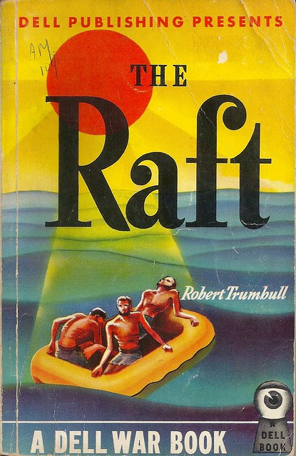
Paperback 1054: The Raft / Robert Trumbull (Dell 26)

Paperback 1054: Dell 26 (1st ptg, 1944)

Title: The Raft
Author: Robert Trumbull
Cover artist: George Frederiksen
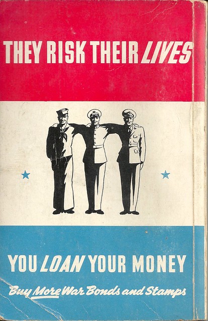
Back cover artist: Gerald Gregg

Condition: 6.5/10
Estimated value: $10

Dell26
Best things about this cover:
  • Everything above the author's name seems very pleasant. Serene, even. Perhaps, as your eyes move down the page, you can even maintain the illusion that these fellows are just out for a weekend jaunt of fun & sun. But that "DELL WAR BOOK" (a kind of book I can't remember seeing before) drives the more dire context home pretty thoroughly.
  • I like early Dell covers, and early covers in general, which are far more tied to abstract expressionism than later, more naturalistic covers (which I also love, obviously)
  • I also like the early Dell EYEBALL IN THE KEYHOLE logo. "You don't read Dell Books, Dell Books read you!"
Dell26bcjpeg
Best things about this back cover:
  • What is happening here? Why are they spaced so far apart? Why have their arms fused together? Does the dude in the middle need propping up? Is this some kind of Weekend at Bernie's situation?
  • The italicizing concept here is ill-conceived. I know alliteration has its charms, but choose parallel construction every time. 
  • War bond ads appeared inside early paperbacks with a great deal of regularity. On the outside of early paperbacks?? Far less so.
Page 123~
He seemed more interested in the boat than in his natural prey.

~RP

[Follow Rex Parker on Twitter and Tumblr]

Friday, July 19, 2019

Paperback 1052: Gold Comes in Bricks / A.A. Fair (Erle Stanley Gardner) (Dell 84)

Paperback 1052: Dell 84 (1st ptg, 1945)

Title: Gold Comes in Bricks
Author: A.A. Fair (pseud. of Erle Stanley Gardner)
Cover artist: Gerald Gregg

Condition: 5/10
Estimated value: $15

Dell84
Best things about this cover:
  • Gold comes in testicles
  • It looks like honey, and if you gotta go, I say asphyxiated by honey is the way!
  • Really love the early Dell covers, which had no pretensions to realism. Much more interested in evoking feeling with shape and color than in getting the perspective or anatomy right
  • Check out the jaunty cursive on the author's name. The early pb was the wild west, from a design perspective. Everyone still experimenting, going nuts.
  • This is the Platonic ideal of the "Reading Copy." Beat to hell, but still tight and complete and unfragile. They don't make 'em like they used to!


Dell84bc
Best things about this back cover:
  • Mapback!
  • Uh ... this could be more interesting. Two nondescript hotel rooms! Thrill to the architectural possibilities!
  • LOL "Corridor," thanks, map
Page 123~
The machine shops had moved. The office stood deserted. There was an air of funereal despair about the town. Those who were left went dejectedly about their business, moving with the listless lassitude of persons who have lost their chance at winning big stakes and are plugging away simply because they can't figure out how to quit.
Ouch. I feel seen. And accused.

~RP

[Follow Rex Parker on Twitter and Tumblr]

Saturday, October 6, 2018

Paperback 1037: Send Another Hearse / Harold Q. Masur (Dell 7737)

Paperback 1037: Dell 7737 (1st ptg, 1965)

Title: Send Another Hearse
Author: Harold Q. Masur
Cover artist: Greene (so he's just Greene, now? like Prince?) (see artist credit on back)

Condition: 10/10
Estimated value: $12
Perma6180
Best things about this cover:
  • "I have other creative talents," whispered the brunette. Throatily, she added, "I hang wallpaper."
  • I love Scott Jordan's expression. "Just gonna light this cigarette and settle in to watch this wallpaper-hanger lady take her clothes off and ... [ding dong] ... what the!? Goddammit, why did I even bother getting a No Solicitors sign if no one's gonna ****ing RESPECT it!?"
  • I also love how jaded the title is. "Yep ... yeah ... I don't know, someone else died, I guess ... no we can't put 'em in the same hearse, you moron. SEND ANOTHER HEARSE!"
Perma6180 1
Best things about this back cover:
  • That is not a martini glass. That is the Holy Grail.
  • "Scott"? Come on. P.I.s go by last names. You switch to "Jordan" eventually, so your dumb first-name gambit actually makes everything weirdly unclear. Nevermind that both "Scott" and "Jordan" can be both first and last names. It's a mess. Just stick with last names, and you're good, man.
  • What kind of chump just *opens* the hotel room door? No "Who is it?" or anything?
Page 123~
And, quite irrelevantly, I thought how various parts of the human anatomy behave differently under stress.
I think he's saying his penis is irrelevant, but who can be sure?

~RP

[Follow Rex Parker on Twitter and Tumblr]

Friday, February 16, 2018

Paperback 1008: Rogue Queen / L. Sprague de Camp (Dell 600)

Paperback 1008: Dell 600 (1st ptg, 1952)

Title: Rogue Queen
Author: L. Sprague de Camp
Cover artist: Mike Ludlow

Condition: 7/10
Estimated value: $8-10

Dell600
Best things about this cover:

  • That seems a reasonable way to learn about sex tbh
  • "OK, so, step 1: put the spear away"—Earth-man
  • I'm sure that phallic rocket is in no way a phallic symbol
  • That is some very convenient cape and forearm
  • Her hair is amazing


Dell600bc
Best things about this back cover:

  • "You ... complete ... me ... seriously, do it, complete me, I'm not a woman yet, get on with it."
  • You take the good you take the bad you take them both and there you have the Facts of Full Womanhood, The Facts of Full Womanhood!
  • That is the sloppiest damn ringed planet I even did see. It's like a 5-year-old drew a ball of yarn


Page 123~

"It is a curious feature of Terran culture that when the men do something of a stupidity they always blame their wives."

I like her.

~RP

[Follow Rex Parker on Twitter and Tumblr]

Monday, January 8, 2018

Paperback 1005: All Men Are Liars / John Stephen Strange (Dell 438)

Paperback 1005: Dell 438 (1st ptg, 1950)

Title: All Men Are Liars
Author: John Stephen Strange
Cover artist: Robert Stanley

Condition: 6/10
Estimated value: $5-10

Dell438
Best things about this cover:
  • "I solemnly swear ... aw, who am I kidding? All men are liars, amirite!? Up top!"
  • Her side-eye! I really should have a "Women Looking At Losers" blog tag. (See Paperback 1004)
  • Her mustard suit is smokin'
  • Shouldn't "man about town" be hyphenated? ... wow, even dictionaries seem divided on this one. One thing no one's divided on: the Ben Affleck movie "Man About Town" is probably best left back in 2006.

Dell438bc
Best things about this back cover;
  • Mapback!
  • Love the Gay '90s font on the title, wtf
  • How have they managed to make Manhattan look so boring? So many things on that island we get ... a generic courtroom interior!?
  • The crossword maker in me is like "hmm... is HDQRS really a valid abbr.?"
Page 123~

Won Way Street rose and strolled across the well of the court.

Sorry. I'm dead. That name just killed me.

~RP

[Follow Rex Parker on Twitter and Tumblr]

Sunday, April 30, 2017

Paperback 989: Once Upon a Dreadful Time / ed. Alfred Hitchcock (Dell 6622)

Paperback 989: Dell 6622 (1st ptg, 1964)

Title: (Alfred Hitchcock's) Once Upon a Dreadful Time (Dell 6622)
Editor: Alfred Hitchcock
Cover artist: Banbury (one name! stylish)

Estimated value: $8-10
Condition: 8/10

Dell6622
Best things about this cover:
  • Alas, poor Hitchcock...
  • Nice self-sideeye
  • Not sure why he's hiding a skull ... from ... himself ... but I'll admit it all looks super-cool.

Dell6622bc
Best things about this back cover:
  • Donald Westlake completists will want to be sure to pick this up
  • Contributors are indeed exclusively male. Women wrote a lot of horror / crime / suspense stories, so the men-only thing here is at least a little weird.
  • The whole Hal Ellson / Hal Elison thing is so weird that his name is spelled both ways in this book (in table of contents, it's ELLSON—which is correct. Here's the NYT also getting it wrong in 1955). And then there's this, from wikipedia:
Harlan Ellison cites Ellson's work as having inspired his own interest in juvenile delinquency — an interest which led directly to the writing of Ellison's first novel, Web of the City. Ellison has also stated that in the earliest days of his career as a writer, he was often mistaken for Ellson writing under a pseudonym — and that decades later, when Ellison had become much more known and Ellson's career had waned, Ellson was often mistaken for Ellison writing under a pseudonym.
 Page 123~ (from "Anatomy of an Anatomy" by Donald Westlake)

At three o'clock on the dot, she heard a thump from above, and knew it was the head.

Westlake is just a champ and that's all there is to it.

~RP

[Follow Rex Parker on Twitter and Tumblr]

Friday, March 3, 2017

Paperback 987: New York: Confidential / Jack Lait & Lee Mortimer (Dell 1534)

Paperback 987: Dell 1534 (2nd ptg, 1951)

Title: New York: Confidential
Author: Jack Lait & Lee Mortimer
Cover artist: Robert Stanley

Estimated value: $12-15
Condition: 8/10

Dell1534
Best things about this cover:
  • Guys! Dolls! Together!
  • Robert Stanley's people are always ridiculously rich and creamy.
  • Seriously, the art is gorgeous. That dark aquamarine NYC night sky somehow works perfectly.

Dell1534bc
Best things about this back cover:
  • Map! Back! Mapback!
  • It's a pretty dang dull map, from a design point of view, but the "Key" on p. 240 is amazing. All those little numbers on the map represent "Hotels," "Night Clubs & Restaurants," "Theaters," and "Shopping":
Dell1534Key

Also, there are appendices of cool info like "Headwaiters' Names" (!?) and a "Glossary of Harlemisms":

Harlemisms
Harlemisms2


Page 123~

Do not use cheap perfume when night-clubbing (or at any time).

~RP

[Follow Rex Parker on Twitter and Tumblr]