Paperback 1124: Gold Medal s1082 (PBO, 1961)
Title: The Removers
Author: Donald Hamilton
Cover artist: Barye Phillips
Condition: 6/10 (crease down the middle of the cover)
Value: $6-10

- Another day, another Barye Phillips Gold Medal cover that is disappointingly sketchy. Why is this there so much unused space? Why is the woman so small? Bah!
- Also: another day, another implausible color of "red" on the "red"head. That's like Ronald McDonald "red," come on.
- On the other hand, love what the cover is doing with the "V" motif here—extending it up to provide space for the tagline, but also using it as a visual representation of the (imagined) gunshot. The whole "V" is like a speech bubble for the gun. A blast bubble.
- I also dig this groovy sixties font.

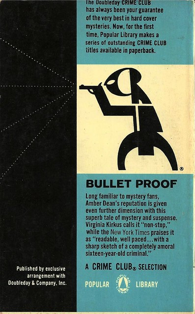
Best things about this back cover:
- Interesting continuation of the "V" motif onto the back cover, extending and transforming it here into the top part of an exclamation point, with Helm himself as the emphatic dot!
- Gold Medal mostly didn't bother with the blurbs from "legitimate" press—you sell these books with Great Girl Art (GGA) and author reputation, not critic blurbs—but I guess if the critics love you, you can try to appeal to the eggheads who would otherwise be embarrassed to be seen reading 35c books.
- "A Creature of Sweetness and Havoc" would, I must admit, be a great crime novel title.
Page 123~
I put the phone down. I was looking at Beth, but for some reason I was seeing a long, low, green car—the color is known as British Racing Green—hurtling across the Arizona desert with that fine, wicked sound that you get only from high-class machinery that's really carrying the mail. Barring the true racing cars, the Jaguar is possibly, along with its American counterpart the Corvette, the most ridiculous vehicle made, from the viewpoint of efficient and economical transportation. You've got power enough to move a ten-ton truck attached to a loadspace barely adequate for two men and a small toothbrush. But it's an ego-satisfying machine in every respect [...]
OK, I've never read a Donald Hamilton novel before (that I can recall), but this stretch of prose actually makes me want to. I love an author who'll just do a funny little plot-irrelevant aside like this. Chandler was at his best when he'd let Marlowe do this sort of thing. Gonna throw a Hamilton novel onto the "summer vacation reading" list (already in danger of getting too long)
~RP