Title: Trinity in Violence
Author: Henry Kane
Cover artist: Uncredited
Estimated value: $10-$15

Best things about this cover:
- A great cover mucked up by someone's bright idea of a teaser. "Let's put the first words of the book on the cover! It'll be revolutionary!" "Where are we gonna put them?" "Why … here, right across the bottom half of the dame. Nobody likes dames on covers anyway. It's words, Words they cry for!"
- I feel like she's so pinned in by darkness that we really Need the color from the bottom half of her dress. It honestly takes me several takes, every time I look at this thing, to realize it's a fur over her right shoulder and not some weird dark thing in the foreground blocking my view.
- Also, is the apartment building on fire? If not, why is there thick black smoke around the title?
- She looks an awful lot like my second college girlfriend. My girlfriend tended to wear more clothes and carry fewer guns than this lady, but still … if this lady we're looking at is named "Rosie" (as that damned block of text suggests), then that's another weird connection, as "Rose" was an element of my girlfriend's name.
- There's something quintessential about this cover. Not great on its own, but great at capturing a certain cover type: generic, be-hatted, trenchcoated sap stands in as proxy for reader/viewer. Doesn't matter what he looks like. It matters what She looks like. And it matters that she's trouble.
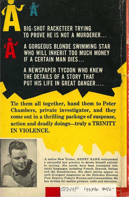
Best things about this back cover:
- I love the primitive video game-like swarm of armed "A" logos. I just need a Peter Chambers icon and a joystick.
- Henry Kane looks like he wants desperately to escape the photo shoot.
- "The Scandinavian?"
Page 123~
He nudged a pinky-point at his thin mustache.From his picture, it looks like Henry Kane knows from thin mustaches. Authenticity, thy name is Kane.
~RP
[Follow Rex Parker on Tumblr and Twitter]