Title: Trinity in Violence
Author: Henry Kane
Cover artist: Uncredited
Estimated value: $10-$15

Best things about this cover:
- A great cover mucked up by someone's bright idea of a teaser. "Let's put the first words of the book on the cover! It'll be revolutionary!" "Where are we gonna put them?" "Why … here, right across the bottom half of the dame. Nobody likes dames on covers anyway. It's words, Words they cry for!"
- I feel like she's so pinned in by darkness that we really Need the color from the bottom half of her dress. It honestly takes me several takes, every time I look at this thing, to realize it's a fur over her right shoulder and not some weird dark thing in the foreground blocking my view.
- Also, is the apartment building on fire? If not, why is there thick black smoke around the title?
- She looks an awful lot like my second college girlfriend. My girlfriend tended to wear more clothes and carry fewer guns than this lady, but still … if this lady we're looking at is named "Rosie" (as that damned block of text suggests), then that's another weird connection, as "Rose" was an element of my girlfriend's name.
- There's something quintessential about this cover. Not great on its own, but great at capturing a certain cover type: generic, be-hatted, trenchcoated sap stands in as proxy for reader/viewer. Doesn't matter what he looks like. It matters what She looks like. And it matters that she's trouble.

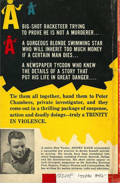
Best things about this back cover:
- I love the primitive video game-like swarm of armed "A" logos. I just need a Peter Chambers icon and a joystick.
- Henry Kane looks like he wants desperately to escape the photo shoot.
- "The Scandinavian?"
Page 123~
He nudged a pinky-point at his thin mustache.From his picture, it looks like Henry Kane knows from thin mustaches. Authenticity, thy name is Kane.
~RP
[Follow Rex Parker on Tumblr and Twitter]


4 comments:
That guy on the cover looks a little surprised. "Oh, hello there... whaaa???"
It's interesting to me how obviously this cover is meant to resemble the Signet Mickey Spillane covers -- you got your sexy dame with a gat, your trench coated private dick with his face averted from the viewer, your utilitarian font, your olive green banner across the top. I'd even say the odds are pretty good James Meese is the artist, too. The only thing that throws off the bait-and-switch is that silly big-ass block of text at the bottom. Ya blew it there, Avon art director!
She needs less clothes to be "as naked as the naked automatic in her hand".
There's no way that fur is on her shoulder. It's hovering in mid-air.
Post a Comment