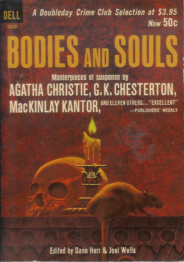
Showing posts with label G.K. Chesterton. Show all posts

Wednesday, February 26, 2014

Paperback 746: The Avon Book of Detective and Crime Stories / ed. John Rhode (Avon 21)

Paperback 746: Avon 21 (1st ptg, 1942)

TitleThe Avon Book of Detective and Crime Stories
Editor: John Rhode
Cover artist: NA

Yours for: $10

Avon21

Best things about this cover:
  • The font? Maybe? Also pink. Pink is nice.
  • This old Avon has held up *really* well. I love a good old paperback that's beat-as-f*ck but still perfectly solid and tight. You could read this a hundred times and it would just get more broken in.
  • This is a classic detection bonanza right here. Not really my cup, but a pretty sweet collection nonetheless.
Avon21bc

Best things about this back cover:
  • Shakespeare-Head!
  • Shakespeare likes mysteries and also the US Armed Forces. Heed Shakespeare's plea, y'all.
  • You can store paperbacks in such things as "clothing" or those new-fangled contraptions, "bags."

Page 123~ (from "A Shot in the Night" by The Baroness Orczy)

My experience is that in all emotions and all weaknesses, in all virtues and in all vices, women invariably outdo the men.

But this is beside the point.

~RP

[Follow Rex Parker on Twitter and Tumblr]

Sunday, June 22, 2008

Paperback 117: Bodies and Souls / ed. Dann Herr & Joel Wells (Dell 0656)

Paperback 117: Dell 0656 (1st ptg, 1963)

Title: Bodies and Souls
Editors: Dann Herr & Joel Wells
Cover artist: Teason

Yours for: SOLD 9/18/10


Best things about this cover:
  • Finally, a paperback that deals seriously with the lingering problem of the Manichean Heresy.
  • "Alas, poor Yorick, I knew him, [Willard / Ben / Templeton / other rat name you can think of]"
  • Hmmm ... uh ... I guess this cover's got a rat. And a skull. And a candle. Those elements hold a certain visual interest.
  • If you like brown, this is the book for you.
  • This book is another good example of why paperback design starts sucking some time around 1960. Art becomes more like stock footage. Text starts dominating the cover in un-thought out and ugly ways. Quit shilling for the "Doubleday Crime Club" and give me the beautiful cover art I deserve! 50 cents for a paperback?! What am I, a Rockefeller?

Best things about this back cover:

  • When I want an authoritative literary opinion, I always turn to [squints to read fine print] the Columbus Ledger-Enquirer!
  • This reviewer is sadly and humorously unaware that "catholic" in fact means "universal." I know the reviewer meant "Catholic" in religious terms ... but precision of word choice matters, even if you do only work for the Columbus Daily Muffin.

Page 123~

from "The Finger of Stone" by G.K. Chesterton

"Have you heard the news I say," rapped out the doctor. "Boyg is dead."

Gale stopped in a sentence about Gothic architecture, and said seriously, with a sort of hazy reverence:

"Requiescat in pace. Who was Boyg?"

~RP