Showing posts with label Short stories. Show all posts

Friday, September 19, 2025

Paperback 1143: Six Times Death / William Irish (Popular Library 137)

Paperback 1143: Popular Library 137 (PBO 1948)

Title: Six Times Death
Author: William Irish (pseud. of Cornell Woolrich)
Cover artist: Uncredited [would guess H. Lawrence Hoffman, but that's a guess]

Condition: 7/10 
Value: $50

[The Book Den, Santa Barbara, CA, Aug. 2025]


Best things about this cover: 
  • Such a weird cover. Looks more like an animation still than a typical paperback cover painting. I love the little firemen silhouettes. At least I think they're firemen. They're a little ominous. Kinda look like cops who've shown up to a house in the middle of the night to fill it full of lead (those hoses shoot awfully straight)
  • Why does the fire look like a goddess who is about to snack on some hapless mortals?
  • That blurb is the kind of blurb you write when you didn't read the book. "These are definitely [flips through book] short stories, which should please the kind of people who like that sort of thing"—NEW YORK TIMES
  • Another great Cornell Woolrich paperback that I picked up for a (relative) song this summer. It contains the story "Marihuana," which, as a stand-alone paperback (Dell 10c), is one of the most iconic vintage paperbacks there is.

And today's back cover ...


Best things about this back cover: 
  • Popular Library, again with the unindented paragraphs (see Paperback 1142). How did anyone tolerate this layout? It should've driven any copywriter or book designer crazy.
  • "... the unbearable horror [that] can color a man's life, the sheer tragedy of fate's perversity, the macabre attraction of evil"—sounds like Being Alive in 2025!
  • "... the futility of striving against a malevolent destiny" is pure noir stuff. The best laid plans go pffft. So much for heroism or any kind of meaningful human agency. Some things are just beyond you. It's Chinatown, as they say.
Page 123~ 

[from "Marihuana"]
    She only had one more dodge left. One more, and then the struggle for life was out of her. "Our song. Wait! I have it here—" She floundered across to a turntable, began shuffling through records with a furtive haste. One dropped, broke; another, a third; she didn't even stop to look at them. 
    She found one, fitted it on, set the needle arm. Then she turned to face him, at last gasp. Already more dead than alive. He had already killed her, all but her body. Life wasn't worth this price, anyway.
Turgid with melodrama, bordering on the comical there at the end, though I really like the bit with the records breaking. Propulsive prose. Vivid.

~RP

[Follow Rex Parker on BlueSky and Letterboxd]

Friday, August 30, 2024

Paperback 1101: Slipping Beauty / Jerome Weidman (Avon 322)

 Paperback 1101: Avon 322 (1st ptg, 1951)

Title: Slipping Beauty
Author: Jerome Weidman
Cover artist: [Ray Johnson]

Condition: 8/10 (cover kind of warps away from the pages at the corners a bit, but otherwise square and bright)
Value: $15

[The Book Den, Santa Barbara, CA]


Best things about this cover: 
  • When you're in the theater with your children and suddenly realize you've misread the marquee... "Mommy, that lady's not sleeping ... mommy ... can I get a cigarette holder?"
  • This is really first-rate girl art. I love this dame: sexy, bored, comfortable in her sexy boredness. He does a good job with her body & profile but he does an even better job with her whole Attitude. High-end hardboiled.
  • I like the palette on this cover, too. Real cool. The icy blue is unusual, and complements the pinkish lingerie and flesh tones really well.

Best things about this back cover: 
  • Loooooove a good author photo, and this one is good. Gotta be smoking, of course, but I love how this is less author photo and more cover adornment. He's *this* close to looking like a logo.
  • LOL those *eternal* ellipses in the New York Times quotation. Like the reviewer is thinking of something diplomatic to say and is like "... uh ... meaty? ..."
  • "Cataloguer of heels"—if I were Weidman, I'd put that on my business card *immediately*
Page 123~ (from "Everybody Wants to Be a Lady")
Well, my husband Mac, he's the nicest fellah you ever wanna meet and all that, but when it comes to things like this, God bless him, if you don't put the words in his mouth, he don't know what to say.

Ah, to live in a time when people said "fellah" and spelled it with an "h." Glory days. 

~RP

[Follow Rex Parker on Twitter and BlueSky]

Monday, June 17, 2024

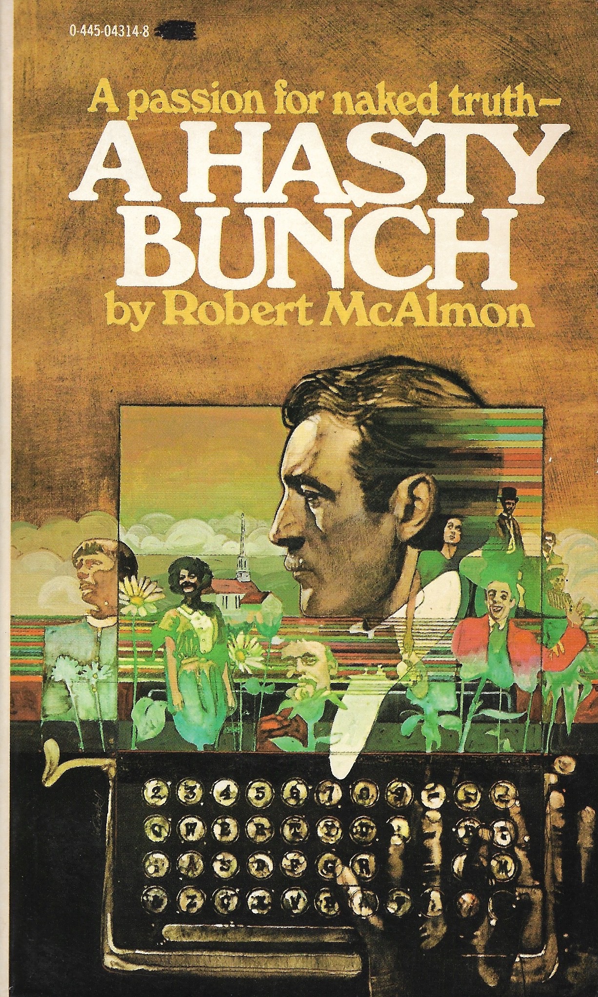
Paperback 1091: A Hasty Bunch / Robert McAlmon (Popular 445-04314)

 Paperback 1091: Popular 445-04314 (1st, ~1977)

Title: A Hasty Bunch    
Author: Robert McAlmon
Cover artist: [Uncredited]

Condition: 9
Value: $20


Best things about this cover: 
  • Look, full disclosure, I have never done acid, but this is what I imagine the world looks like. Kind of a pleasant psychedelic jumble with rainbow streaks. Love the horizontal lines coming out the back of the main guy's head, and then running through the entire middle of the painting. Completely unnaturalistic and Of The Time (the '70s). My favorite figure is the guy on the far right, who looks kinda like if the Joker were a cruise director.
  • The typewriter, equally great, but equally disorienting, in its own way. The keyboard makes sense to a point but somewhere east of the "F" key things start to buckle and by the time you get all the way to the right its a monstrous free-for-all. Oh, I'm not realizing that what I'm seeing is a hand hovering over the keys on the right side. Who Types Like That!?
  • I got this book solely because of the cover. I didn't start out collecting anything from the '70s, but, well, time has passed (30 years next year since I started my collection), and the '70s are now fair game, especially when a book is in near-perfect condition and just sitting there on the $1 shelf.
  • Sometime in the '70s, Southern Illinois UP reprinted some long out-of-print American books, and then ended up partnering with Popular Library here to release a number of them as mass-market paperbacks: their Lost American Fiction Series. This book is part of that series. There are 15 other books listed, with intriguing titles like THE PROFESSORS LIKE VODKA, CUBICAL CITY, and THEY DON'T DANCE MUCH. I am ... curious. This particular book has an afterword by writer Kay Boyle. Here's the full list of everything Southern Illinois Press brought back.
  • I'm also curious about this cover artist, whom I love, and whose name I don't know. I believe he's also the artist on this early-'70s Bantam cover:

[You can see the resemblance, I hope. If you know who it is, kindly holler.]

And now the back cover...


Best things about this back cover: 
  • Telling it how it really is and especially "sexual candor" are always big selling points for paperbacks. Not just truth, but (as the front cover says) "naked truth." What fun is the truth if it's wearing clothes. People want stuff that's sexily truthful. Hornily honest. In a word: frank. (I wish that word were somewhere on these book covers—my favorite cover copy euphemism; been a while since I've seen it)
  • This book was originally published in 1922, and even then it was barely published at all: "Reprint of a Contact Press edition privately printed by the author in Dijon, 1922."
  • This books is a collection of short stories by an ex-pat who apparently hung with Hemingway and Joyce. "Prophetic genius"? That is a big claim. Let's see what p. 123 has to say: 
Page 123~ (from "A Business Family")
"It doesn't do a place any good to have a person die in it. We ought to have insisted on her being taken to a sanatorium."
Mrs. Sturgeon runs the "Rest an Hour Kosher yearround hotel," and one of her guests, Mrs. Davis, has just done her the great disservice of dying in her establishment. Hugely inconvenient, the dead.

~RP

[Follow Rex Parker on Twitter and BlueSky]

Wednesday, July 18, 2018

Paperback 1030: Damon Runyon Favorites / Damon Runyon (Pocket Books 158)

Paperback 1030: Pocket Books 158 (1st ptg, 1942)

Title: Damon Runyon Favorites
Author: Damon Runyon
Cover artist: criminally uncredited [Frank J. Lieberman]

Condition: 8.5/10
Estimated value: $20

PB158
Best things about this cover:

  • You guys it's just so beautiful. I don't really have much to say. It just evokes a whole era, a magical place and time, as seen through the haze of nostalgia. It's So Soft.
  • The orange is wonderfully bright. These early Pocket Books are rarely this nice, with the colors unfaded and the Permagloss largely intact (just the tiniest bits of pull-away on some of the edges). Not perfectly square, but perfectly tight. Pages are practically bone white. Not sure it's been read at all.
  • That cab!
  • I want to go to Mindy's *right now*.

PB158bc
Best things about this back cover:

  • Master Of The Main Stem! (!) (!?) (!!??)
  • I wonder when "according to Walter Winchell" stopped working.
  • Runyon is such an important popularizer of the colloquial speech and lowbrow slang that dominated mid-century crime fiction. Colorful New York characters. Big False Face! BFF!

Page 123~ (from "Sense of Humor")
"Why," he says, "do not you hear the news about Rosa? She takes the wind on me a couple of months ago for my friend Frankie Ferocious, and is living in an apartment over in Brooklyn, right near his house, although," Joe says, "of course you understand I am telling you this only to answer your question, and not to holler copper on Rosa."
Joe the Joker doesn't want to holler copper because Rosa spends money like nobody's business and Frankie is about to find out how expensive she is. Dames!

~RP

[Follow Rex Parker on Twitter and Tumblr]

Friday, January 13, 2017

Paperback 985: Runyon First and Last / Damon Runyon (Graphic 30)

Paperback 985: Graphic 30 (1st ptg, 1951)

Title: Runyon First and Last
Author: Damon Runyon
Cover artist: Uncredited

Estimated value: $10-15
Condition: 7/10

Graphic30
Best things about this cover:
  • I oppose fur but that is a magnificent fur. That is an ostentatious, almost comically elongated sleeve. And shoulder pad.
  • I love how she seems to be admiring Runyon's name while poor Slats pleads spectrally in the background.
  • Runyon is a really important early 20c. American newspaperman and short story writer. He records and cultivates a certain hardboiled, slangy, colloquial style that ends up being very influential. You may know him from such things as "Guy & Dolls."

Graphic30bc
Best things about this back cover:
  • Runyonese. I like my ham on rye with extra Runyonese.
  • The titles of these stories alone are worth the price of admission. Soupbone Pew!
  • "Informal Execution" is such a menacing phrase. I'm guessing that one wasn't made into a musical.

Page 123~ (from "Old New Year's")

On this day everybody swears off doing something or other, generally drinking, which is very easy for most people to swear off on New Year's Day, because generally they feel so tough from welcoming in the New Year that they never wish to see another drink again as long as they live, or anyway until they feel better.

I like that usage of "tough." So much more delicately ambiguous than the straight jab of "hungover."

~RP

[Follow Rex Parker on Twitter and Tumblr]

Monday, August 22, 2016

Paperback 970: The Illustrated Man / Ray Bradbury (Bantam 991)

Paperback 970: Bantam 991 (1st ptg, 1952)

Title: The Illustrated Man
Author: Ray Bradbury
Cover artist: [Charles Binger]

Estimated value: $15
Condition: 8/10

Bant991
Best things about this cover:
  • Happy Bradburthday! (b. Aug. 22, 1920)
  • Ooh, the rarely seen *male* Fear Hand. Cool.
  • First story in this collection is "The Veldt." It is holy-smokes great. Legendary. Rereading today.

Bant991bc
Best things about this back cover:
  • This is the greatest back-cover bio of all time. OF ALL TIME.
  • Decry the hogwash!
  • After this book came out, Bradbury continued writing for another *60* years.
  • Had no idea he rocked the bow tie. Hot.

Page 123~

(LOL ... uh, this book is missing p. 121-152; not torn out, just ... never included!? Whoa. So ... p. 23!)

The first concussion cut the rocket up the side with a giant can opener. The men were thrown into space like a dozen wriggling silverfish. They were scattered into a dark sea; and the ship, in a million pieces, went on, a meteor swarm seeking a lost sun.

[Opening paragraph of "Kaleidoscope"] [insert quiet admiration here]

~RP

[Follow Rex Parker on Twitter and Tumblr]

Friday, May 20, 2016

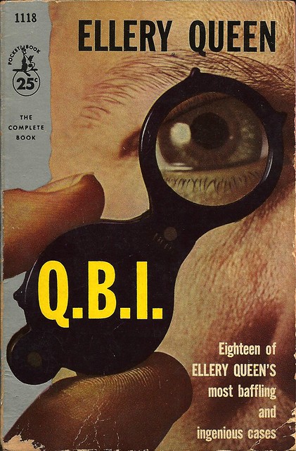
Paperback 942: Q.B.I. / Ellery Queen (Pocket Books 1118)

Paperback 942: Pocket Books 1118 (1st ptg, 1956)

Title: Q.B.I.
Author: Ellery Queen
Cover design: Milton Herder

Estimated value: $5-8
Condition: 5/10

PB1118
Best things about this cover:
  • It's like the F.B.I. but queer. I imagine.
  • This cover wins awards for "Most Visible Thumbprint" and "Best Kempt Cilia"
  • Where can I get one of these switchblade micro-monocles? Judging by this guy's pupil dilation, they seem fun.

PB1118bc
Best things about this back cover:
  • Type script is best.
  • No Nouns Allowed Without Adjectival Guardian
  • Kid Naping. That word *never* looks right to me.

Page 123~ (first line of "Dying Message Dept.: G. I. Story")

Ellery swung off the Atlantic State Express in his favorite small town disguised by earlaps, muffler, and skis, resolved that this time nothing should thwart his winter holiday.

You'll Never Guess What Happens Next! (spoiler: holiday thwarted)

~RP

[Follow Rex Parker on Twitter and Tumblr]

Friday, May 30, 2014

Paperbacks 780 and 781: The Unknown and The Unknown 5 / ed. D.R. Bensen (Pyramid R-851 and R962)

Paperbacks 780 & 781: Pyramid R-851 & R-962 (PBO, 1963 & 1964)

Titles: The Unknown and The Unknown 5
Editor: D.R. Bensen (both)
Cover artist: John Schoenherr (both) / Illus. by Edd Cartier (both)

Yours for: $12

PyrR851
PyrR962

Best things about these front covers:
  • Two for one today, as these appeared back to back on my bookshelf and seemed to go together.
  • The adorableness of Winky Peek-a-Boo Demon is considerably undermined by his unholy thumbnail.
  • I'm classifying that bony limb on The Unknown 5 as "Fear Hand," though honestly, it's more like "Hey. 'Sup? Hand."
  • Can't tell if that bird has no head, or if it's just set completely within its squat little torso.
  • I don't know what became of The Unknowns 2-4, but I fear the worst.

PyrR851bc
PyrR962bc

Best things about this back cover:

  • Weird that 3/5 of the names on The Unknown 5 are legendary and 2/5 I never ever saw before just now.
  • Everybody must name something "Cleve," the next opportunity you get. I insist.
  • I like that the back cover of The Unknown 5 believes there is such a category as "Fine Paperbacks." Adorable.


Page 123~ (from "Hell Is Forever" by Alfred Bester)

"Ego—" mused the voice. "That is something which, alas, none of us can understand. Nowhere in all the knowable cosmos is it to be found but on your planet, Mr. Braugh. It is a frightening thing and convinces me at times that yours is the race that will—" The voice broke off abruptly.

Don't tase me, Braugh.

~RP

[Follow Rex Parker on Twitter and Tumblr]

Saturday, April 24, 2010

Paperback 309: Yesterday's Love / James T. Farrell (Avon 260)

Paperback 309: Avon 260 (2nd ptg / 1st thus, 1950)

Title: Yesterday's Love
Author: James T. Farrell
Cover artist: Uncredited

Yours for: $17


Best things about this cover:
  • You know what they say: "Yesterday's Love, Today's Floating Head"
  • Marion celebrates her victory in the "Ornamented Boobs" contest by ordering up a pizza for her and the floating head of her recently deceased boyfriend: "Oh, and get extra anchovies. I can't taste for shit since I became incorporeal."
  • "Yes, hello, Home Depot? My wallpaper seems to have grown a head. Also, it's astonishingly ugly. Can you help?"
  • "Studs Lonigan" always struck me as a great porn name. "Long Studsigan" might be better, though perhaps too spot-on.

Best things about this back cover:
  • Yes, I knew it. "Frankness!" I was just perusing this back cover going "come on, some form of the word 'frank.'" — "These stories will sear you with their frankness!" Then they will put you in the oven of "brutal awareness" and gently roast you until you are cooked through.
  • Is James T. Farrell the reason so many writers and hipster affect a scroungey "I could give a fuck" look. This guy's got it down pat. He's like the original. "Hair-combing's for squares! Fuck ties! Where are my cigarettes?"

Page 123~
She went to Sonny. Harry looked at her with utter contempt. His eyes were full of hatred. He got up and turned on the radio. He could hear the child babbling and gaily talking to its mother as she washed him. He turned off the radio and sat there waiting until they would take their walk. Then they would eat their supper, see another moving picture, and come back to the hotel. [final paragraph of "The Sport of Kings"]

~RP

[Follow Rex Parker on Twitter]

Sunday, April 4, 2010

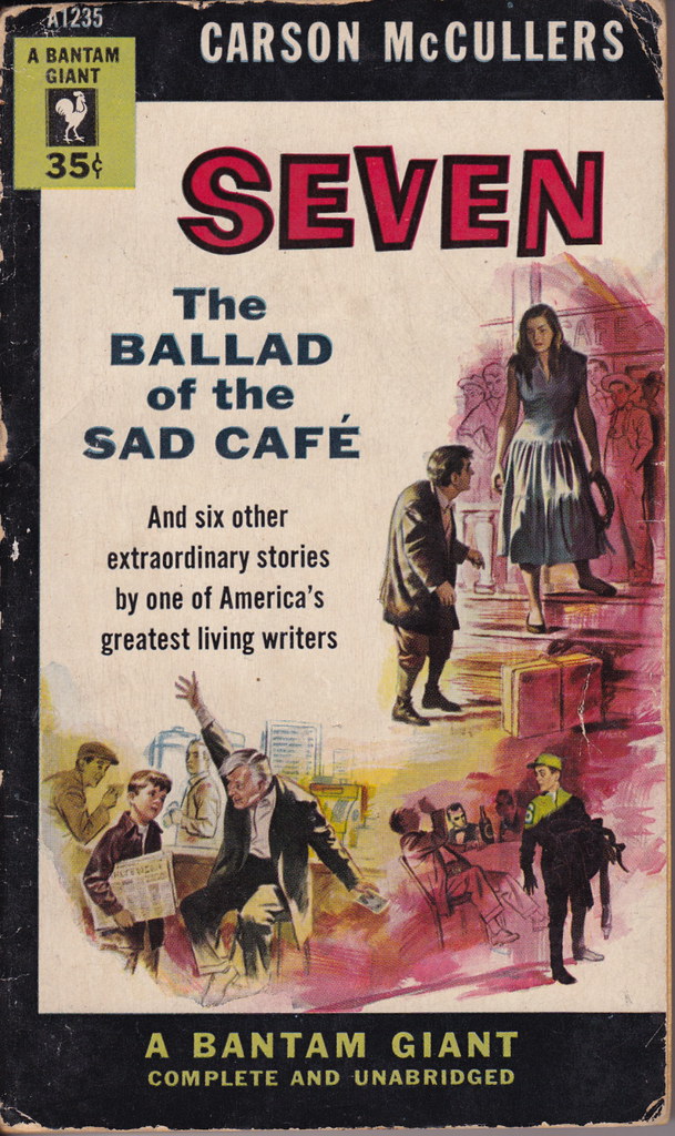
Paperback 304: Seven / Carson McCullers (Bantam Giant A1235)

Paperback 304: Bantam Giant A1235 (1st ptg — unusually, labeled "First Edition" — 1954)

Title: Seven
Author: Carson McCullers
Cover artist: Mitchell Hooks

Yours for: $9

  • ... in which an Amazon thrashes a little hunchback with a whip, a young Army private steals a heap of seatbelts from Abe Lincoln and Harry Truman, and Old Joe McGuffin asks Joey if he's ever been in a Turkish prison.
  • Never was a big fan of the multi-scene cover — too much going on, all the art gets short shrift.

  • "A fourth-dimensional quality" — so ... it's a book about time travel, then? Awesome.
  • "... the tempestuous seas of human living" — yeesh, dial it back, Cap'n Foley.
  • "Troubling of a Star" is a terrrrrrible title. Why not just call it "The Troubling Star" or "Star Trouble" or "Raiders of the Lost Ark" or something?
  • New York TIMES (!) gives us perhaps the best one-word review of a book so far: "... ABLE"; that's not a review, that's a suffix.

Page 123~

The child repeated the words, and she repeated them with unbelieving terror. "The tooth tree!"


~RP

[Follow Rex Parker on Twitter]

Monday, October 29, 2007

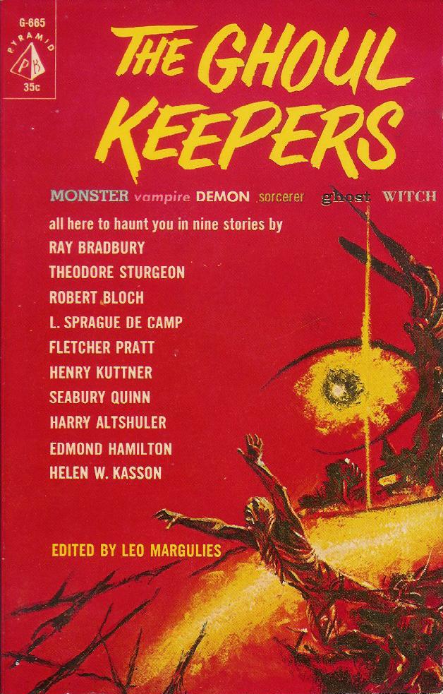
Paperback 38: Pyramid G-665

Paperback 38: Pyramid G-665 (PBO, 1961)

Title: The Ghoul Keepers
Editor: Leo Margulies
Cover artist: John Schoenherr

Yours for: $11


Best things about this cover:
  • So red
  • "I am the eye in the sky, / Looking at you -ou -ou, / I can read your mind..."
  • What kind of title is The Ghoul Keepers? Is it supposed to be a pun on "Goal Keepers?" I hope there is at least one story in here about monsters who play soccer.
  • There is nothing recognizable in this cover painting except the supremely miserable man (possibly bleeding from his eyeballs) who is about to impale himself on the spear-like branches.
  • That man is clearly damned - he has been cursed with an obscenely long thumb on his right hand ... and an exoskeleton.
  • "Seabury Quinn" is the most made-up-sounding name ever ever. Ever. Actually, it's just the "Seabury" part. Unless you are a racehorse, that is not an acceptable name.
This book is so beautiful. I wish you could see it in real life. Pristine. Unread. The kind of book collectors dream of. Several of the featured writers here are top-notch - the top three on the list, specifically. One of my students, whom I'll call Cindy Loo Hoo, is writing her Honors Thesis on short horror fiction. She will undoubtedly want to look at this book. But I am too neurotic a collector freak to let her actually read it.


Best things about this back cover:
  • Here we see the man falling in the opposite direction. And in black-&-white. How interesting.
  • I actually love the cheeky reference to "The Shadow" in the footnote.
  • Answers to the quiz:
1. Mermen
2. Sasquatch
3. a vampire (trick question)
4. Caspar
5. that quiet guy next door
6. Betty & Veronica

RP

Monday, October 15, 2007

Paperback 30: Bantam F2817

Paperback 30: Bantam F2817 (1st ptg, 1965)

Title: 13 French Science-Fiction Stories
Editor: Damon Knight
Cover artist: Uncredited

Best things about this cover:

  • I think I had a dream like this once.
  • How can so much skin be so unsexy?
  • "... when French l'amour meets science fiction" = "When French 'the love' meets science fiction" = corny and stupid.
  • "It's the story of a voluptuous naked cat-woman who shoots a rocket out of the back of her head in order to keep a horde of flying sun-angels from stealing her newspaper, and the nearly nude one-armed bald chick in diaphanous tatters who turned her back on the whole ordeal."

Best things about this back cover:

  • If the giant fonts here are to be believed, the French are known for two things: love and wackiness
  • "From the land of Zola and Maupassant ..." - like it's some exotic, far-off world. I like that they chose the authors with the most science-fictiony-sounding names. Zola was a favorite of the mid-century paperback world because he had literary credibility but was also, you know, a little dirty. His paperback popularity in the 40s and 50s is actually pretty remarkable. I have many Zola works in my collection, many of them with lurid covers. The paperback industry could make just about anyone seem like a dirty writer if it wanted to.
  • Why are the three lines in the middle of the page in different colors? Somebody really needed to keep a tighter rein on the design team here.
  • "They gave the world Jules Verne" - perhaps the weirdest claim that's ever been made about the French. "Please, take Jules Verne. We no longer have any use for him."
  • "Imaginative" spelled backwards is Evita Nigami
  • Writing "Imaginative" backwards is not terribly imaginative

RP