
Paperback 1091: Popular 445-04314 (1st, ~1977)
Title: A Hasty Bunch
Author: Robert McAlmon
Cover artist: [Uncredited]
Condition: 9
Value: $20
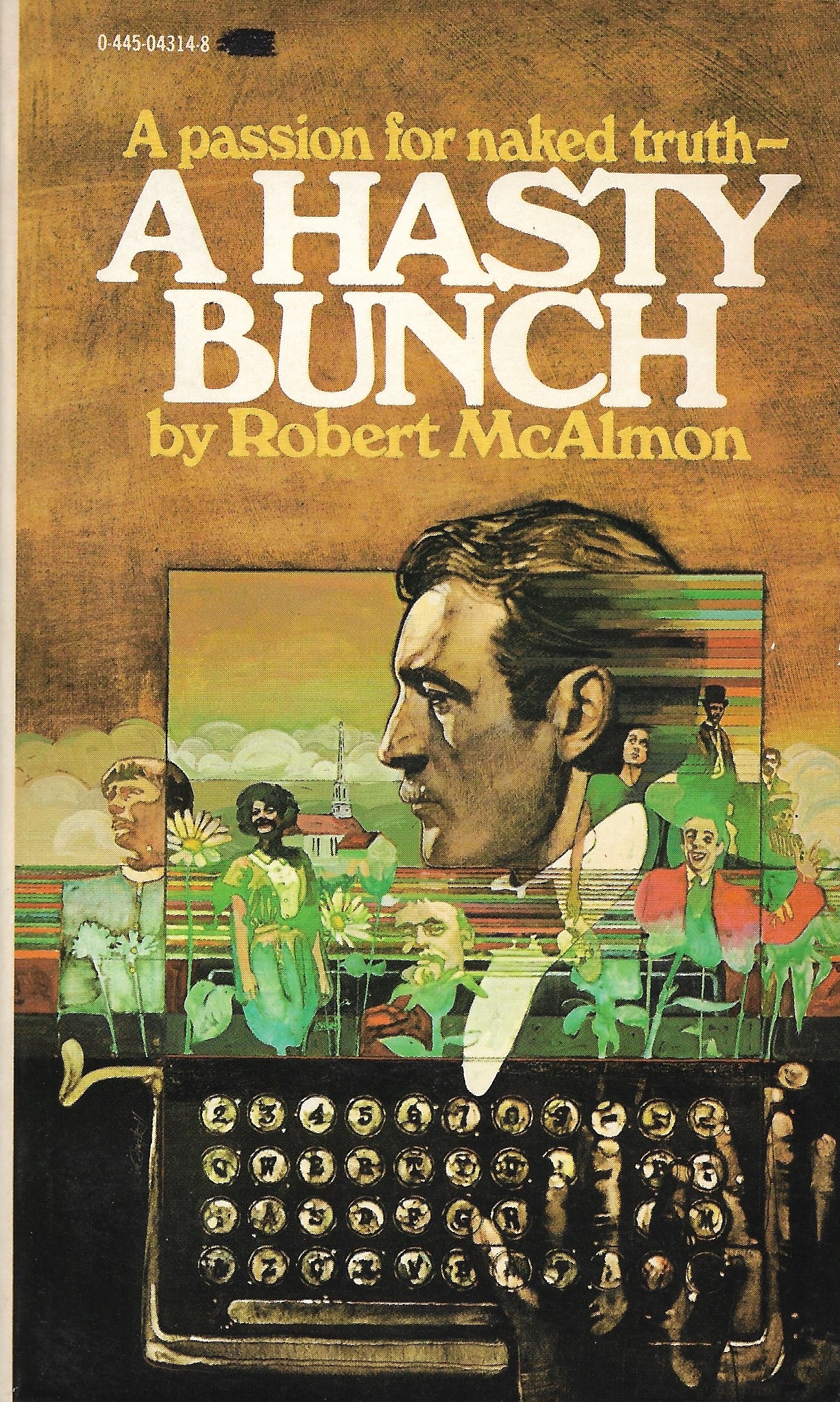
- Look, full disclosure, I have never done acid, but this is what I imagine the world looks like. Kind of a pleasant psychedelic jumble with rainbow streaks. Love the horizontal lines coming out the back of the main guy's head, and then running through the entire middle of the painting. Completely unnaturalistic and Of The Time (the '70s). My favorite figure is the guy on the far right, who looks kinda like if the Joker were a cruise director.
- The typewriter, equally great, but equally disorienting, in its own way. The keyboard makes sense to a point but somewhere east of the "F" key things start to buckle and by the time you get all the way to the right its a monstrous free-for-all. Oh, I'm not realizing that what I'm seeing is a hand hovering over the keys on the right side. Who Types Like That!?
- I got this book solely because of the cover. I didn't start out collecting anything from the '70s, but, well, time has passed (30 years next year since I started my collection), and the '70s are now fair game, especially when a book is in near-perfect condition and just sitting there on the $1 shelf.
- Sometime in the '70s, Southern Illinois UP reprinted some long out-of-print American books, and then ended up partnering with Popular Library here to release a number of them as mass-market paperbacks: their Lost American Fiction Series. This book is part of that series. There are 15 other books listed, with intriguing titles like THE PROFESSORS LIKE VODKA, CUBICAL CITY, and THEY DON'T DANCE MUCH. I am ... curious. This particular book has an afterword by writer Kay Boyle. Here's the full list of everything Southern Illinois Press brought back.
- I'm also curious about this cover artist, whom I love, and whose name I don't know. I believe he's also the artist on this early-'70s Bantam cover:
 |
[You can see the resemblance, I hope. If you know who it is, kindly holler.] |
And now the back cover...

Best things about this back cover:
- Telling it how it really is and especially "sexual candor" are always big selling points for paperbacks. Not just truth, but (as the front cover says) "naked truth." What fun is the truth if it's wearing clothes. People want stuff that's sexily truthful. Hornily honest. In a word: frank. (I wish that word were somewhere on these book covers—my favorite cover copy euphemism; been a while since I've seen it)
- This book was originally published in 1922, and even then it was barely published at all: "Reprint of a Contact Press edition privately printed by the author in Dijon, 1922."
- This books is a collection of short stories by an ex-pat who apparently hung with Hemingway and Joyce. "Prophetic genius"? That is a big claim. Let's see what p. 123 has to say:
Page 123~ (from "A Business Family")
"It doesn't do a place any good to have a person die in it. We ought to have insisted on her being taken to a sanatorium."
Mrs. Sturgeon runs the "Rest an Hour Kosher yearround hotel," and one of her guests, Mrs. Davis, has just done her the great disservice of dying in her establishment. Hugely inconvenient, the dead.
~RP


3 comments:
https://www.invaluable.com/auction-lot/allan-mardon-ny-az-born-1931-gouache-painting-167-c-a88450492a
Allan Mardon (New York, Arizona, Ontario, born 1931)
Born in Welland and raised in Sarnia, Ontario, he became a fine art painter of large-scale work with subjects relating to American myths and history including Indian battles and cavalry such as Wounded Knee.
He took his art training at the Ontario College of Art, the Edinburgh School in Scotland, and the Slade School in London. He then returned to Canada and set up a studio in Toronto from where he did free-lance illustration which became much in demand. An early job in the U.S. was with "Sports Illustrated," and he moved to Connecticut to be closer to that work. He also did illustration for "McCalls," "The Ladies Home Journal," "Redbook," "Time," and "National Geographic" as well as large corporations including Exxon and American Express. He won an award of merit from the Society of Illustrators.
After retiring in 1988 and moving to Tucson, Arizona, Mardon has found a new career in fine art dedicated to to the exploration of Native American culture, history and traditions.
Allan Mardon is a careful researcher for each painting. He is dedicated to accurately portraying the Native American experience even though he is an anglo artist. He is influenced by the work of Paul Klee and Hieronymus Bosch. His narrative pieces are often densely packed with figures, symbols, and animals painted with bright colors in a primitive style. Mardon's paintings are beautiful narratives combining myth, legend and history.
Allan Mardon is known to place a hummingbird somewhere is each of his paintings. He tells a story of one collector who called and asked him to put one in after he had purchased a painting and realized it was lacking his signature symbol.
I realise there’s a lot to get through on this cover, but I think the melting(?) surfboard being smashed to pieces by the acid rainbow lights deserves a mention. I would also have bought this for a dollar - a magnificent example of ‘70s cover art.
Re: the back cover copy, this is a also classic example of that phenomenon (especially common on ‘70s SF books) where you starting reading and think, “wow, this sounds like a crazy story, how does all this stuff fit together?” - only to suffer the disappointing realisation that you’re actually holding a book of short stories, which are all being summarised in a single paragraph.
In fact, it seems to have been standard practice in publishing during this era to try to make collections of shorts look like novels… maybe the accepted wisdom was that shorts didn’t sell, but whatever, I dunno.
It feels like an ITC font, but I can't ID it, though looking closer maybe not because of its quirks but I love it.
Post a Comment