Showing posts with label Astronaut. Show all posts

Tuesday, May 29, 2018

Paperback 1023: Children of the Void / William Dexter (Paperback Library 52-357)

Paperback 1023: Paperback Library 52-357 (PBO, 1966)

Title: Children of the Void
Author: William Dexter
Cover artist: Uncredited ("The artist is not credited, no visible signature [Jack Gaughan ?]" (isfdb)

Condition: 8/10
Estimated value: $10-12
PBLib52-357
Best things about this cover:
  • Used Spaceship Salesmen of the Void
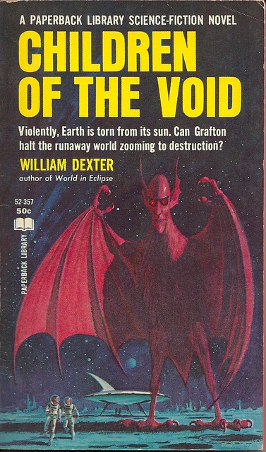
  • When the humans you're using for biceps curls suddenly get a mind of their own...
  • My favorite word on this cover is "Violently." Like, how else is an Earth going to be "torn from its sun"? "Affectionately"?
  • Grafton can't even get to his damned spaceship. How's he gonna halt a runaway world when this animatronic Chuck E. Cheese reject makes him run in terror?
  • Not at all sure they didn't mean "Children of the Noid"; the similarities are uncanny:


And now...
PBLib52-357bc
Best things about this back cover:
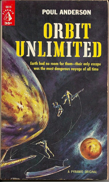
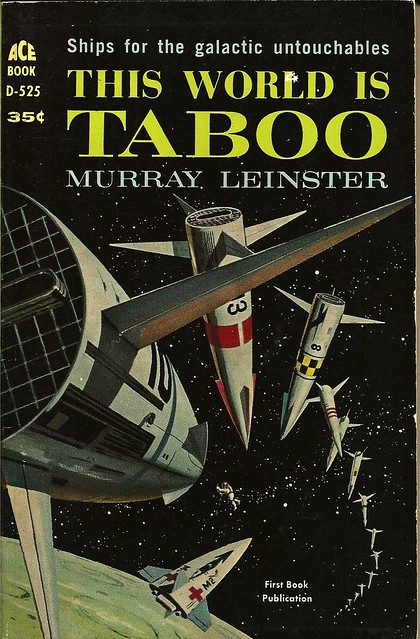
  • Wow, superdumb title replication, but super cool sketch of '60s scifi futurism. Spaceships were awesomest when they were entirely fanciful. I don't want to live in a future that isn't a mid-century future.
  • That is a particularly dull and detail-free opening paragraph.
  • Wow, Denis Grafton (!) is a recurring character? The basis of a series? He's like Chairman of the Board of Space Heroes That Time Totally and Utterly Forgot
Page 123~
But there was always something at the back of the adult mind that whispered to us that we should shun these strange creatures.
O great, a treatise on right-wing immigration policy. No thanks.

~RP

[Follow Rex Parker on Twitter and Tumblr]

Friday, May 25, 2018

Paperback 1022: Orbit Unlimited / Poul Anderson (Pyramid G615)

Paperback 1022: Pyramid G615 (PBO, 1961)

Title: Orbit Unlimited
Author: Poul Anderson
Cover artist: John Schoenherr (credited)

Condition: 8/10
Estimated value: $8-12

PyrG615
Best things about this cover:

  • Tired of orbit plans that restrict your orbiting times or charge your over-orbiting fees? Then sign up for Sprint's new Orbit Unlimited plan. Orbit any time. Here we see subscribers enjoying the Orbit Unlimited Family plan...
  • This cover is super boring. I'm kind of interested in the space surfboard, and in the rusty nose of whatever that vessel it is the astrofolk are exploring. But honestly the most interesting thing about this cover is the military surplus font and its alternate-letter coloring.
  • I still haven't read a damn thing Poul Anderson has written, despite owning what feels like dozens of his books.
PyrG615bc
Best things about this back cover:

  • Was it a trap? It's a trap! I hear it's a trap.
  • Even this premise sounds boring. They left to avoid oppression. But then they got a message: "Oppression over!" Should they believe the message? Wait, stop, why are you putting the book back on the shelf? OK, no, wait, there's seexxxxxxxx...." Shelf time unlimited.
  • "The Top-Selling American Book In Russia" is one of the weirdest promo claims I've ever seen on a book. I'm not even sure what that's supposed to signify to me.
  • 1961: Everybody's Reading "The Gadfly"! 2018: Nobody Has Heard of "The Gadfly"!


Page 123~
"We'd better plan our next moves in advance. Also, it's time for a rest and a snack."
Finally, scifi I can relate to.

~RP

[Follow Rex Parker on Twitter and Tumblr]

Wednesday, January 21, 2015

Paperback 852: The Astronaut / Hank Searls (Pocket Books 6093)

Paperback 852: Pocket Books 6093 (PBO, 1962)

Title: The Astronaut
Author: Hank Searls
Cover artist: Uncredited

Estimated value: $5-10

Donation to the collection from The Second Reader Bookshop (Buffalo, NY)

PB6093

Best things about this cover:

  • It's the touching story of a lonely Stormtrooper and his inflatable girlfriend…
  • If you're gonna fall to your death, may as well go out ogling bikini-clad blondes.
  • This must be just before he captures her and puts her in a bottle and makes her wear pajamas all day long.
  • The design here is actually spectacular. It's got that wackadoodle '60s vibe. Nice incorporation of the letter "O" into the spacesuit design. Stars in her eyes are a little cheesy / spot-on, but her little green bikini makes a nice visual impact, and the overall sun-drenchedness of the thing is a nice counterbalance to my mostly Dark cover collection.


PB6093bc

Best things about this back cover:

  • The Man Who Mistook His Wife For A Hat, Literally.
  • "You down with M.P.P.?" ("M.S. Ph.D.!")
  • Whoa, "hanky-panky at the motel"!? Tell me more. Seriously, if it happens at motels, I need to know.
  • Project Head? Really? No one batted an eyelash at that? OK, then, '60s, carry on …


Page 123~

Straight in front of him were the retro-rocket controls, welded immovably in place so that the chimp could not override ground control.

Chimps? It's got chimps? Talk about burying the lede…

~RP

P.S. Many thanks to John from The Second Reader Bookshop in Buffalo, NY, who reads my crossword blog and responded to my fund-raising drive there with a donation of books for here. Two more coming later this week.

P.P.S. John also sent me this postcard, which … well, if you all won't appreciate it, I don't know who will:

LUBERACK
[Miss Lube Rack]

[Follow Rex Parker on Twitter and Tumblr]

Friday, November 21, 2014

Paperback 833: The Door Through Space / Marion Zimmer Bradley // Rendezvous on a Lost World / A. Bertram Chandler (Ace F-117)

Paperback 833: Ace Double F-117 (PBO / PBO 1961)

Titles: The Door Through Space / Rendezvous on a Lost World
Authors: Marion Zimmer Bradley / A. Bertram Chandler
Cover artist: Ed Emshwiller / Ed Emshwiller

Estimated value: $10-15

AceF117

Best things about this cover:

  • "40 Demons!?" "No, 4-D Demons!" "…?"
  • Even the giantest Fear Hand could not protect the galaxy's skinniest spaceship from the flamboyant-yet-savage robot birds!
  • *That's* your "Door Through Space"? Looks more like "Archway To Pool Party."
  • Emshwiller's covers are awesome to look at. He likes to include all this random ornate decoration and machinery. Here, I particularly admire the oil rig/water slide/clock tower gizmo in the lower right. The people in the party seem to dig it, too. Maybe it is their god.


AceF117bc

Best things about this other cover:
  • Damn Ikea ceiling fans! Come on!
  • #LostWorldProblems
  • Imaginary space suits are So Much Cooler than real ones. I think I found my next Halloween costume.
  • I did not know the word "cybernetic" (or "cyber-" anything) went this far back.

Page 123~

It cannot possibly have produced the illusion of two figures, Captain and Captain's lady—and which Veronica was it?—walking, arm in arm, up the ramp to the yelllow-lit circle of the airlock. And the most impossible illusion of all, perhaps, was that of the man who stood there to greet them. I saw his face plainly as I approached, just before the odd scene winked out into nothingness.

It was my own.

End of story! Whoa, did not see that coming. P.S. spoiler alert. P.P.S. "Which Veronica Was It?" is a scifi Archie story waiting to happen.

~RP

[Follow Rex Parker on Twitter and Tumblr]

Saturday, April 26, 2014

Paperback 768: Star Science Fiction Stories No. 2 / ed. Frederik Pohl (Ballantine 612)

Paperback 768: Ballantine Books (2nd ptg, 1962) (isfdb entry)

Title: Star Science Fiction Stories No. 2
Editor: Frederik Pohl
Cover artist: [Richard Powers]

Yours for: $10

BB612

Best things about this cover:
  • Beard.
  • Seriously, beard. How often do you see beard? Not too often.
  • I'm disturbed by his lack of hands. I guess they're inside those little spheres, but it looks like they've replace one of his hand with a giant hypodermic.
  • Not the most scintillating cover art, but I do love Powers's fever-dream space shapes and colors.

BB612bc

Best things about this back cover:
  • Rocket! Or jet gull! Probably rocket!
  • Again, I love when books explain the basics of publishing to you. "We find good stories … and then we publish them!"
  • Weird to brag about being an "original publication" and claim that the stories "appear here for the first time" when this is a reprint of the real original, published in 1953.

Page 123~ (from "Conquest" by Anthony Boucher)

"I fly with my synapses, if that's the word I want, and sometimes I guess they don't apse."

I see APSE a lot in crosswords. Never quite like that, though.

~RP

[Follow Rex Parker on Twitter and Tumblr]

Friday, April 25, 2014

Paperback 767: This World Is Taboo / Murray Leinster (Ace D-525)

Paperback 767: Ace D-525 (PBO, 1961)

Title: This World Is Taboo
Author: Murray Leinster
Cover artist: [Ed Valigursky]

AceD525

Best thing about this cover:

  • This world is taboo … hence the looooong line to get in.
  • I really do love mid-century rocket design. Why does the future-past / past-future always look so much more awesome than the present?!
  • I have no idea what I'm looking at here, but I feel like things are not going well for the wee man at the center of it all.


AceD525bc

Best things about this back cover:

  • That's a pretty mean thing to say about Dara. I'm sure she's lovely.
  • I dara you to land on Dara.
  • There is something so odd about "dodge" —not the word I expect … plus it's all orphaned there at the bottom. Word choice and layout matter.
  • I want a t-shirt with that blue circle design on it. Not even kidding.


Page 123~

The admiral said through stiff lips, "I'll blast—"

I don't know what the admiral's doing, but it sounds kinda taboo.

~RP

[Follow Rex Parker on Twitter and Tumblr]

Saturday, March 23, 2013

Paperback 623: Alien Planet / Fletcher Pratt (Ace F-257)

Paperback 623: Ace F-257 (1st ptg, 1964)

Title: Alien Planet
Author: Fletcher Pratt
Cover artist: Ed Emshwiller

Yours for: $11

AceF257

Best things about this cover:
  • In many ways, a rather generic scifi title / cover (I mean, come on, Alien Planet? That's the best you can do?). But all of this intricate techno-organic Rube Goldberg-esque machinery is gorgeous. There's man, there's monster, and then there's the in-between—which I'm gonna call the "Psychotic Fish Rollercoaster."
  • Also love the design on the dude's spacesuit. It's ornate, clean, and confectionary. I wanna lick him real bad.
  • That monster thingie is super-creepy if you really look at it. Looks like generic "alien" until you notice the humanoid features; that's what makes it really nightmarish. The face. The opposable thumbs. All floating in their own haze of stink. Good stuff.

AceF257bc

Best things about this back cover:
  • Humanish hands harder to see here. Also, this thing's a lot less scary out of context. 
  • Apparently this is a "classic novel." I checked the original publication date. 1932.
  • I would've sworn "Murashema" had to be based on "Hiroshima," but the original publication date suggests not. Too early for that name to be very evocative in the west. 

Page 123~

The big man gave a heave that threw me on my side. I clutched him desperately, but at that moment the prisoner won free, snatched up the javelin and calmly and accurately plunged it into the throat of the man who was now trying to down me.

If unintended sexual subtext is your thing (you know, plunging "javelins" into throats and what not), this is your book. "I shifted position to bring the big man under me," etc. etc.

~RP

[Follow Rex Parker on Twitter and Tumblr]