Title: This World Is Taboo
Author: Murray Leinster
Cover artist: [Ed Valigursky]

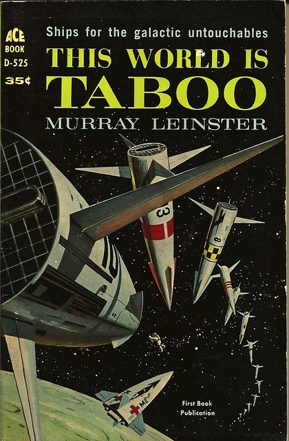
Best thing about this cover:
- This world is taboo … hence the looooong line to get in.
- I really do love mid-century rocket design. Why does the future-past / past-future always look so much more awesome than the present?!
- I have no idea what I'm looking at here, but I feel like things are not going well for the wee man at the center of it all.

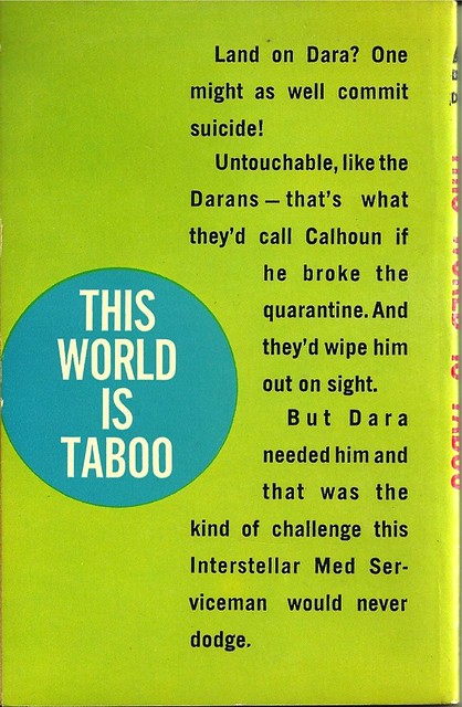
Best things about this back cover:
- That's a pretty mean thing to say about Dara. I'm sure she's lovely.
- I dara you to land on Dara.
- There is something so odd about "dodge" —not the word I expect … plus it's all orphaned there at the bottom. Word choice and layout matter.
- I want a t-shirt with that blue circle design on it. Not even kidding.
Page 123~
The admiral said through stiff lips, "I'll blast—"
I don't know what the admiral's doing, but it sounds kinda taboo.
~RP
[Follow Rex Parker on Twitter and Tumblr]


3 comments:
But what the heck does that line of text at the top mean? "Ships for the galactic untouchables"? Doesn't really tell us much.
Cover looks like Ed Valigursky.
http://www.munchkinpress.com/cpg149/displayimage.php?album=110&pos=168
It's Valigursky. ISFDB cites the ACE Image Library. You definitely need to add isfdb.org to your list of resources for your SF covers. They don't always know, but this is the second time in a couple of months that they've had a definitive answer.
Leinster's Med Ship stories are pretty good. If I remember this one correctly, that long line isn't ships waiting to land, it's nuclear warheads waiting to drop if the Darans get out of line. They look pretty menacing, though I'm not sure why they all have different markings.
Post a Comment