Showing posts with label A.A. Fair. Show all posts

Friday, July 19, 2019

Paperback 1052: Gold Comes in Bricks / A.A. Fair (Erle Stanley Gardner) (Dell 84)

Paperback 1052: Dell 84 (1st ptg, 1945)

Title: Gold Comes in Bricks
Author: A.A. Fair (pseud. of Erle Stanley Gardner)
Cover artist: Gerald Gregg

Condition: 5/10
Estimated value: $15

Dell84
Best things about this cover:
  • Gold comes in testicles
  • It looks like honey, and if you gotta go, I say asphyxiated by honey is the way!
  • Really love the early Dell covers, which had no pretensions to realism. Much more interested in evoking feeling with shape and color than in getting the perspective or anatomy right
  • Check out the jaunty cursive on the author's name. The early pb was the wild west, from a design perspective. Everyone still experimenting, going nuts.
  • This is the Platonic ideal of the "Reading Copy." Beat to hell, but still tight and complete and unfragile. They don't make 'em like they used to!


Dell84bc
Best things about this back cover:
  • Mapback!
  • Uh ... this could be more interesting. Two nondescript hotel rooms! Thrill to the architectural possibilities!
  • LOL "Corridor," thanks, map
Page 123~
The machine shops had moved. The office stood deserted. There was an air of funereal despair about the town. Those who were left went dejectedly about their business, moving with the listless lassitude of persons who have lost their chance at winning big stakes and are plugging away simply because they can't figure out how to quit.
Ouch. I feel seen. And accused.

~RP

[Follow Rex Parker on Twitter and Tumblr]

Friday, July 8, 2016

Paperback 960: Bedrooms Have Windows / A. A. Fair (Erle Stanley Gardner) (Dell 0511)

Paperback 960: Dell 0511 (1st New Dell ed., 1963)

Title: Bedrooms Have Windows
Author: A. A. Fair (Erle Stanley Gardner)
Cover artist: Darryl Greene

Estimated value: $15-20
Condition: 10/10 (a time-travel kind of copy, like it's 1963 again; unread, square, shiny, bright blue page edges, ridiculous)

Dell0511
Best things about this cover:
  • She looks worried. Maybe she needs Yet Another Cigarette.
  • How big is her bed? The headboard appears to start in the far corner of the room. Is her room just one big bed? That's pretty cool.
  • This cover is exquisitely balanced and demonstrates a nice attention to detail. I'm somehow transfixed by the latches, like miniature sentries at the bottom of the sill.
  • Gauzy curtain, also lovely. And that tension between the tightly enclosed, highly segmented left half of the window and the dramatic, animated, border-bursting right half—love it.

Dell0511bc
Best things about this back cover:
  • Ooh, close-up. Normally I don't like recycled back covers, but this one makes nice use of that window gridding, covering the horizontally-lined left pane with horizontal lines of text, while leaving the right half airy and open.
  • God bless Dell for *clearly crediting* cover artists more than most other publishers.
  • I've written about this book before, in an earlier (1952) edition. Here's the cover:

And the write-up (Paperback 211!)

Page 123~

The taffy-haired blonde who was standing in front of the mirror, surveying her partially clothed figure with quite evident approval, was the girl who had picked me up the night before as her escort, and had taken me to the motor court. 

Aw, how quaint. "Motor court." You can do all kinds of illicit things in a "motor court" and still feel pretty good about yourself. It's positively Arthurian. "Casual sex, m'lady?"

~RP

[Follow Rex Parker on Twitter and Tumblr]

Thursday, July 7, 2016

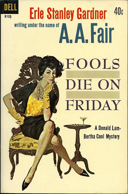
Paperback 959: Fools Die on Friday / A.A. Fair (Erle Stanley Gardner)

Paperback 959: Dell R105 (1st thus, 1961)

Title: Fools Die on Friday
Author: A.A. Fair (Erle Stanley Gardner)
Cover artist: Bob McGinnis

Estimated value: $10-15
Condition: 9+/10

DellR105
Best things about this cover:
  • It appears that either I hit some perfectly preserved AA Fair / Erle Stanley Gardner motherlode at some point in my collecting journeys, or someone sent me box of same. These books are exceedingly common, but no less glorious, art-wise. And in this condition, mwah!
  • I love McGinnis's work, though I don't always share his, uh, aesthetic. There's often an icy, angular quality to his women, and the hair, dear lord, the hair. There be dragons.
  • The shoes, though. The shoes. Gotta be the shoes.
  • All covers are improved by martini.

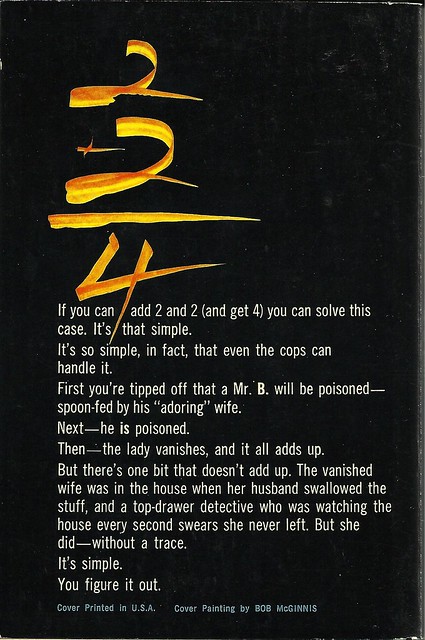
DellR105bc
Best things about this back cover:
  • Math!
  • Crazy calligraphic math!
  • This back cover does nothing to convey how charming the Lam/Cool mysteries are.

Page 123~

She pushed back her stenographic chair, walked over to a shelf, whipped out a map, and placed it on the counter.

OK, I don't know who she is, but I'm in love.

~RP

[Follow Rex Parker on Twitter and Tumblr]

Monday, July 4, 2016

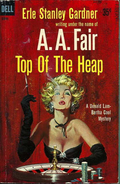
Paperback 958: Top of the Heap / A. A. Fair (Erle Stanley Gardner) (Dell D309)

Paperback 958: Dell D309 (1st thus, 1959)

Title: Top of the Heap
Author: A.A. Fair (Erle Stanley Gardner)
Cover artist: Robert McGinnis

Estimated value: $8-10
Condition: 8/10

DellD309
Best things about this cover:
  • Well, *not* the hair. That's some full-on Cruella Deville nonsense.
  • If you stare at her boobs (and why not?) it's like you're looking at a very fancy black cat waiting to pounce on the spinning ball.
  • I've seen some opera gloves in my time, but those are the operaiest.

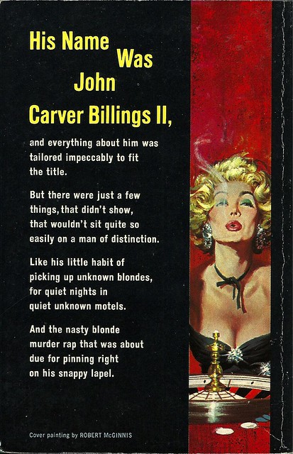
DellD309bc
Best things about this back cover:
  • Oh, there she is again.
  • "Was" ... and the reason we dropped the "Was" was ...?
  • Is this a poem. This feels like a poem. I mean ... it's not Roethke, but it's OK.

Page 123~

"How was the money secured for the development work?"

I swear to you that that is the most exciting line on this horribly boring page. It was that or "Something about the name appealed to the investing public." Or, "Permission was given to sell the stock at par value zzzzzzzz..." etc.

~RP

[Follow Rex Parker on Twitter and Tumblr]

Thursday, June 23, 2016

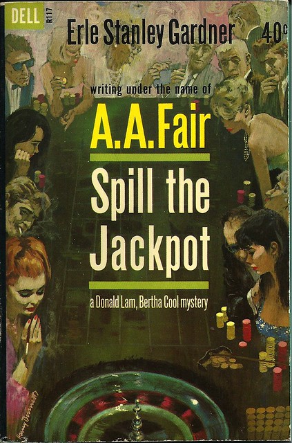
Paperback 953: Spill the Jackpot / A.A. Fair (Dell R117)

Paperback 953: Dell R117 (1st thus, 1962)

Title: Spill the Jackpot
Author: A.A. Fair (Erle Stanley Gardner)
Cover artist: Harry Bennett

Estimated value: $10-15
Condition: 9.5/10

DellR117
Best things about this cover:
  • So. Great. It's like a rogue's gallery of hot and shady '60s people.
  • Redhead's cigarette is freaking me out. Like some sixth finger that got horribly bent backwards.
  • Just genius to use the margins of the cover this way. The encroachment of text, to the point of total visual dominance, is of course one of the most lamentable trends in paperback history. This cover responds to that trend not by shrinking the art (which often happened) but by incorporating the text into the art, making the margins the place of real action. It's superior cover design.

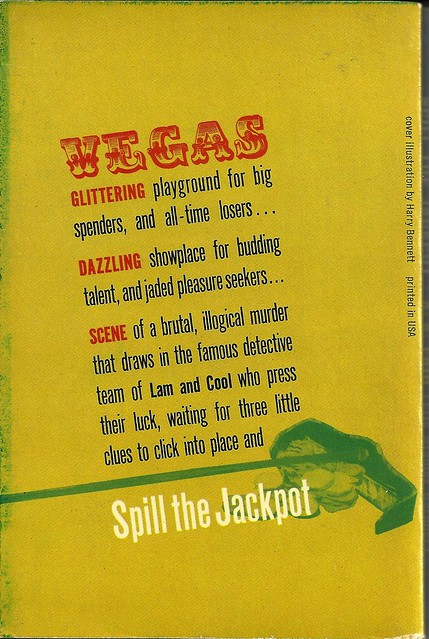
DellR117bc
Best things about this back cover:
  • Man, that "VEGAS" font is god-awful—totally out of sync, period-wise, with the cool-modern front cover.
  • Oh wow, that's a rake. I had to look at that visual element very closely to figure that out. This back cover is the Bizarro version of the front cover, i.e. it's Terribly designed.
  • "Jaded pleasure seekers"! I relate to these people. JPS4LIFE!

Page 123~

Somehow, looking at her, you felt she hadn't been to bed and that she wasn't accustomed to going to sleep before daylight.

Coincidentally, Vampire Weekend was playing on the radio when I typed this out.

~RP

P.S. I found this immaculate Detective Book Club offer card sleeping safely in the pages of this book.


[Follow Rex Parker on Twitter and Tumblr]
Sunday, March 20, 2016

Paperback 929: You Can Die Laughing / A. A. Fair (Pocket Books 45004)

Paperback 929: Pocket Books 45004 (2nd ptg, 1964)

Title: You Can Die Laughing
Author: A.A. Fair (Erle Stanley Gardner)
Cover artist: photo cover

Estimated value: $5-10

pB45004
Best things about this cover:
  • Yeah, well you can go *$&%^ yourself with this terrible cover, Pocket Books.
  • Fully painted covers cost money. This ... doesn't.
  • What the hell kind of mask is that? It doesn't even make sense as a decorative mask, as it's ugly as hell. Honestly, I think this "concept" came together in like 30 seconds. Nothing about it makes sense. It is not funny, or creepy, or anything. It is a non-cover. I'm mad at myself for buying this, for any amount of money.

pB45004bc
Best things about this back cover:
  • Hey there, exclamation point. How you doin'...? You've, uh .... filled out since last I saw you.
  • "A figure like one of the babes in the comic strips!" That is a new frame of reference. "Mmm, I really dig her comical proportions and two-dimensionality." 
  • Gender-coded font colors! This has been: Great Moments in Reactionary Design ...

Page 123~

Bertha's temper visibly began to rise. "There are times when I could take this paper knife and cut your throat from ear to ear, Donald Lam! What the hell do you mean you rented her?"

Not sure a knife made of paper is going to do much, Bertha. Just punch him in the face. No one will mind.

~RP

[Follow Rex Parker on Twitter and Tumblr]
Wednesday, December 31, 2014

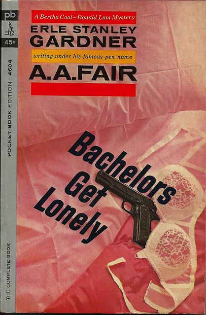
Paperback 846: Bachelors Get Lonely / Erle Stanley Gardner (Pocket Books 4604)

Paperback 846: Pocket Books 4604 (1st ptg, 1963)

Title: Bachelors Get Lonely
Author: A.A. Fair (Erle Stanley Gardner)
Cover artist: photo cover

Estimated value: $10-15

PB4604

Best things about this cover:

  • I can confirm the basic premise of this title.
  • I find this cover oddly sexy, if wildly implausible.
  • Pink. I dig it. At least it's different.


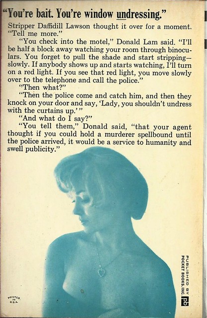
PB4604bc

Best things about this back cover:

  • You had me at "Stripper Daffidill (sic!?) Lawson"
  • What an odd photo choice. Random stock photo, faded and blued.
  • Lam's pretty light-hearted for someone trying to catch a murderous voyeur.
  • "Swell."


Page 123~

"The walls are terribly thin," she whispered. "People will know that … that I'm having a visitor."

~RP

[Follow Rex Parker on Twitter and Tumblr]
Friday, May 31, 2013

Paperback 647: Bats Fly at Dusk / A. A. Fair (Erle Stanley Gardner) (Dell 0476)

Paperback 647: Dell 0476 (1st New Dell ed., 1963)

Title: Bats Fly at Dusk
Author: A.A. Fair (aka Erle Stanley Gardner)
Cover artist: Ron Lesser

Yours for: $7

Dell0476

Best things about this cover:
  • Just woke up, or the latest style? Who can say?
  • Bats Fly at Dusk ... Ladies Strip at Dawn.
  • This cover has neither enough skin nor enough context to be interesting. 
  • I know this will sound heretical, but I think the dress would be sexier *on* her.
  • This book is close to immaculate. I just found a box full of (primarily) Gardner/Fair stuff. A reader graciously shipped it to me a while back, and I looked at its treasure, then set it aside, and forgot about it. So it's vintage paperback Christmas all over again.

Dell0476bc

Best things about this back cover:
  • Is she standing in front of the silhouette of  ... a badge? A vase? A strawberry?
  • I like how he's not sure about the age, but he's got the pounds down to a very precise number.
  • Every time I pick up a Cool/Lam book, I say to myself, "Man, I really gotta read some of these again." And then other books intervene.

Page 123~

"I told Miss Jackson that if she wanted to stay on in the place alone the raise in rent wouldn't be effective. Miss Jackson really seems like a nice sort, exactly the type I like for tenants."

I'm a little worried for Miss Jackson.

~RP

Wednesday, June 13, 2012

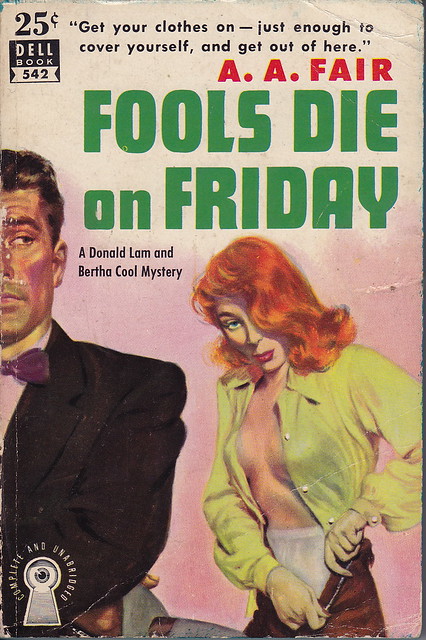
Paperback 537: Fools Die on Friday / A. A. Fair (Dell 542)

Paperback 537: Dell 542 (1st ptg, 1951)

Title: Fools Die on Friday
Author: A.A. Fair (aka Erle Stanley Gardner)
Cover artist: Robert Stanley

Yours for: not for sale (donation to the collection), but FYI, it's prolly worth about $30

Dell542.FoolsFri_0001
Best things about this cover:
  • Reader K. Harvey was helping clean out the house of a friend's aunt and she came across a treasure trove of old paperbacks. She offered to send them to me. I accepted. So a couple days ago I got a box crammed full of Fair/Gardner books (as well as some Leslie Charteris / "Saint" stuff), all of which are in good-to-great condition. There must be 35-40 books in all. A generous donation, from which we will all benefit—I'll try to post all the covers here, sometimes 2 or 3 at a time (to highlight certain stylistic trends) over the course of the summer, while still moving steadily through my collection (don't want to overdose on Gardner). 
  • I lead with this cover because it is legendary. Future editions of this book will button her shirt and hide her panties, making her look far more elegant, far less slatternly. I.e. yawn. Behold:
  • "... just enough to cover yourself ..." Well, I guess she's ready then.
  • I love old half-face there on the left. In particular, his tie. And his eyes. He's doing that "I can magically see behind me" thing that people on paperback covers and in soap operas sometimes do. He looks like every man Robert Stanley ever drew, i.e. like Mike Shayne.
  • If it weren't for the boobs, I'd have to say "cross-dresser."


Dell542bc.FoolsFri

Best things about this back cover:
  • Mapback!
  • "Real clues" — none of the fake stuff for us, thanks.
  • BALLWIN looks allllll kinds of wrong.
  • Love the building cutaway—like a giant just tore the top half of the apartment off.

Page 123~

She pushed back her stenographic chair, walked over to a shelf, whipped out a map, and placed it on the counter.

I am slightly in love with the phrase "stenographic chair," which I did not realize until just now was a thing.

~RP

[Follow Rex Parker on Twitter and Tumblr]
Monday, January 2, 2012

The P. Morrison Donations #6: Beware the Curves / Erle Stanley Gardner (Pocket Books 75598)

The P. Morrison Donations #6

Title: Beware the Curves
Author: Erle Stanley Gardner ("writing under his famous pen name A.A. Fair")
Cover artist: Well, hello there ... aren't *you* a tall drink of water ...


PB75598.Curves

Best things about this cover:
  • Sometime in the mid-60s, the quality of pb covers started to go downhill—art gave up its real estate to text, usually the author's NAME or a detective's NAME. Cover paintings get smaller and then eventually disappear, leaving only stock photos behind.
  • This cover is designed to do one thing: make you wonder "is that her nipple showing through the lacy dress, or just a shadow...?"
  • Gardner was exceedingly prolific and, in part because of that prolificness, artistically underrated. He writes a good story, and I prefer these Lam and Cool detective stories (for which he used the pseudonym "A.A. Fair") to anything else he did.

PB75598bc.Curves
Best things about this back cover:
  • What design! ... is what I'd say if I were looking at a different book. As I say, the '60s bring about the slow uglification of paperbacks until we're left with ... this.

Page 123~
She pursed her lips. "I can usually size up character," she said. "And if I can't, well, if anyone gives me a double cross, Donald, I'm ruthless, absolutely, utterly ruthless."

"Most women are," I told her, "but few of them admit it."
"Dames," he added with a shrug. "Whaddyagonnado? ... Seriously, what do I do? They keep walking away from me every time I try to talk to them. Ruthless bitches, why won't you talk to me!?"

~RP

[Follow Rex Parker on Twitter and Tumblr]
Monday, September 26, 2011

Paperback 459: Spill the Jackpot / A.A. Fair (Dell 109)

Paperback 459: Dell 109 (1st ptg, 1946)

Title: Spill the Jackpot
Author: A.A. Fair (Erle Stanley Gardner)
Cover artist: George A. Frederiksen

Yours for: $21


dell109spilljackpot
Best things about this cover:
  • When slot machines get drunk (Xs for eyes, dead giveaway), they barf blood and skulls. True fact.
  • This is a fantastic example of the bright, vivid, more abstract covers that Dell tended to feature in its early years. You don't really get the saucy, realistic, Great Girl Art covers until about 1948.


dell109bc.spilljack_0001

Best things about this back cover:
  • Wow, no wonder people gamble. You can practically feel the monotony coming off the page.
  • Is Hotel Sal Sagev a real place? 'Cause that's some painfully unimaginative naming. Diputs!
  • "Boulder? Sure ... just go down Fremont here past Eighth and then it's just another 775 miles. You can't miss it."

Page 123~

Abruptly he turned and smiled at Bertha. "So sorry, Mrs. Cool, I interfered with you so early in the morning. Try and overlook it. If you people can learn to accept these interruptions philosophically, it's going to be a lot easier on you."

If you are a chronic interrupter, I suggest you memorize that last line. The key to being a dick effectively is: you must go all in.

~RP

[Follow Rex Parker on Twitter and Tumblr]
Wednesday, March 31, 2010

57 Books from the University Book Sale: Book 56

Actually, I have no idea what the last two books are from the Book Sale. They appear to have sort of blended in with the rest of the collection. So the last two books will just be ones I can't place, not yet officially in The Collection — stuff that *could* have come from the Book Sale. Enjoy.

Title: Some Slips Don't Show (Pocket Books 6095, 1st ptg, 1961)
Author: A.A. Fair (aka Erle Stanley Gardner)
Cover artist: Harry Bennett

Yours for: $8

  • Expression on that guy's face is Nightmarish. That chair, however, is pure '60s gold, as is the Jackie-O style of Miss Primping there. I love the mysterious inscription over Dean Martin's ugly cousin's head: "Amy." It's as if he's thinking, "Amy, I'm sorry I barfed on your other dress."
  • I believe this painting represents the seated drunk green guy's perspective. He's so sloshed that the objects of his ogling have huge, sickly, sweeping motion lines. Throwing back her hair creates a Pollockesque swoosh. Kind of looks like the number "9."
  • On second, or third, glance, I believe that that is not a chair he's sitting in, but a hovercraft. He's reminding more and more of that Martian from the "Flintstones" every time I look at him.
  • Seriously? You decide to reprise an image from the front cover and you choose *him*!? "Hey, [hic!], look at me! I'm flying through your doorways! Lady!"
  • I'm not sure I get the joke? Is she naked under clothes? Is her slip really showing? Is there a pun on "slip," so that I'm supposed to understand that she's made an error of some sort. Is "slip" some horrible anatomical code word? Only the racially ambiguous drunk alien knows.

Page 123~

"And furthermore," I told her, "don't hand me that line about what I owe you. I don't owe you a damned thing!"

He's short, but Donald Lam can talk down to the ladies like nobody's business (I actually really like the Cool + Lam books by "Fair")

~RP

[Follow Rex Parker on Twitter]

Sunday, September 27, 2009

Paperback 293: Give 'Em the Ax / A. A. Fair (Dell 389)

Paperback 293: Dell 389 (1st ptg, ca. 1952)

Title: Give 'Em the Ax
Author: A. A. Fair (Erle Stanley Gardner)
Cover artist: uncredited

Yours for: $22

Just received this book in the mail as a gift from a generous reader, C. Cope of Weatherford, TX. I already own it, but am psyched because now I have a copy to read. I'll get right on it, right after I finish rereading "The Long Goodbye" for the umpteenth time (teaching it this week). The copy offered here is from my original collection.


Best things about this cover:

  • Gams. Heels, hosiery seams ... the works.
  • World's shallowest bathtub.
  • Where is the ax that she gave him? I wish I could see it.
  • What kind of skirt is that? Looks like a pelt of some kind.
  • They killed Big Bird to make that bath mat.
  • I love the horrid realism of that guy's face folds.

Best things about this back cover:
  • Mapback! Always awesome.
  • When I open a gin joint, it will be called "Rimley's Rendezvous." Actually, scratch that. Too many syllables, a little too French. Still, it's colorful.
  • This is like some architect's sketch pad — an architect preparing to enter a "Best Rectangular Shape-Drawing" contest.
  • Love love love the bungalow-style old skool motel. Motels are the bestest of all crime novel settings.

Page 123~

Bertha's jaw was pressed forward like the prow of a battleship. "What's your proposition?" she said ominously.


If you've ever read a Lam & Cool mystery, then you know Bertha Cool is not to be @#$#ed with. She's ... imposing. 165 lbs and "hard as barbed wire." I really like Gardner's Lam/Cool stuff. Perry Mason, not so much, though, to be fair, I haven't read a Mason novel in a long, long time. Maybe it would hold my interest better now.

~RP

Thursday, March 26, 2009

Paperback 211: Bedrooms Have Windows / A. A. Fair (Dell 603)

Paperback 211: Dell 603 (1st ptg, 1952)

Title: Bedrooms Have Windows
Author: A. A. Fair (pen name of Erle Stanley Gardner)
Cover artist: Mike Ludlow

Yours for: $8


Best things about this cover:

  • "Bedrooms Have Windows" - they sure do. And Blondes Have Mirrors and Peeping Toms Have Trenchcoats.
  • That is the see-throughiest blouse I've ever seen anywhere.
  • I've always loved that Dell keyhole eye logo.
  • I also love the yellow cloth on her ... what do you call that piece of furniture? A vanity!
  • Black bra = trouble. I saw "Psycho." I know.

Best things about this back cover:

  • Arrows, Ha ha
  • "They laugh alike, they walk alike, at times they even talk alike ..."
  • Boy, they sure know how to make an author look exciting.
  • "Pocket-edition Venus" - that's hot.
  • Lam and Cool mysteries are great, and ESG wrote them all (I think) under the A.A. Fair name. Lam and Cool are the Jack Sprat + wife of mystery stories (only they aren't married).

Page 123~

The taffy-haired blonde who was standing in front of the mirror, surveying her partially clothed figure with quite evident approval, was the girl who had picked me up the night before as her escort, and had taken me to the motor court.

~RP