Title: The Raft
Author: Robert Trumbull
Cover artist: George Frederiksen
Back cover artist: Gerald Gregg
Condition: 6.5/10
Estimated value: $10

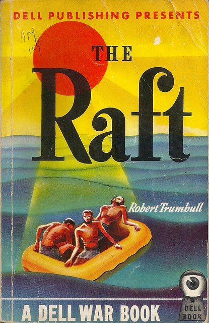
- Everything above the author's name seems very pleasant. Serene, even. Perhaps, as your eyes move down the page, you can even maintain the illusion that these fellows are just out for a weekend jaunt of fun & sun. But that "DELL WAR BOOK" (a kind of book I can't remember seeing before) drives the more dire context home pretty thoroughly.
- I like early Dell covers, and early covers in general, which are far more tied to abstract expressionism than later, more naturalistic covers (which I also love, obviously)
- I also like the early Dell EYEBALL IN THE KEYHOLE logo. "You don't read Dell Books, Dell Books read you!"

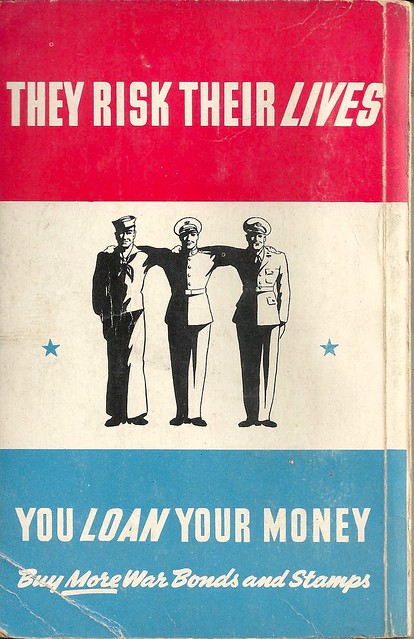
- What is happening here? Why are they spaced so far apart? Why have their arms fused together? Does the dude in the middle need propping up? Is this some kind of Weekend at Bernie's situation?
- The italicizing concept here is ill-conceived. I know alliteration has its charms, but choose parallel construction every time.
- War bond ads appeared inside early paperbacks with a great deal of regularity. On the outside of early paperbacks?? Far less so.
He seemed more interested in the boat than in his natural prey.
[Follow Rex Parker on Twitter and Tumblr]


5 comments:
Well obviously, if the men on the back were more closely spaced, people might think they were *cough* gay. And we can't have that!
(I can't work out what's going on with their arms. Perhaps it's some kind of horrific war injury?)
I've read this book (got it from Scholastic in the 5th grade over 40 years ago) and I had no idea it was written so early. They were actually writing books about WWII during the war. There's a scene early on where the characters are escaping from a sinking submarine that has stuck with me over the decades.
Also what vintagehoarder said about the back cover. I was going to say something about them getting ready to go into an MGM dance number, but their proportions just seem off.
Never get tired of the eye in the keyhole!
Keyhole Eye is one of the greatest logos in commercial history
I don't like the Keyhole Eye. It always makes me picture really putting my eye up that near to a keyhole, and that feels uncomfortable.
Post a Comment