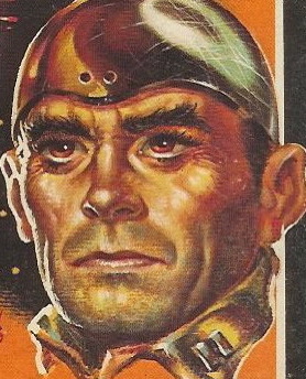
Title: Meet Me at the Morgue
Author: John Ross Macdonald
Cover artist: Victor Kalen (sic! — it's Victor Kalin)
Yours for: $13
Best things about this cover:
- Too much hiding.
- I'll give the font one thing—it's unusual. Not sexy. Not scary. Not pretty. But unusual.
- One of the redder books I own.
- I feel like Victor Kalin is cheating here: "I got this sketch ... it's kinda finished ... just throw some red over it."
- If the red weren't translucent, the gender of the person behind the curtain would be Way more ambiguous.
- This is one of the many names Ross Macdonald had before he settled on Ross Macdonald. His real name was Kenneth Millar.
- This edition came out the year Chandler died (the 54th anniversary of Chandler's death was yesterday—his 125th birthday is later this year).
Best things about this back cover:
- Hey, more cursive—bit more grown-up this time.
- Red Carbuncle, the lovable drunken angry clown!
Page 123~
"Damn my eyes!" He struck himself sharply on the scalp with his clenched fist, but in such a way as not to disturb the part.
'Cause that's how he rebooted his eyes when they froze up.
~RP
[Follow Rex Parker on Twitter and Tumblr]


5 comments:
The blurb writer totally punked out. Perhaps it's due to association with Ross. Anyway, he punked out. He wrote in sentences. Good ones. Short ones. At least for a while. But then he faltered. It started small. It started with an em-dash. Once you let those in, it's over. Commas start appearing, and sentences get longer and longer. You start adding redundancy, such "as the sentences get longer and longer" when simply saying "the sentences got longer" would suffice. Then you start adding useless information, like the fact that the ice pick had a red plastic handle. Who cares, it's an ice pick in a neck, and that's sufficient. Just say ice pick sticking out of its neck. It's like saying "the murderer opened the door with a creak when he went in the room". Who cares about the damned door when there's a murderer with a gun?
I went from 'murder would strike again, and again, and again' right to 'the funniest book of the year'; somehow i don't think they thought that bit of layout through.
Cover script is terrific, but leaning a bit too much toward "morque."
I did the same thing as NomadUK, and I had a tough moment laughing with a mouth full of coffee.
Actually the cover art is attributed to Frank Kalen. I have seen Victor Kalin's name misspelt as "Kalen", but in this instance I believe the artist is Frank Kalan.
Cheers,
Steve
Post a Comment