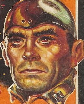
Title: The Heart Is a Lonely Hunter
Author: Carson McCullers
Cover artist: uncredited
Yours for: $10
Best things about this cover:
- I'm going to go with "the font." I don't really like this cover.
- Why does this cover make me think the story takes place in China. I fell like this should be the cover of a Pearl S. Buck novel.
- Orange rules, as a color.
- That red drawing of a carnival is so incredibly tiny that I can hardly believe anyone OK'd its inclusion on the cover. What's it supposed to signify? It's too small to create much visual interest, and it bears no clear (or unclear) relation to the main painting. Just weird.
Best things about this back cover:
- "I am Carson McCullers and I am looking at you. Yes I am."
- "... an enduring masterpiece that will live on" — yeah, that's what "enduring" things tend to do. Ugh.
- What is "savage tenderness?" Is that when a native boy gently pats your brow? Or ... what? Was the design of this book (incl. decisions about cover copy) just given over to some intern? The whole thing feels ... not laughably bad, but just off.
Page 123~
Grandpa scratched his ear with a matchstick. 'Somebody got to stay home.'
~RP
[Follow Rex Parker on Twitter]
P.S. Tomorrow begins the University Book Sale. I will be there when it starts and will not leave until I have acquired much goodness. I may have to bring helper monkeys to make sure nothing sweet gets by me. Look for the fruits of my labor beginning Sunday.


10 comments:
One of my favorite books! I wouldn't read it if I only had that cover to go on. The red splotch on the cover looks like some three year-old attacked it with a crayon.
Dondie says: Remember those wonderful days when I was a helper monkey? Ah, memories...
The disembodied head of Carson McCullers appears to be the bouncer for some sleazy dive with a peephole slot in the front door. If I open the back cover, is the full Carson McCullers standing there?
This one is just...not good. The design elements are OK separately, but together they're just a big mishmash - the fun font is fine by itself, but with that gloomy picture and strange mini carnival? It's like whoever did the layout just grabbed some bits from the scrap basket and whacked them together.
Can't wait to see what you bring back from the sale!
The wacky '60s font used for her name on the back cover really doesn't go with anything else. At all.
Is it the scan or the composition or just me, but the front cover seems to have an unusual tall, narrow format. Kind of like some PBs you get these days that are supposedly more comfortable to hold and read. Also, as I scrolled down, I had the impression that the stop sign with the (palm?) tree behind it was a large pendulum with a huge weight about to bash the boy in the head.
Uh, I think that's supposed to be a girl -- the main character, Mick Kelly, a "tomboy." As to the tiny carnival, there is a carnival in the story. Funny, a number of McCullers' paperbacks feature that long, narrow "painted on a board" graphic, apparently all by the same artist.
That cover is so depressing. The lack of cohesion and the dark picture and the words "lonely", "grotesque", and "macabre" all being on this cover just kind of made me inexplicably sad.
_________________________________________
http://coverjunkie.blogspot.com/
Yeah, and if you read the book, Lyndee, you will be ready to throw a rope over the closet rod and end it all. Hopelessness, terminal loneliness, injustice, cruelty, rejection, broken dreams....this novel has it all!
The cover does no justice to what is one of the finest books of the 20th Century. I have read this book at least 50 times.
Post a Comment