Title: Million Dollar Murder
Author: Edward Ronns
Cover artist: Uncredited
Yours for: $9

Best things about this cover:
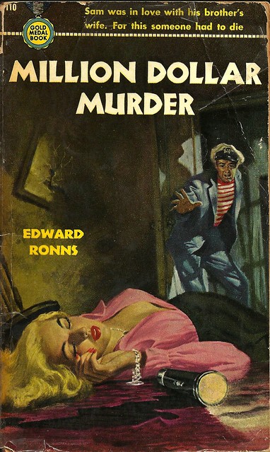
- His head is decidedly not in proportion to the rest of him. I imagine his voice is helium-ridden. "Throw me the flashlight," he squeaked.
- There is a genre of cover painting wherein dead women are draped backwards over pieces of furniture (beds, couches, etc.), of which this painting is a close cousin. Coming back toward the camera, tits high and mighty. It's disturbing, though I guess if I just imagine she's sleeping … less so.
- The cover copy *sounds* good, but really, really lacks logic.

Best things about this back cover:
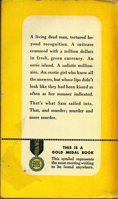
- Early paperbacks were terrible at this back-cover stuff. Except Dell. Mapbacks heal all wounds.
- "A list. A list of things one might find in a cheap thriller. A list where the last item is long and convoluted. And murder times infinity."
- Edward Ronns is really Edward S. Aarons. Or vice versa. I forget. (I was right the first time)
Page 123~
Broom said: "You're learning. About the birds and the bees, I mean. Take the bees, for instance. The queen bee, especially. You know much about the queen bee, Sam?"
"You're driveling," Sam said.
"Look," Broom eructed, "if you're not going to take these apiology classes seriously, you're never going to be able to write an adequate epic simile. So shut up and listen!"
~RP
PS Fear Hand!
[Follow Rex Parker on Twitter and Tumblr]


5 comments:
So, that "fresh, green currency" wasn't ripe yet, eh?
Cristiane
It's a funny thing--I always enjoyed Edward Ronns's novels, never cared for Edward Aarons's work, and was quite surprised when I found out they were the same person.
So we're not regarding Sam the Sailor Man as having Fear Hand?
RWG:
My mistake. Corrected.
I like to think that the inventors of silicone breast implants had access to this paperback. The project lead slaps the book down on the table and says, "Gentlemen, give me something that looks like these!"
The nipple bump on her left breast is a nice touch. I've noticed that on many of the covers from the period the artist will put in one bump but never two. A sort of mason-dixon line of the acceptable vs. the lewd?
Post a Comment