Title: The Thursday Turkey Murders
Author: Craig Rice
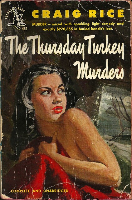
Cover artist: William Wirtz
Yours for: $8

Best things about this cover:
- Would not have thought a cover featuring a half-naked woman could be this dull and ugly, but evidence is evidence.
- Seriously, terrible painting. I can't even glean context from this thing. Where is she? It's like she's in some creepy guy's ice-fishing shack, looking out in a Dali-esque winter landscape. After an earthquake that has left everything oddly atilt. Plus the painting is all smeary. Blargh.
- Craig Rice was a woman. See also Leigh Brackett. They both ghost-wrote novels for actor George Sanders in the 1940s.

Best things about this back cover:
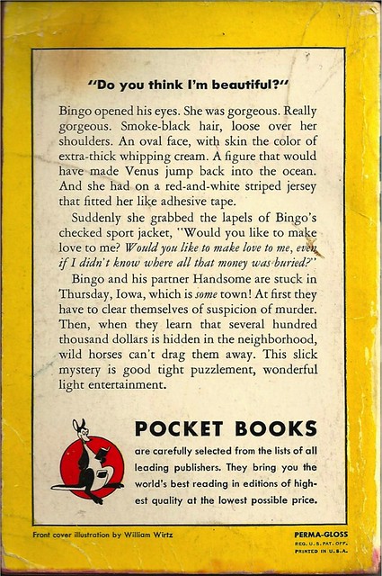
- This book is part of Rice's "Bingo and Handsome" series, which is the title of a mediocre TNT comedy-crime drama waiting to happen.
- "Baby, your skin is the color of extra-thick whipping cream." Nope. You can say this in as many different voices as you like. Not sexy.
- I will say that "A figure that would have made Venus jump back into the ocean" is pretty damn good, as cover copy writing goes (admittedly low bar).
Page 123~
"Now a bullet from a high-powered rifle would go through a feller's head and come out the other side without making much of a hole, providing the feller had the right kind of bones in his skull and that the rifle was shot off from far enough way [sic]."
I have no idea what it means, but "The Right Kind of Bones" would make an excellent book title.
~RP
[Follow Rex Parker on Twitter and Tumblr]


3 comments:
Wrong rear cover pic!
It had been fixed a full minute before you posted this. Aargh! Not fast enough! Damn it!
RP
Not only is the painting ugly, it seems really incongruous with the title. The Thursday Turkey Murders sounds light and fairly comic, but this painting is grim and would like to be menacing. It actually could be decent cover art (not for this book), but you'd have to get rid of the stuff behind the woman's left shoulder and give her more definition. And change the palette of the background from its current fecal brown.
Post a Comment