Title: Stairway to an Empty Room (Popular Library, undated — early/mid-60s)
Author: Dolores Hitchens
Cover artist: uncredited
Yours for: best offer
- Oh, snap!
- Stairway to a massive car interior
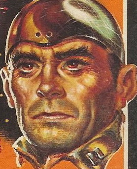
- His left hand is Disgusting — like the claw of some mythical, horrifying sea creature
- "They said 'just lift the neck' ... why ain't there no candy comin' out! What good's a life-sized Pez dispenser if it don't put out!?"
- Dolores Hitchens is actually a pretty good writer
- One-armed, bow-legged spy with wide, rectangular wang = interesting logo choice
- "Expertly tautened!" — next time I see a pair of high, firm breasts, I'll know what to say
Page 123~
Biddy's fingers writhed inside Monica's. The hot eyes were frightened and unsure. "You let me alone. You get out of here."
If only that first sentence read "Biddy's fingers writhed inside Monica" — I might be inclined to read it.
~RP


9 comments:
That's what I thought it DID say!
Ugly Hands' victim has a weird hand of her own -- the thumb looks huge. Why's she barefoot if it's cold enough to be sporting that cute olive-green trench? The mystery deepens...
I know cars were big in the 60s, but this interior is ridiculously huge. Also, this is a very strange art choice for a book whose title mentions a) a stairway and b) a room.
Alix - easily answered. Ugly Hands is a foot fetishist. Therefore he made her take her shoes off before he killed her.
I am so glad that weird-ass pictograph is enlarged on the back, because that is definitely my favorite part of the front cover, which is a little too explicit for my sensibilities.
It looks as though it's been cut out and rearranged from the letters of a word, does anyone else see that?
"It looks as though it's been cut out and rearranged from the letters of a word, does anyone else see that?"
Holy cow, I think you're right. The left side of the head is a "c", the right side is an "r", the torso might be an "i", the weird arm-body piece is an "m", and the legs and...um..."appendage" is an "e". It's "crime"! What's that spell? "Crime"! What do we want? "Crime"! Yea "crime"!
Damn but that's one ugly logo, and making it up from stylized letters doesn't change that.
On another note, I can't remember a book with such an uninformative back cover -- the blurb on the front says more about the plot than the back does.
And another thing about that graphic -- if I were the person in question, I'd get a gun that shoots straighter.
The bow-legged spy with a rectangular wang could almost have been a good logo, but something went very wrong--made up of letters you can't make out, weird proportions, and a gun that seems to be operating like a delicate little watering can.
I've always thought PEZ was a weird and disturbing concept for candy - bend back a cartoon character's head and eat its larynx?
OK, "Oh, snap!" was WAY too funny. I feel ashamed to have laughed like a crazed hyena.
Post a Comment