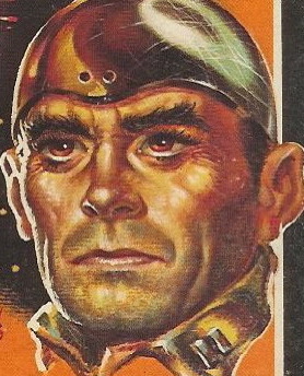
Title: My Pal, the Killer / Scratch a Thief
Author: Chester Warwick / John Trinian
Cover artists: Uncredited / Uncredited
Yours for: $11
Best things about this cover:
- Font!
- I love that guy. "Dames ... probably expects me to walk over there and see if she's OK. Shows what she knows."
- She looks like she keeled over mid-mambo.
- The flowers near her ankles are lovely and delicate. Nice, incongruous touch.
Best things about this other cover:
- "I" dot = clown nose
- I love how perspective has been wildly manipulated here. Eyeline = assline. Plus, he's doing that "I can see behind me" thing that only exists in soap operas and book covers.
- If that title is playing on "To Catch a Thief," that's terrible. Not as terrible as the puke-green background color, but pretty terrible, nonetheless.
Page 123~ (from My Pal, the Killer)
He nodded. Even in the poor light I could see the grimness of his face. He said, "I got the idea, watching you two together, that you were attracted to my daughter. I hope so."
This was the introduction of a new (and sadly short-lived) stock figure in American crime fiction: Inappropriate Dad.
~RP
[Follow Rex Parker on Twitter and Tumblr]


4 comments:
I want to buy this. Those covers are amazing. How do I do so? Email me
I'm thinking he'll go examine the corpse one he finishes his cigarette. See, it's hard enough smoking with your hands in your pockets without getting ash all over your suit, but it's near impossible to do so while you're walking. And face it, she'll still be dead in two or three minutes, so can't you just let a guy enjoy his damned cigarette?
I think the worst part of the baby-poop wash on the second cover is the way it affects the woman's skin tones. The worst part is the normal skin tone highlights on the backs of her knees/top of her calves and her foot. It makes the coloring on her thighs even more icky.
Also the guy on that cover has kind of a Hugh Laurie thing going.
Having been a soap opera fan in my youth, I feel compelled to make a small correction. It's true that it was common in soap operas for one actor to turn and face the camera, and then a second actor would come up behind the first one so they were both facing the camera. Then they would have a conversation in this position, with the second actor speaking to the back of the first actor's head. It's also true that this would be an unnatural and rare (if existent at all) way for two people to speak to each other in real life, and that it was known for being a peculiar hallmark of soap operas. (Understandable, though, as it was a way to get both actors' faces on screen without a lot of back and forth camera work.) However, and this is where my correction comes in, it was never stated or implied or made to seem as if the first actor could see behind him or herself or see the second actor's face. You're welcome.
Post a Comment