Title: Call for Michael Shayne
Author: Brett Halliday
Cover artist: Robert McGinnis
Yours for: $12
Best things about this cover:
- "I'm holding for Mike Shayne, so you can just wait your damned turn for the phone. Here, stare at the side of my left boob while you wait."
- One of the oddest cover poses I've seen for a McGinnis girl — casual gun play + casual, inexplicable semi-nudity. Yet the net effect is still smoking hot.
- For my birthday, I would really love it if one of you could PhotoShop this baby and make it say "Call For Michael Sharp" (my "real" name)
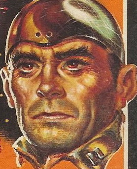
- I love the floating head of Mike Shayne. Quintessential tough dick.
Best things about this back cover:
- The fact that I have left the store's ID tag tucked into the back cover all these years. I love when stores are fastidious about labeling their shit.
- "The night of June 8" is tomorrow, fyi.
- We didn't need the first set of parentheses, let alone the second. What, are you whipsering?
Page 123~
Knowing Masters's reputation as a domineering bully, it seemed reasonable to expect his secretary to be a weak-kneed yes-man, a sycophant.
~RP
P.S. just hours after I posted this write-up, reader "Tulse" gave me this:

I should ask for stuff more often. Now I want it on a T-shirt. You're the best, Tulse. I'm truly grateful.


8 comments:
Happy birthday, Rex!
http://s571.photobucket.com/albums/ss160/Tulse/?action=view¤t=CallforMichaelSharp.jpg
What the heck is that woman taking off anyway? It looks like it's attached to her right side. Is she shedding her skin?!
Oh my God, she is, isn't she? AH! RUN MICHAEL SHANE! YOU'RE GETTING CALLS FROM THE LIZARD QUEEN!!!!
Though I suppose for a guy that's better then getting a call from the Lizard King. (Unless you're the dude in the post below this one.)
NIcely done indeed, Tulse!
I had a tough time with her props; I didn't get that that was a gun in her hand at first, and for several puzzling moments I thought she was wearing the biggest pair of earrings *ever*.
I cannot for the life of me think what she could be wearing that's under one boob yet still completely zipped up.
She's really quite stunning, though the extreme arch of her eyebrow is starting to make me head hurt a little.
(And, of course, the mystery of the unnecessary parentheses remains.)
I think it's important to assert, as in the second parenthetical, that "recently dead" people don't say anything.
"Quintessential tough dick." I could go so many places with this statement, but I simply can't decide. Plus, I don't want to be crude; this is a Family Blog after all.
She seems to be thinking, "Smart ass, it's for you ..." *BLAM!*
I have to agree with Alix's observation of the eyebrow. That's the first thing I noticed. Who the heck shapes their eyebrows by curling them up at the end?
I'm also in pain at the way she's squishing her boob into her armpit. Ewwww.
_________________________________________
http://coverjunkie.blogspot.com/
I'm catching up on several months worth of posts.
I'm surprised that nobody's mentioned that the cover illustration is a dead ringer for "Breakfast At Tiffany's" Audrey Hepburn.
The illustrator for Joan D. Vinge's "The Snow Queen" paperback also used A.H. as his inspiration:
See:
http://www.amazon.com/gp/customer-media/product-gallery/0446676640/ref=cm_ciu_pdp_images_all
(One of my favorite covers ever, btw...)
Post a Comment