
Title: The Intimate Stranger
Author: William Lynch
Cover artist: Woodi (Ishmael)
Yours for: $10
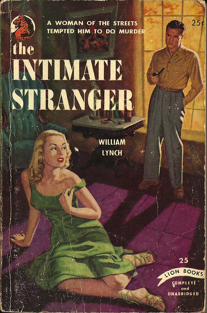
Best things about this cover:
- "No … not the dress strap … alright, alright, I give. I'll murder someone."
- Melissa's lessons in "how to use furniture" were long and grueling.
- I genuinely like her whole get-up.
- The Erotic Awakening of Ward Cleaver.
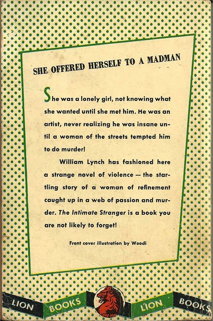
Best things about this back cover:
- Well, there's your first problem, lady. You gotta offer yourself to one of them there sane guys.
- "He was an artist … you know how they are."
- Green polka dots are my new favorite back cover design concept.
Page 123~
The underbrush scraped her bare legs, leaving torn, painful weals, sometimes tearing away filings of flesh and her hands were sore and torn with the constant grasping of bushes for support.That is a manifestly terrible sentence, on several levels, and yet I kinda wish the book were titled "Filings of Flesh."
~RP
[Follow Rex Parker on Twitter and Tumblr]


4 comments:
1. I love her sandals. I want her sandals!
2. Interesting how the background is a bit geometrically wonky, esp. the painting. It's like realism with background surrealism.
Yeah, that painting is doing some crazy *%&$
I agree about the oddly shaped painting. And technically speaking, some of the shadows are off.
There's something that's just off about the whole front cover. The angles, not just of the shadows and the painting, but the way he's standing and tilting his head. She's terrific, though. Sort of a cross between Vera Miles and Bette Davis.
The back cover is quite interesting for one that's mostly wall-o-text. I like the skewed rhombus and the way the header follows the top line, while the rest of the text is properly vertical. I guess is kind of reflects the weird angles on the front.
Post a Comment