Title: Stacked Deck
Author: Frank Kane
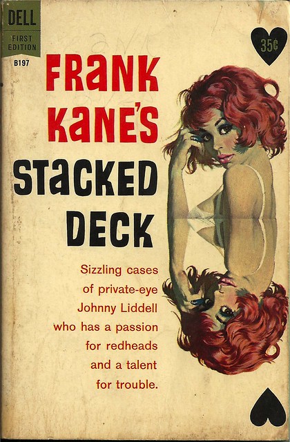
Cover artist: Bob McGinnis
Yours for: $8

Best things about this cover:
- I see why she is drawn as a reflection of herself—the whole playing card angle—but dear god this cover would be 10x better if the top half of the painting just Continued. Down. I feel slightly ripped off. Let's just say that McGinnis had a knack for the lower half.
- The upper half is, however, is exquisite.
- Black hearts = nice touch.
- Ooh, short stories. That's cool. You don't see that very often in single-author paperbacks.

Best things about this back cover:
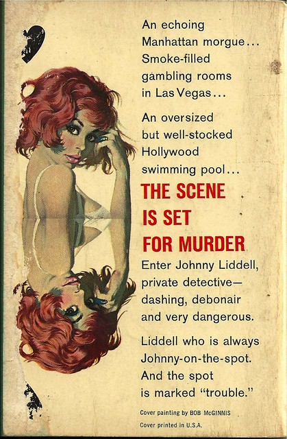
- Love the description of the Hollywood swimming pool as "well-stocked."
- "Debonair" is one of those words that can cut both ways—teeters on the wall between "cool" and "repulsively slick."
- Last line there is a super-weak attempt to drum up some Marlovian mystique. Face it: you're never going to get more succinct and bad ass than "Trouble Is My Business," so don't even try.
Page 123~
He stared glumly at the coffee, pulled himself out of the chair and spilled the coffee into the sink. He lifted the Scotch bottle from the closet, spilled three fingers into a glass.This after a woman left his apartment, telling him that she was going to turn herself in to the police. I can only assume that that last line is an aural pun that is utterly lost in print.
"What a waste of good material," he groaned.
He lifted the glass to his lips, drained it, shook his head sadly. "What a waste!" [end of story]
~RP
[Follow Rex Parker on Twitter and Tumblr]


3 comments:
I'd like that painting to keep going so I can see just how stacked that deck is.
Yeah, the reflection point could be just a little lower. She also has a somewhat greenish tinge that makes her look really sick or maybe dead.
Ye gods, I wish my eyes were that big. Baaaaaaambi eyes.
Post a Comment