Title: Operation: SEX
Author: Kimberly Kemp
Cover artist: Paul Rader
Yours for: $30

Best things about this cover:
- Operation: LACK OF IMAGINATION
- I have an alternative title for this book: Naughty Pine.
- This cover manages to be both deeply disturbing and super hot. Indirect evidence of nudity = very effective.
- You have to love the absurdity of the pull-down window shade in the foreground—it's architecturally impossible, of course, but does a cool job of implicating us in the voyeurism.

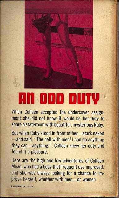
Best things about this back cover:
- Whoa. Ruby? Tell me more about Ruby. The cover said nothing about Ruby.
- "Anything!"
- Talk about burying the lede—how is the front cover not more lesbianified? I mean, I love the cover, but if lesbian pulp has taught me anything (and it Has), it's that when your book has lesbian sex in it, some visual/textual indication of that goes on the cover. No beating around the bush. As it were.
Page 123~
She visualized the tiny droplets striking the shoulders and then draining down in liquid rivulets, down over those peaked breasts. Down. Across that smooth belly and down into—
End of paragraph. I assume the next words were going to be the aforementioned bush, but who knows?
~RP
[Follow Rex Parker on Twitter and Tumblr]


2 comments:
Is it just me, or do those look like a MAN'S legs?!?
Y'know, there are awkwardly triangular rooms in this world. Where two streets meet at an acute angle, sometimes the corner of a building will contain ridiculously shaped rooms like the prow of a ship. I'm just going to assume that this... person (I'm looking at those legs and wondering if Amy might be right) is standing near the apex of their triangular bedroom with one shade open a crack and the facing shade well up.
Post a Comment