Title: Big Man
Author: Richard Marsten
Cover artist: Richard Abbett
Yours for: $10
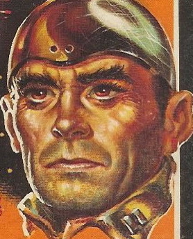
- This is somehow both unremarkable and quintessential. I wish the background lady were a little more crisply rendered, a little bit less like some medieval woodcut, but I love the distressed title font, the nutso Lee Marvinesque shooter, and the tiny detail of the shell casing floating between his eyes and the gun. Oh, and the red. The big, bold, blood red. All great.
- Richard Marsten = Evan Hunter = Ed McBain, for those of you playing the alias name game at home.
- 1959 is the dead center of my collection, so I have a particular affection for books from that year, especially beat-up but still complete and readable crime fiction paperback originals with sensational covers. The somewhat lousy girl art is the only thing keeping this from being Perfect.
- It's honestly creepy how much this guy appears to be imitating Lee Marvin in "Point Blank" ... which won't come out for almost another decade.
Best things about this back cover:
- Carfon looks like something that should have a "TM" after it and be on the handset of chunky 1980s car phone.
- May Taglio! (not to be confused with Maytag Leo, who fixes your washer/dryer)
- I reviewed Daybreak once, a long time ago.
Page 123~
"You ain't gonna kill me," he said. "If you don't know it, I do. You just ain't gonna kill me in cold—" and I pulled the trigger.This page dragged me right in and I read to the end of the chapter. It's amazingly brutal. The next killing's even colder. And none of these people is May Taglio! Based on these pages, I don't see him having Any problem killing his wife. I might actually read this one cover-to-cover.
~RP
[Follow Rex Parker on Twitter and Tumblr]


4 comments:
When I read the headline on the back cover, my first thought was: "Oh, an ad for one of those self-help mail-order courses." But, reading the rest of the copy, I think the homework assignment is a bit extreme.
Actually, the girl art itself isn't that bad. She maybe needs a little more definition to her left thigh, but overall it's OK. The real problem is all the other clutter there with her. Most especially that chair or whatever it is. It's totally distracting and leaves me, at least, trying to figure out what it is, instead of looking at the girl or even the guy with the gun.
40 grand a year! Hell, I need to get into The Organization. I'd have no problems plugging May Taglio for 40k a year.
I do not like this cover. Far too cluttered, as the other reader pointed out. Simplicity would have ruled her.
Post a Comment