Title: The Better To Eat You / Mischief
Author: Charlotte Armstrong
Cover artist: Uncredited / Uncredited
Yours for: $7
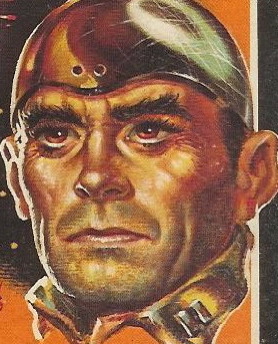
- Allow me to pre-apologize for the nightmares you'll be having later.
- Don't look at me, lady, because I have *no* fucking idea either.
- This is the painting of a man about to take his own life. Or a man who is trying to get fired.
- You know what? I don't think she's scared. I think she's kind of turned on. This painting has layers. Many creepy layers.
- "Despair" (1963) — Oil and blood and scabs and tears on canvas
- This woman is *really* enjoying her bondage fantasy.
- "807"is the pictorial equivalent of clownface, i.e. What The Hell?
- Look out, Grace Kelly! Raymond Burr can see you!
Page 123~ (of The Better To Eat You)
"You didn't try to make him listen when I wanted you to go to the Village . . ." Malvina smouldered.
"Malvina smouldered" is the new "Jesus wept."
~RP
[Follow Rex Parker on Twitter and Tumblr]


11 comments:
What the hell do clowns have to do with Little Red Riding Hood?
Is there an award for most nightmare-inducing double-covers?
Scary clown -- my worst nightmare.
Susan
Smart Bitches also recently induced nightmares with a similar cover that, oddly enough, also had something to do with eating.
The Hungry Ones
Jesus. THIS is why I don't like clowns. *shudder*
So, so many things wrong with this.
However, ro-
mance could be the worst.
So, this was the other "Cultural Detritis"?
This is one of the creepiest covers I've ever seen. I'd love to know what kind of mind thought up this artwork.
Wow, that first cover is awesome. But I have the feeling they switched the blurbs. I mean, the scary clown talks about "romance and complex villainy", while the Bewitched/Rear Window thing mentions "sheer, crawling horror".
I mentioned Bewitched, because that was the first thing that leaped to mind when I saw the second cover, but I don't really know why. Might be the starbursts. The first woman looks more like Elizabeth Montgomery, though.
Oh, clowns are only scary in the moonlight ... or when you find one in your closet. They aren't scary on the covers of books. They scream "Read me, kids!" Honestly, I'd love to have the original art for this.
The cover for "Mischief" is almost painfully literal, as if someone said, "We'll make a picture of each key plot point, then stack them all on top of each other."
It's a story to make you too scared to ever leave your kids with a babysitter.
I mentioned Bewitched, because that was the first thing that leaped to mind when I saw the second cover
That's because she looks like Agnes Moorehead.
Post a Comment