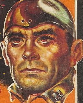
Title: Sad Cypress
Author: Agatha Christie
Cover artist: Who Knows?
Yours for: $25
Best things about this cover:
- It's like Art Deco meets Evil - "Help, I'm being attacked by the Chrysler Building!"
- I like how "Sign of a good / detective novel" is so shabbily printed. Did they not have the technology to, say, center things in the 1940s?
- White Circle books are really hard to get hold of in the States. They are Australian, I think. There seems to have been a White Circle publishing out of Canada too. Maybe it's a Commonwealth imprint. At any rate, this book was published in Sydney.
- So basically this is a story about two ghosts who really hate trees ...
Best things about this back cover:
- EVERYTHING - do you know how rare it is to get a full-page ad on the back cover? Very. I think I have one other book with such a cover - that cover has an ad for men's belts (!?). This one, however, has cartoonery and poetry and disease paranoia and I'm gonna say quackery. So so so awesome.
- I can't decide if that officer is breaking up a fight or enforcing a quarantine.
Page 123:
Poirot waved a hand.
"There is nothing much to that! It might easily have been written by an educated person who chose to disguise the fact. That is why I wish you had the letter still. People who try to write in an uneducated manner usually give themselves away."
~RP


2 comments:
I'm surprised we're not seeing more advertising on the back covers -- after all, it's everywhere else, in the stadiums, stadium names, product placement in movies, etc.
However, the reality is the back cover ad is probably a relic from the old serial days, when novels were published by the chapter with lots of ads, many for similar products. RP would've loved it back then.
For example, I find the advertisements (some quite lengthy) in my facsimile edition of Nicklaus Nickleby to be quite fascinating.
Peace, yo.
Post a Comment