Thursday, July 7, 2016

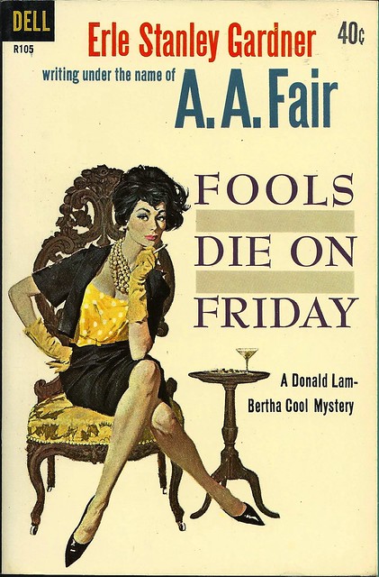
Paperback 959: Fools Die on Friday / A.A. Fair (Erle Stanley Gardner)

Paperback 959: Dell R105 (1st thus, 1961)

Title: Fools Die on Friday
Author: A.A. Fair (Erle Stanley Gardner)
Cover artist: Bob McGinnis

Estimated value: $10-15
Condition: 9+/10
DellR105
Best things about this cover:
  • It appears that either I hit some perfectly preserved AA Fair / Erle Stanley Gardner motherlode at some point in my collecting journeys, or someone sent me box of same. These books are exceedingly common, but no less glorious, art-wise. And in this condition, mwah!
  • I love McGinnis's work, though I don't always share his, uh, aesthetic. There's often an icy, angular quality to his women, and the hair, dear lord, the hair. There be dragons.
  • The shoes, though. The shoes. Gotta be the shoes.
  • All covers are improved by martini.

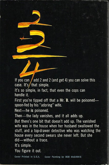
DellR105bc
Best things about this back cover:
  • Math!
  • Crazy calligraphic math!
  • This back cover does nothing to convey how charming the Lam/Cool mysteries are.

Page 123~

She pushed back her stenographic chair, walked over to a shelf, whipped out a map, and placed it on the counter.

OK, I don't know who she is, but I'm in love.

~RP

[Follow Rex Parker on Twitter and Tumblr]

Monday, July 4, 2016

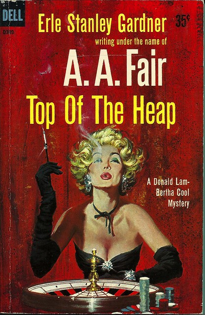
Paperback 958: Top of the Heap / A. A. Fair (Erle Stanley Gardner) (Dell D309)

Paperback 958: Dell D309 (1st thus, 1959)

Title: Top of the Heap
Author: A.A. Fair (Erle Stanley Gardner)
Cover artist: Robert McGinnis

Estimated value: $8-10
Condition: 8/10

DellD309
Best things about this cover:
  • Well, *not* the hair. That's some full-on Cruella Deville nonsense.
  • If you stare at her boobs (and why not?) it's like you're looking at a very fancy black cat waiting to pounce on the spinning ball.
  • I've seen some opera gloves in my time, but those are the operaiest.

DellD309bc
Best things about this back cover:
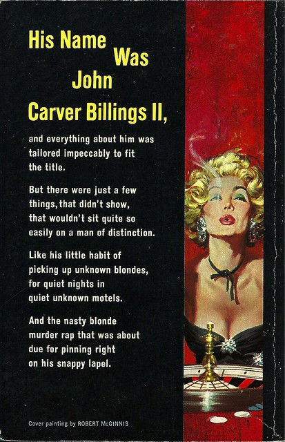
  • Oh, there she is again.
  • "Was" ... and the reason we dropped the "Was" was ...?
  • Is this a poem. This feels like a poem. I mean ... it's not Roethke, but it's OK.

Page 123~

"How was the money secured for the development work?"

I swear to you that that is the most exciting line on this horribly boring page. It was that or "Something about the name appealed to the investing public." Or, "Permission was given to sell the stock at par value zzzzzzzz..." etc.

~RP

[Follow Rex Parker on Twitter and Tumblr]
Saturday, July 2, 2016

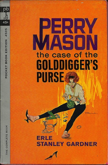
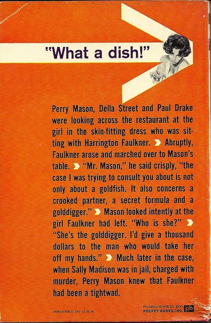
Paperback 957: The Case of the Golddigger's Purse / Erle Stanley Gardner (Pocket Books 4505)

Paperback 957: Pocket Books 4505 (8th ptg, 1962)

Title: The Case of the Golddigger's Purse
Author: Erle Stanley Gardner
Cover artist: Robert McGinnis

Estimated value: $6-10
Condition: 8/10 (shiny and unread but mildly, uh, storage-smushed in a couple places)

PB4505
Best things about this cover:
  • Honestly, this is ridiculous. It looks like she's somehow killed a fancy, jewel-encrusted parrot and is preparing to devour its carcass. The bones!
  • There are precisely two great things about this cover: a. orange! and b. that left shoe and whatever story lies behind its location.
  • I have never seen McGinnis's talents put to poorer use. A huge Perry Mason logo, but only a teeny tiny half-shod McGinnis girl?! Priorities, man.

PB4505bc
Best things about this back cover:
  • This way to dish!
  • I'm guess a guy named Harrington Faulkner doesn't work at the docks.
  • Now I ain't sayin' she a goldfish-digger...
  • So ... Goldfish ... that explains the color. I think.

Page 123~

With every simulation of candid surprise, Dixon raised his eyebrows.

~RP

[Follow Rex Parker on Twitter and Tumblr]
Wednesday, June 29, 2016

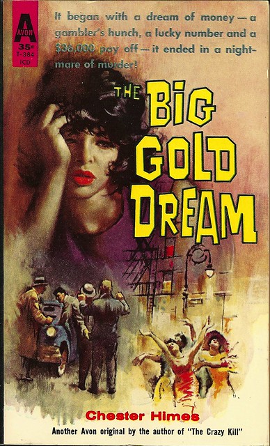
Paperback 956: The Big Gold Dream / Chester Himes (Avon T-384)

Paperback 956: Avon T-384 (PBO, 1960)

Title: The Big Gold Dream
Author: Chester Himes
Cover artist: [George Ziel]

Estimated value: $50-60
Condition: (9+/10)

AvonT384
Best things about this cover:
  • She has that face I get when I look at the internet for too long. But she has better lips. And better hair. In that she actually has hair.
  • Love the Big Gold Font
  • I'm not usually a big fan of the multi-scene cover, largely because it makes all the visual elements too small to have the kind of dramatic impact I like, but this particular iteration is nicely handled. Captures the darkness and brightness (and architectural elements) of the city really nicely.
  • This book is in indescribably great condition. Shiny. Square. Unfaded. Tiny bit of wear to spine and very faint warp toward the tippy top of the book are the only things keeping this from 10/10 condition rating.
  • Chester Himes is a really important writer—possibly the most important black crime fiction writer in US history. The fact that I own a first-edition Himes in *this* condition is one of the crowning glories of my 20-year collecting addiction odyssey.


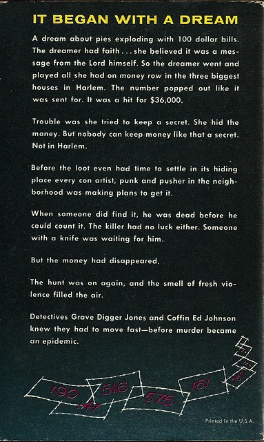
AvonT384bc
Best things about this back cover:
  • Those numbers slips are Fantastic. The rest, blargh.
  • Does have a compelling opening line, though. I want to dream about pies exploding with 100 dollar bills!
  • "The smell of fresh violence filled the air" is one of the more haunting lines I've read on a back cover.
  • Coffin Ed Johnson and Gravedigger Jones remain the best-named detectives in crime fiction history. Hercule shmercule.

Page 123~

Slick turned his stare back to Susie. "You're not very bright, rockhead," he said. "He wants to cut himself a slice of our pie."
"He's going to get more slices than he's looking for," Susie threatened.

Ooh, double entendre. Good one, Susie.

~RP

[Follow Rex Parker on Twitter and Tumblr]
Monday, June 27, 2016

Paperback 955: The Way It Is / Curt Flood (Pocket Books 78188)

Paperback 955: Pocket Books 78188 (1st ptg, 1972)

Title: The Way It Is
Author: Curt Flood
Cover artist: photo cover

Estimated value: $20-30
Condition: 7/10

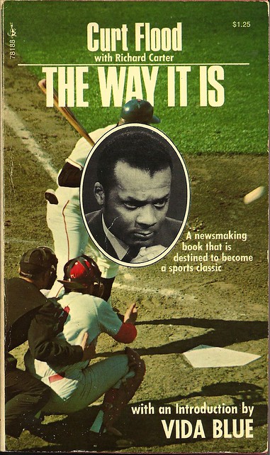
PB78188
Best things about this cover:
  • We now interrupt this cover to bring you the telekinetic powers of Curt Flood!
  • It's like Curt willed the ball to stop with his mind. "If you want the game to start again, I have some ... demands."
  • Curt Flood with the rarely seen Self-Photobomb!
  • This cover seems both ill-conceived (you're blocking the shot!) and genius (Curt Flood will not be denied!)
  • Vida Blue's intro is good. Also, Vida Blue is one of the greatest baseball names of all time.

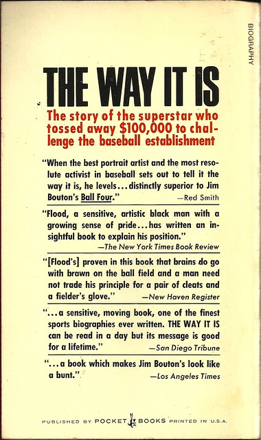
PB78188bc
Best things about this back cover:
  • Man, people are throwing a lot of shade at Jim Bouton.
  • Back when a "sensitive, artistic black man" was apparently some kind of wonder to the NYT...
  • Miguel Cabrera's breakfast costs $100,000. All ballplayers should tithe to the Church of St. Flood.

Page 123~

Having established the plan unilaterally, without bargaining of any kind, they felt free to modify it at will. Above all, they felt free to keep the TV and radio money for themselves. This disturbed the players.

~RP

[Follow Rex Parker on Twitter and Tumblr]
Friday, June 24, 2016

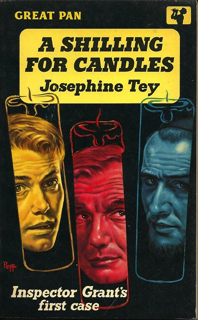
Paperback 954: A Shilling For Candles / Josephine Tey (Great Pan G170)

Paperback 954: Great Pan G170 (1st ptg, 1958)

Title: A Shilling for Candles
Author: Josephine Tey
Cover artist: Peff

Estimated value: $15-20
Condition: 9/10

PanG170
Best things about this cover:
  • OK, Britain, you wanted to go back in time, you love your precious currency ... here you go.
  • This cover is both very creative and very boring. Hard to get "dymanic" from three candle-heads.
  • Peff! 4 of 5 dentist recommend Peff for their patients who chew Peff. Peff!

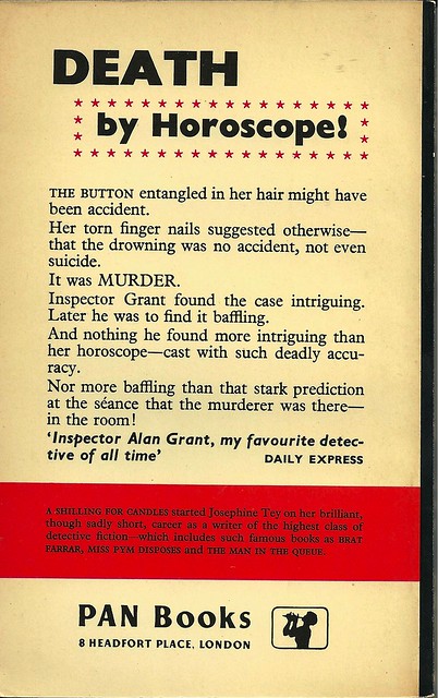
PanG170bc
Best things about this back cover:
  • Formatting. Come on, Britain. You guys have formattting, right? Spaces? Indentations? That stuff?
  • As if "by Horoscope" wasn't unscary enough—you put in inside marquee stars? Now DEATH just looks silly.
  • I'm sorry, "at the séance"? I feel like we missed a plot detail.

Page 123~

Sanger had made further enquiries from many people about that unsympathetic character, Herbert Gotobed.

I assume this is some kind of dream sequence.

~RP

[Follow Rex Parker on Twitter and Tumblr]
Thursday, June 23, 2016

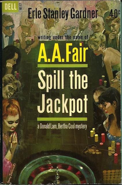
Paperback 953: Spill the Jackpot / A.A. Fair (Dell R117)

Paperback 953: Dell R117 (1st thus, 1962)

Title: Spill the Jackpot
Author: A.A. Fair (Erle Stanley Gardner)
Cover artist: Harry Bennett

Estimated value: $10-15
Condition: 9.5/10

DellR117
Best things about this cover:
  • So. Great. It's like a rogue's gallery of hot and shady '60s people.
  • Redhead's cigarette is freaking me out. Like some sixth finger that got horribly bent backwards.
  • Just genius to use the margins of the cover this way. The encroachment of text, to the point of total visual dominance, is of course one of the most lamentable trends in paperback history. This cover responds to that trend not by shrinking the art (which often happened) but by incorporating the text into the art, making the margins the place of real action. It's superior cover design.

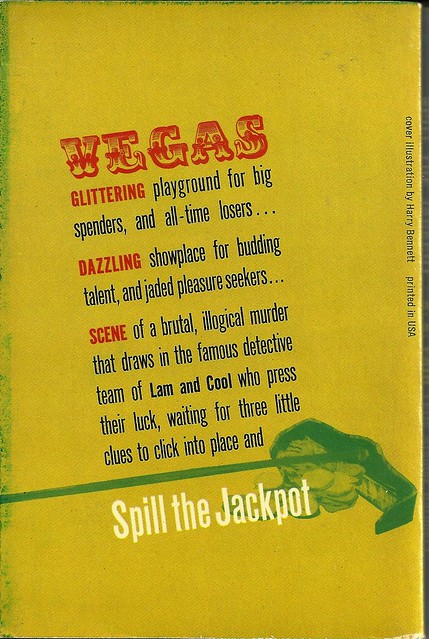
DellR117bc
Best things about this back cover:
  • Man, that "VEGAS" font is god-awful—totally out of sync, period-wise, with the cool-modern front cover.
  • Oh wow, that's a rake. I had to look at that visual element very closely to figure that out. This back cover is the Bizarro version of the front cover, i.e. it's Terribly designed.
  • "Jaded pleasure seekers"! I relate to these people. JPS4LIFE!

Page 123~

Somehow, looking at her, you felt she hadn't been to bed and that she wasn't accustomed to going to sleep before daylight.

Coincidentally, Vampire Weekend was playing on the radio when I typed this out.

~RP

P.S. I found this immaculate Detective Book Club offer card sleeping safely in the pages of this book.


[Follow Rex Parker on Twitter and Tumblr]