Thursday, August 13, 2009

Glick!

R.I.P. Budd Schulberg (1914-2009)

Here's a British paperback of Schulberg's best-known (and probably best) novel:


[A hot cover of a hot book, sent to me by a reader with a good eye and good taste]


Click here to see Budd Schulberg's The Disenchanted ("Pop Sensation" Paperback 246)

~RP

Wednesday, August 12, 2009

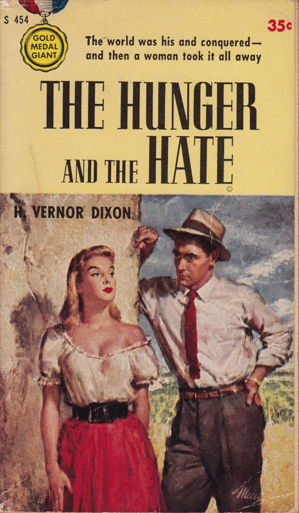
Paperback 276: The Hunger and the Hate / H. Vernor Dixon (Gold Medal 454)

Paperback 276: Gold Medal 454 (PBO, 1955)

Title: The Hunger and the Hate
Author: H. Vernor Dixon
Cover artist: James Meese

Yours for: $11


Best things about this cover:

  • "I'm hungry." "Well, I hate you." The End.
  • His hat is fabulous but his tie looks like something he ripped off an early-80s New Wave keyboard player.
  • "The world was his and conquered" has to be one of the most inelegant and awkward opening gambits in mainstream paperback cover copy history. "The world was his ... and then a woman took it all a way" would work. So would "He conquered the world ... but then a woman took it all away." So would "He was a traveling salesman with a hankering for Mexican restaurant waitresses..."

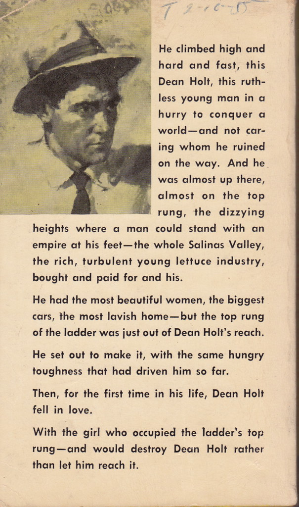
Best things about this back cover:

  • Crop. Zoom. Reverse image. Change to B&W. There. Now you can really feel the Hunger. And the Hate.
  • Jeez, it's a whole frickin' short story back here. Concision!
  • What's his name again? I forgot ... you only said it four times.
  • "Hey, ya know what a good place for a paragraph break would be? The middle of a sentence." (see last two "paragraphs")

Page 123~

He thought of Truly and dissected her in his mind and liked little of what he found and wondered why he had been such a damned fool as to accept her invitation.


Strangely, the part of this sentence I hate most is "as to."

~RP

[Follow Rex Parker on Twitter]

Sunday, August 9, 2009

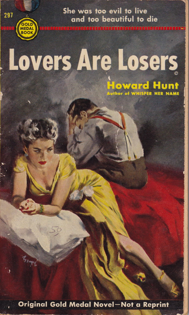
Paperback 275: Lovers Are Losers / Howard Hunt (Gold Medal 297)

Paperback 275: Gold Medal 297 (PBO, 1953)

Title: Lovers Are Losers
Author: Howard Hunt
Cover artist: Barye Phillips

Yours for: I forget — I'm blogging from CO and forgot to record the $$$ information before I left


Best things about this cover:

  • Steve wondered why he'd ever agreed to marry the Bride of Frankenstein.
  • Steve became despondent when his new magician's assistant-bride refused to let him have his favorite pillow. "You have to earn it, Steve. Pillows are for closers."
  • Sucker Slouch (TM)!
  • Her dress is hot from the bow up. From the thighs down, I have no idea what the hell is going on.


Best things about this back cover:

  • The head of the monstrous she-bandit bobbed menacingly in the brook.
  • That's your "fog of evil?" Really? Looks like a poorly rendered tree trunk.
  • The back cover appears to have nothing to do with the front cover, and neither cover appears to want to tell you what the book is really about. Marketing!

Page 123~

"Are we going somewhere?"

"Acapulco, I suppose. Doesn't everyone?"


~RP

[Follow Rex Parker on Twitter]

Friday, August 7, 2009

Paperback 274: Man Divided / Dean Douglas (Gold Medal 407)

Paperback 274: Gold Medal 407 (PBO, 1954)

Title: Man Divided
Author: Dean Douglas
Cover artist: Barye Phillips

Yours for: SOLD! (Aug '09)


Best things about this cover:

  • In case it's not clear, "half world" = gay gay gay. See also "twilight world."
  • "He had to choose — a half world or a world of woman's love" — if his posture's any indication, that decision has already been made.
  • The guy in the chair displays the classic "Sucker Slouch" (TM). It's common on noir/hardboiled covers. We will see a variation of this pose again on Sunday.
  • You can almost hear the guy deflate: "ohhhh ... fuck." He can't even look at ... her? Wait, how do I know the seated guy is the "Man Divided" in this scenario? Why do I have a feeling that the "woman" in the pale green has a voice like Jack Palance?

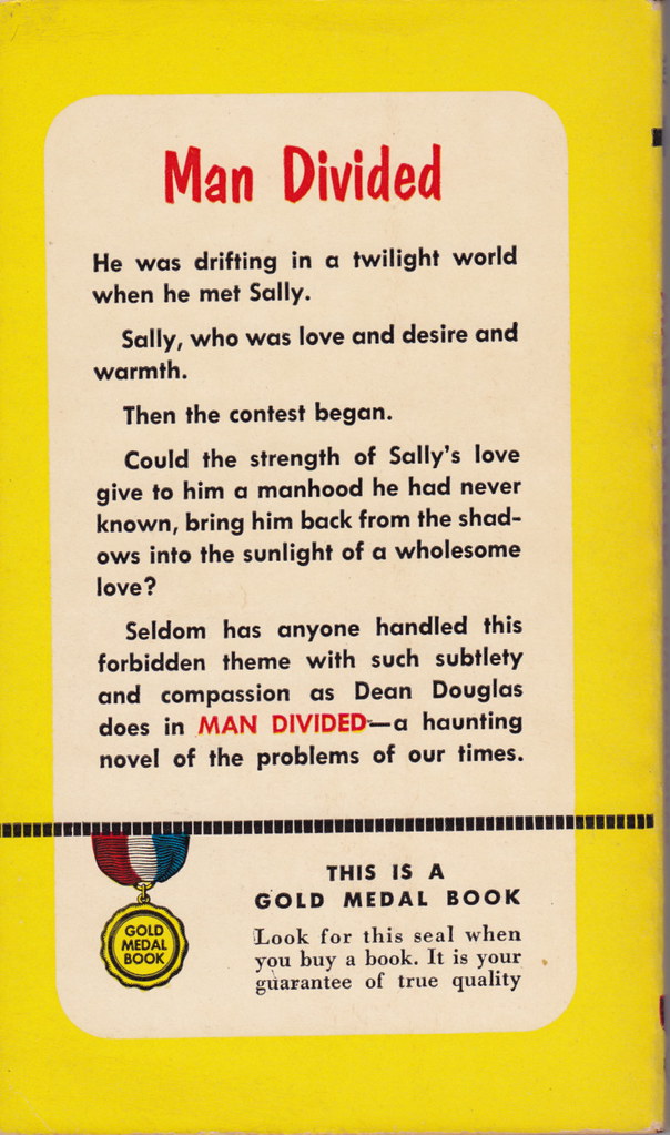
Best things about this back cover:
  • See, I told you. "Twilight world." Right on cue.
  • "Then the contest began." I hope it's a baton-twirling contest. I love a good baton-twirling novel.
  • "The problems of our times" = worst euphemism for homosexuality ever. I'll take outright offensive over this hazy blandness. Hell, I'd take "baton twirling" over this.

Page 123~

The next morning there was the mute evidence on the floor, the broken glasses and the pool of water from the melted ice cubes. Cromer had been furious about something. She had not asked. She had waited curiously to see.


Bi-curiously, that is.

~RP

[Follow Rex Parker on Twitter]

Wednesday, August 5, 2009

Paperback 273: Danger in Paradise / A.S. Fleischman (Gold Medal 295)

Paperback 273: Gold Medal 295 (PBO, 1953)

Title: Danger in Paradise
Author: A.S. Fleischman
Cover artist: Barye Phillips

Yours for: $15


Best things about this cover:

  • Is she trying to crawl under some kind of tarp? What's that huge dark area above her right hand supposed to be? Pan back!
  • Seriously, pan back. This woman was not meant to be appreciated at this distance. She looks scared. And smeary.
  • "Her love was an invitation to death ... but first she needs to change her car's oil" (my new explanation for what she's doing on her back on the ground about to go under some dark object)
  • I only just got the fact that the title is a play on the phrase "Stranger in Paradise."
  • The right hand doesn't quite look like it belongs to her. And those talons are freaking me out.

Best things about this back cover:

  • Oh, "Look Behind You, Lady"'s got a comma now, eh? Well, la-di-dah.
  • Apollo Fry, the lost Fry Guy.
  • "I flicked her chin with my knuckles" is a great euphemism for "I punched her in the face."
  • "When we came out of the trance..." Wait, what? What happened between paragraphs. One second he's playfully abusing her, and the next, they're coming out of a trance?
  • "... set in the troubled East." i.e. exotic downtown Trenton, NJ.

Page 123~Bold

"She wouldn't be hard to fall in love with, would she?"

I clamped my jaws.


Well, that's an awkward sentence. All I can picture is him with his lower face in a vise.

~RP

[Follow Rex Parker on Twitter]

Sunday, August 2, 2009

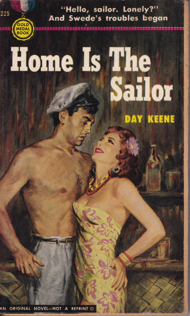
Paperback 272: Home Is The Sailor / Day Keene (Gold Medal 225)

Paperback 272: Gold Medal 225 (PBO, 1952)

Title: Home is the Sailor
Author: Day Keene
Cover artist: uncredited

Yours for: $25


Best thing about this cover:

  • Someone needs to tell him that a captain's hat really does not go with pajama bottoms.
  • She is hot in a tawdry bar slut kind of way. The upthrust boobs and hand-on-ass are particularly nice touches.
  • I worry that his aggressive and thorny-looking patch of chest hair is going to chafe her delicate boob skin (I am now giggling aloud at the phrase "boob skin")
  • She looks lusty, while he looks like he's going to vomit his last daiquiri right in her face.

Best things about this back cover:
  • Why aren't guys named "Swede" anymore? Maybe because being named Swede has been shown to cause a remarkable increase in the likelihood that you will die in some miserable, noirish fashion (see Hemingway's "The Killers," for instance).
  • Copy writer here is clearly a graduate of the Crappy Metaphor Institute. He seems to have minored in Redundancy (when you've already called her a "tempest," "hurricane" should not be your next go-to image).

Page 123~
That had been in the bar, in a booth, with Corliss sitting opposite me, looking cool and fresh and virginal in white, eating prime ribs au jus, urging me to eat; me unable to eat, nursing a fresh bottle of Bacardi.

Nothing more virginal than a white-clad lady daintily slurping her blood-red meat.

~RP

[Follow Rex Parker on Twitter]

Saturday, August 1, 2009

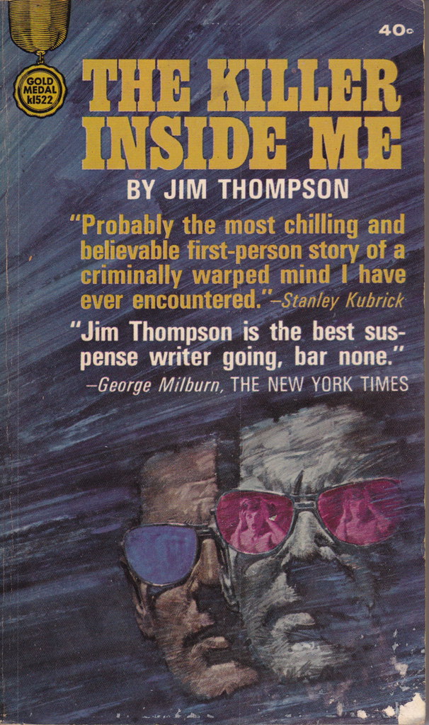
Paperback 271: The Killer Inside Me / Jim Thompson (Gold Medal 1522)

Paperback 271: Gold Medal k1522 (1st thus, 1965)

Title: The Killer Inside Me
Author: Jim Thompson
Cover artist: uncredited

Yours for: $30


Best things about this cover:
  • The most famous novel by the king of paperback originals. Book is tight and square as the day it came off the shelf. Very faint reading crease and horrible scuffing in bottom right corner are about the only defects.
  • This cover is a good example of how paperbacks start to suck, design-wise, beginning in the 60s. Art gets minimized, text takes over. Further, the cover copy is no longer interesting, imaginative, lurid tag lines, but turgid quotes from highbrow folks telling you what great literature this book is. Well, they aren't lying. The book is fantastic. But this reaching after seriousness by crowding the cover with critical acclaim really chafes my aesthetic hide.
  • Pink glasses? Really?
  • I actually love the reflection of the screaming dame in the lenses, but she's too small to be very interesting. Ten years earlier, she'd have been five times bigger.
  • Lou Ford Does Not Look Like This Guy. At least not in my head he doesn't.

Best things about this back cover:

  • Booooooooo!
  • How quaint: the real book critic goes slumming and finds a gem among the 'originals' (books so untouchable he can't even refer to them without first putting on scare quotes).
  • If the French like it, it must be good.
  • Among those on this comparison list, only McCoy is remotely comparable to Thompson. The other guys (both masters) write P.I. novels with P.I. heroes and an entirely different sensibility. If Sam Spade were a murdering sadist, then there'd be some basis for comparison.

Page 123~

Howard kept his seat. His face looked like a blob of reddish dough, but he shook his head at Jeff and kept his seat. Howard was really trying hard.


~RP

[Follow Rex Parker on Twitter]