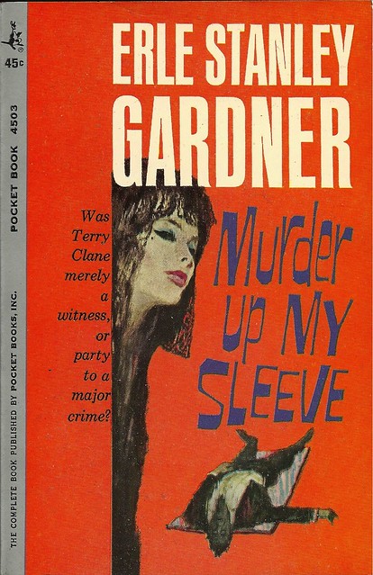
Title: Murder Up My Sleeve
Author: Erle Stanley Gardner
Cover artist: Uncredited
Estimated value: $10-12 (condition = perfect)

- The best-selling follow-up to "Larceny Down My Pants"
- Wow, that dude's magic carpet ride appears to have gone terribly, horribly wrong
- "Hi, I'm here for the 'Yoga for Mourners' class ... my, that's quite a convincing Corpse Pose you've got there."
- This cover is terrible. It has two good things about it: orange, and title font. The rest is a sketchbook, at best.

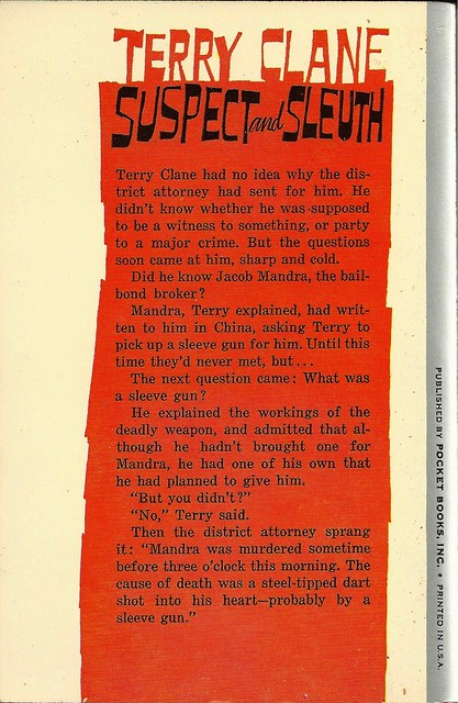
- "Hey, what if, instead of an orange rectangle, we go with, like, a jagged ... orange rectangle?" "Brilliant!"
- More great font action.
- Sleeve gun? Ohhhhhhh, now I get it. Murder up my SLEEVE. Good one. Much better than "Dartgun up My Sleeve." Wordplay!
Page 123~
"Mix the highballs, stupid."
~RP
[Follow Rex Parker on Twitter and Tumblr]


1 comment:
I think the worst part about the front cover is the placement of the text on the left. It's crowded way too close to the vertical line that cuts off the art. Is that kerning (speaking of which the kerning in Erle is terrible)? It's not leading, but I'm sure there's some term for it.
Great page 123 quote, though.
Post a Comment