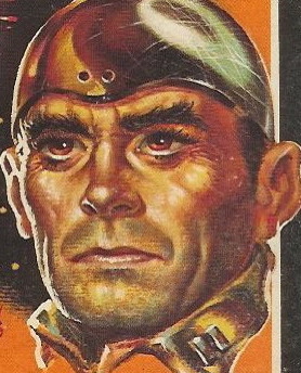
Title: The Killer Inside Me
Author: Jim Thompson
Cover artist: uncredited
Yours for: $30
Best things about this cover:
- The most famous novel by the king of paperback originals. Book is tight and square as the day it came off the shelf. Very faint reading crease and horrible scuffing in bottom right corner are about the only defects.
- This cover is a good example of how paperbacks start to suck, design-wise, beginning in the 60s. Art gets minimized, text takes over. Further, the cover copy is no longer interesting, imaginative, lurid tag lines, but turgid quotes from highbrow folks telling you what great literature this book is. Well, they aren't lying. The book is fantastic. But this reaching after seriousness by crowding the cover with critical acclaim really chafes my aesthetic hide.
- Pink glasses? Really?
- I actually love the reflection of the screaming dame in the lenses, but she's too small to be very interesting. Ten years earlier, she'd have been five times bigger.
- Lou Ford Does Not Look Like This Guy. At least not in my head he doesn't.
Best things about this back cover:
- Booooooooo!
- How quaint: the real book critic goes slumming and finds a gem among the 'originals' (books so untouchable he can't even refer to them without first putting on scare quotes).
- If the French like it, it must be good.
- Among those on this comparison list, only McCoy is remotely comparable to Thompson. The other guys (both masters) write P.I. novels with P.I. heroes and an entirely different sensibility. If Sam Spade were a murdering sadist, then there'd be some basis for comparison.
Page 123~
Howard kept his seat. His face looked like a blob of reddish dough, but he shook his head at Jeff and kept his seat. Howard was really trying hard.
~RP
[Follow Rex Parker on Twitter]


6 comments:
That Cassill blurb reminds of Steve Martin's blurb for Carrie Fisher's "Postcards From the Edge":
"Makes 'Moby Dick' look like some big fat stupid book."
Poor Howard. It must be hard to sit on a confectionery oven.
Nope, that guy looks nothing like Lou Ford. Lou Ford looks just like Audie Murphy.
I love Jim Thompson, and this book especially, but this whole cover treatment is all wrong. It completely misses the insane enthusiasm of his work. Whatever Thompson is, he's not broody.
You see, Lou Ford is really a ski instructor on the slopes of Whistler. He's got those ultra cool mirror-lens sun glasses on that change color and he gets pissed off because: 1) they're not working worth a shit in that horizontal blizzard, and 2) he's super annoyed that the pupil before him absent mindedly left all of her clothing back at the chalet.
--- Now,he'll just have to kill her... I can relate.
Back Cover: considering Cassill's rather modest avhievements, I wonder whee he thinks he's looking down from.
Post a Comment