
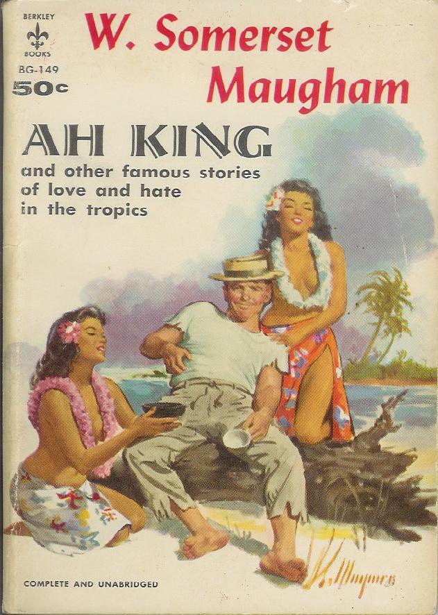
Title: Ah King and other famous stories of love and hate in the tropics (!)
Author: W. Somerset Maugham
Cover artist: Robert Maguire
Yours for: SOLD 9/18/10
Best things about this cover:
- Sometimes, when I've been at the computer for too long, I sit like this. The topless native girls never seem to show up.
- Could this dude be more oafish? He's literally belly-scratching.
- I wish we had a better close-up on the women, as Bob Maguire does women, especially faces, better than anyone. The kneeling woman is especially sexy and not just because she's, you know, kneeling. God I wanna photoshop this guy out of the picture so bad.
- You'd never know from this cover that Maugham is one of the most popular and esteemed writers in British history.

Best things about this back cover:
- OK, for once, these blurbs all sound awesome. I may actually read stories from this book today. That's a first.
- Is it just me, or does the type-setting look ever-so-slightly off? Like the black and blue inks were set separately, and aren't quite square to one another. It's making me a bit queasy.
- If I read just one story in this collection, it will be "The Book-Bag"
Page 123~
"When you left them, after a couple of days at the bungalow, you felt that you'd absorbed some of their peace and their sober gaiety. It was as though your soul had been sluiced with cool clear water. You felt strangely purified."
-from, that's right, you guessed it, "The Book-Bag"; I'm dying to see how a book-bag figures into a story about incest on a rubber plantation. I'll let you know.
~RP


9 comments:
Somerset Maugham is one of my favorite all time authors. It's a shame, i think, to have such a cheesy cover gracing pages of gems.
Ok. so maybe the women aren't too cheesy - i'm not an aficiando of cover art (though god, it looks like he's about to scratch his crotch as well!!)
If you choose to read the stories, i promise you won't be disappointed!
i remember devouring his works - reading everything i could get my hands on at the time.
as for the back cover off-sets: it appears as though the blue type was meant to be 'block quoted.' while the left margin indented correctly, the right margin did not.
however, to be fair, this might be an industry standard? because i believe blogger does the same whenever i hit the 'quote button - it off-sets the left margin but leaves the right one alone ... ?
lola
The back cover is deliberately designed that way; the title across the top is registered properly above the black text (besides, if it was that far out of register the front cover image would have suffered too).
It's not the best design, to my eye, in terms of general layout -- and one major problem is the combination of columbine blue with pale coral. Bleah.
Hey Rex, you said "The kneeling woman is especially sexy..." but they are both kneeling - which one catches your fancy?
There's something about the guy on the cover that makes me think he's some sort of odd cross between Boston Legal's Denny Crane, Married With Children's Al Bundy, and that skinny guy from The Honeymooners who's name suddenly escapes me.
I think publishers had the right idea, putting literature inside covers designed to make the buyer think the book is all sex. Instead, contemporary works of literature get covers that look like the art in hotel rooms: Bland, unaffecting, and easily overlooked. I mean, just think what a pulp publisher could have done with a title like 'The Kite Runner.' Or Richard Price's 'Lush Life.'
Well, I may be 10 1/2 months late to the party, but I’ll comment. . .
I think Rex is right about the back-cover text not being square. It’s not the margins or indentation style, it’s that the black text appears to be rotated a fraction of a degree clockwise relative to the blue text. Unthinkable with digital typesetting technology, but very possible when pasting up artwork or taping negatives to masking sheets. Or it could be an optical illusion, but I don't think so.
The last paragraph says "Mr. Maugham is a born story-teller." I remember Mr. Maugham as a 1983 movie starring Michael Keataughan and Teri Gaugharr.
I want it, I want it! Somerset Maugham is one of my favourite authors. (Er, yes, I discovered your blog and backlogged through all the posts just to see which books I'd missed...)
A bit late, I know (3 yearsish...) but did Rex ever read and report on disturbing incest-sounding rubber fun?
Post a Comment