Tuesday, November 27, 2007

Paperback 48: Pyramid G432

Paperback 48: Pyramid G432 (PBO, 1959)

Title: Private Eyeful
Author: Henry Kane
Cover artist: Robert Maguire

Yours For: SOLD! (4-18-08)


Best things about this cover:

Everything - this cover is so great that I actually have nothing mocking or jokey to say. It's gorgeous, and has so many of the elements I look for in a cover:

  • Girl with Gun (GWG)
  • Great Girl Art (GGA)
  • Great design
  • Great title
  • Gorgeous condition
Plus: Orange!? That's hot. You Never see a woman in an orange dress on these covers, let alone one wearing matching pumps! The heavy black outline makes her look a little bit like Miss Halloween, 1959, but whatever. It hardly matters. I love her. And she's a female detective - at a time when that was Not At All common, especially in the hardboiled genre. Also love the colorful angular design near the spine - and her proud look / defiant posture really seals the deal. A Hall of Fame cover for sure. Bob Maguire was one hell of a cover artist.


Best things about this back cover:

"It was cockeyed..." - That's what she said.

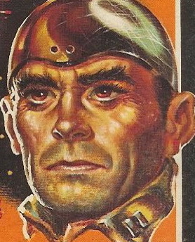
Ooh, this back cover's ugly - what a horrible contrast with the front cover

Question of the day: Is the man pictured above

a. wearing Merlin's robe
b. tunneling out of prison
c. suffering from a debilitating attack of scabies that also somehow affects clothing, or
d. Dorian Gray?

Answer: I have no idea.

RP

Saturday, November 24, 2007

Paperback 47: Bantam 405

Paperback 47: Bantam 405 (1st ptg, 1948)

Title: The Hucksters
Author: Frederic Wakeman
Cover artist: Bernard D'Andrea


Best things about this cover:

  • The Mysterious Hand of ... The Black Man
  • "Uh ... Honey, did you order room service? You know how I hate being bothered when I'm doing my Word Finds!"
  • "Don't look at me. I'm just harmlessly playing with this surreal toaster/radio while trying to keep my robe shut, even though it appears I am ogling the handsome porter who has just entered our doorway."

This cover is a miniature allegory of post-war race relations in America.

RP

Thursday, November 22, 2007

Paperback 46: Fawcett / Gold Medal M2268

Paperback 46: Fawcett / Gold Medal M2268 (3rd ptg, 1971)

Title: The Crossroads
Author: John D. MacDonald
Cover artist: Uncredited


Best things about this cover:

  • "Look at my shoulder holster! Look at it! Yeah, that's right. You better be afraid!"
  • Floating Head says: "You dance funny, little man."
  • This book has much better cover copy than it does art. See back cover...

Best things about this back cover:

  • Centeredness makes back cover copy look like a poem - an awesome poem. Not sure which is my favorite phrase here: "sadistic chiseler" or "musclebound lover-boy." Probably the latter. Also, I love Anything having to do with a motel. Motels are my second-biggest thematic obsession, after Revenge.
  • Ridiculous, arbitrary formatting - the gun-toting fist breaks up the text in absurd ways. It's like someone opened up a little door in a wall and is now about to shoot through it blindly.
  • John D. MacDonald looks like the biggest Poindexter ever. His glasses are positively Asimovian. Awesome.

RP

Monday, November 19, 2007

Why Book Sales are Like Crack Dens To Me, Part 4

Dondie's Revenge!

The continuing story of the books I bought at the University Book Sale for no good reason except that their covers amused me ...

Title: Darling
Author: Frederic Raphael
Cover artist: photo cover


Best things about this cover:

  • "I love me"
  • Why is the lettering on "Darling" veiny / viny?
  • I think this photo was cropped wrong

The back cover is SO much more interesting


Best things about this back cover:

  • "Frenzied sexcursion"!
  • Is that the same guy in both pictures? The sideburns say 'no.' Sexcursion!
  • "Face that has launched a thousand billboards" - "Billboards" = not quite as glamorous as "ships"
  • She looks disappointed in Sexcursion Part One: "Your ugliness disappoints me. You have made The Happiness Girl unhappy. Be gone."
  • Normally one does not find a large polka dot hair bow in a sexcursion. Disturbing.
Next!

Title: The Late Great Me
Author: Sandra Scoppettone
Cover artist: photo cover


Best things about this cover:

  • Her right hand is like that of a right tackle awaiting the hike
  • "I'm in love with vodka. I love it so much, I gave it my watch."
  • Her lap looks disturbingly wet.
  • "I have bangs like an early twentieth-century mustache. Or a ..."
  • Dondie says: "C-clamp!?"
  • Rex says: "Yes"
  • Dondie says: "Rex has gone to the bathroom...the controls are mine! all mine! muahahaha!"
  • Dondie says: "Books are funny."
  • Dondie says: "This one especially so, because...the cover is...dumb."
  • Dondie says: "I wish that girl would come over and share her vodka with me, after all, she is the girl next door..."
  • Dondie says: "I wish I could have thought of something better" (Too Late! Rex is back!)

Best things about this back cover:

  • "That vodka looks even better from back here, several feet further away."
  • "Come hither, vodka..."
  • "That vodka sure was good. I'm glad I got out these 45's to symbolize my descent into rock-n-roll madness."
  • "The biggest lush at Walt Whitman High" - awesome distinction
  • "President of a lot of leftover people" - Geri's mom has no facility with words. Here, she confuses people with dinner.
RP w/ Dondie

Sunday, November 18, 2007

Paperback 45: Pocket Books 447

Paperback 45: Pocket Books 447 (1st ptg, 1947)

Title: Turnabout
Author: Thorne Smith
Cover artist: Uncredited (possibly Charles L. McCann)

Yours for: SOLD! (8/22/08)

Best things about this cover:
  • I can't believe that in the 1940's you could get away with a front cover featuring a transvestite man in the bed of a transsexual Joan Crawford impersonator. Progressive.
  • I hope (for his sake) that those are his knees that are tenting that bed sheet.
  • Look at the bloody talons peeking out from the sleeve of Man-Joan's candy-cane pyjamas. Run away, transvestite man, run away!
  • I believe that Charles L. McCann illustrated this cover. Why? Well, this "woman" has McCann's signature noseless-alien design. Remember this looker, from one of McCann's illustrations in Let's Make Mary?

Of course you do.

I love that the front cover gives you No explanation of what exactly is going on with Joan and her John - you have to flip the book over to find out; not that things get much clearer ...

Best things about this back cover:

  • "Ribald" - 40's code for "sexed-up"
  • "It seems..."
  • "Mr. Ram..." - because Egyptian gods like European formality
  • "Tim now occupied his wife's body..." [!?]
  • "personally" [???]
  • Last sentence makes No grammatical sense - I believe "become" should be "becomes"; I know that Pocket Books had decent editors, so this is just embarrassing
  • "... the most hilarious novel in many a moonshine" [which copy writers were clearly drinking when they wrote this up]

Thorne Smith was a terrifically popular "humor" writer of the 40's and 50's. I own several of his paperbacks. One features a lady with preposterous boobs not unlike Mr. Crawford's here, and she is riding a sheep. I know, you can't wait, but you'll have to.

RP

Friday, November 16, 2007

Paperback 44: Graphic 149

Paperback 44: Graphic 149 (PBO, 1957)

Title: Murder Without Tears
Author: Leonard Lupton
Cover artist: Roy Lance

"Games without frontiers ... murder without tears"

Best things about this cover:
  • "I'd love to stay with you longer in this rock quarry, but my ride's here now, so I better go..."
  • Purple Sky, Tree of Death! (my suggested alternate title for this book)
  • Hey lady, it's a gun, not a pet.


Best things about this back cover:
  • Everything
  • What the hell does "Need a Body Cry" mean?! I need a grammatical explanation
  • "Need a body? Cry: 'Murder Without Tears'!" - does that make sense?
  • This lady has forced me to create a new blog tag: "Bad Hair" (see also Paperback 43)
  • I love the "Brady Bunch" feel of the back cover - it's like Bobby's trying to shoot Marcia

RP

Wednesday, November 14, 2007

Paperback 43: Priory 1127

Paperback 43: Priory 1127 (undated)

Title: The Squeeze
Author: Gil Brewer
Cover artist: photo cover


"Let's see ... I feel as if we're one prop short of making this the most cliché hard-boiled cover photo ever. What are we missing? "Sexy" blonde? Check. Cigarette? Check. Alcohol? Check. I'm an aging "tough" guy, so ... Check. Hmmm. What could it be? Oh, right, now I remember. I've got it right here in my pocket..."

Best things about this cover:

  • In one of what must have been numerous cost-cutting moves, Priory apparently opted to use still photos from the first few minutes of 70s porn flicks for their covers
  • Is she supposed to be hot? She looks disheveled and drug-addled. That wig! (at least I hope that's a wig)
  • If a paperback has ever featured a less sexy couple than this, I haven't seen it

Priory books were "Produced in Israel" (!?) for a largely Commonwealth market (back cover features prices for NZ, AUS, UK, S.Afr., Canada, as well as U.S.). They are reprints of Ace Books (of which I have already featured many in my collection) and they appear to have been produced primarily in the early 70's. This book is terribly trashy and dirty and horrible. It reeks of cheap motel - the sticker only adds to the tacky ambiance. I tried to remove it, but that would have resulted in a horrible sticker pull, so I opted to leave it. Gil Brewer is actually a very accomplished crime fiction writer, and it would horribly unfair to judge this book by its cover. And yet I can't help myself.

RP

Sunday, November 11, 2007

Paperback 42: Bantam A2096

Paperback 42: Bantam A2096 (1st ptg, 1960)

Title: The Three Roads
Author: Ross Macdonald
Cover artist: Uncredited


Best things about this cover:

  • The story of one woman's feverish nightmares about her missing pink pump with matching pom pon ("Rosebud...")
  • Is this a picture of the "stolen passion" or the "brutal murder?"
  • Why does her left leg disappear in a smoky mist? Did she forget to take something off the stove?
  • Ross Macdonald was a writing star in the mystery world until he was caught using steroids. Now his name is forever haunted by the dreaded asterisk.
  • I love the magical sheets, which defy physics in order to give her ass the barest of cover and thus prevent us from enjoying an unbroken line of head-to-toe nudity. Cursed sheets!

Best things about this back cover:

  • If you liked this book, you'll love the sequel: MEMORY MURDERED ABSORBING!
  • This is what a book looks like when it's designed by someone with a punctuation fetish. For god's sake, it's not Spanish - why are there punctuation marks before the word "MEMORY?"

Here we find out the real reason for the asterisk on the front cover. Kenneth Millar (his real name) wrote under his own name, then John Ross Macdonald, until John D. MacDonald started to make a splash, and then people got confused. This book was published at the height of that confusion, clearly. Eventually, he'd stick with Ross Macdonald (the first "d" is not capitalized). I have written about this guy. Spent days working through his correspondence and other papers at UC Irvine. The best time I ever had being an academic. It was like being ... well, a detective. Hot.

RP

Friday, November 9, 2007

Paperback 41: Penguin-Signet 670

Paperback 41: Penguin-Signet 670 (1st ptg, 1948)

Title: They Shoot Horses, Don't They?
Author: Horace McCoy
Cover artist: T.V.


"Oh Jim, they were so cruel. They made fun of my severe bangs and lime-green sweater. Hold me, Jim!"

"Yes, that's right, rest your head on my shoulder while I use my salt-and-pepper hair to bathe us both in a magical brown penumbra."

Best things about this cover:
  • T.V. is a well-known cover artist. Don't know what the initials stand for. I just like that they are T.V. If only there were an artist with the initials V.C.R. or D.V.D.
  • The man is embracing the woman, but even he can't help looking at her haircut with derision. "What was she thinking!?"
Horace McCoy is a fantastic hard-boiled writer. This novel is better known as a 1970s movie starring Jane Fonda. It's actually not about horses, or bad haircuts, at all. It's about marathon dancing during the Depression. And some dude who gets sentenced to the death penalty. How's that for an eloquent summary?


  • He looks like the B-est of B-Movie actors
  • You should know that his "resumé" here is Very Very typical of paperback writers at the time. I'm not sure we are to take much of it at face value. Seems like every other paperback writer had tough odd-jobs like carny or blackjack dealer or lion tamer or the like.

RP

PS, This book was published during the brief period of time when Penguin was transitioning to Signet / NAL in the U.S. (late 40's) - a handful of books have this hybrid imprint, "Penguin Signet." Shortly after the switch, Signet would make a boatload of money as Mickey Spillane's publisher.

Wednesday, November 7, 2007

Why Book Sales are Like Crack Dens To Me, Part 3

While we have a minute or two, Dondie and I thought we would blog another book-sale book.

Title: Flesh
Author: José Philip Farmer
Cover artist: Uncredited (sadly)

Dondie says: "I'm sorry ... have you read the back of this?" [Hands Rex book. Rex reads...]

Rex says: "Yes, that is quite something."

Here is the front cover:


  • "Why isn't this working? What am I doing wrong? My left horn!?"
  • "This moose won't make love to me. I'm sad."
  • "I am pigeon-toed and can't seem to vault over this moose."
  • The blood appears to be rushing to his ... everywhere.
  • That reindeer is mincing. It also has cacti on its head.
  • This cover is almost too insane to make fun of.


  • "This was AWESOME!"
  • "Commander Stagg" = least creative porn name ever
  • This novel makes fun of itself.
  • Dondie and I are out of ideas... :(
RP (with special guest star, Dondie)

PS Wendy (in Comments) mentions the cover art of other editions of this book. If you ever see this version:

... at a reasonable price (say, a few bucks...), Buy it! It is well known (among collectors) and reasonably valuable ($30-$50). But, really ... do you need a reason to buy it. Look at it! Who wouldn't want it?

RP

Monday, November 5, 2007

Paperback 40: Best Seller Classics (nn)

Paperback 40: Best Seller Classics (nn) (1st ptg? No date given)

Title: Call of the Wild
Author: Jack London
Cover artist: N/A


There is only one reason I own this book: the texture. Can you see? Can you see the lizardy surface? It's just So Weird. I don't know when this edition was published, or why, but here it is. I believe I once saw one of these books in red. Same book ... just red. I may have dreamed that, but I'm pretty sure I didn't. There is literally No text on the back of this book. It's just ... blue. Apparently this textured cover thing was supposed to be fancy; a note on the publishing info page reads: "Specially selected immortal literature, handsomely designed with luxurious, leatherette finish covers." I will now assess the validity of this statement on a word-by-word basis:

  • "Specially selected..." - if they say so. I can't dispute this.
  • "... immortal..." - it's literature, not a vampire.
  • " ... literature, ..." - sure, go on ...
  • "... handsomely designed ..." - stretching it...
  • "with luxurious..." - I challenge
  • "leatherette finish covers" - so that's what you call that texture. "Leatherette." This must be one of those rare instances where the "-ette" suffix means "not."

RP

Thursday, November 1, 2007

Why Book Sales are Like Crack Dens To Me, Part 2

Welcome back to further tales of my addiction.

Dondie is back with me once again to help me comment on the paperback carnage. And we're off:

Title: The Man with the Heart in the Highlands and Other Stories
Author: William Saroyan
Cover artist: Cassler


  • And thus "Riverdance" was born ...
  • "Dance, Timmy, dance, or I'll cut off your other arm!"
  • This book was later retitled "The Child Predator with the Heart in the Highlands." (Subtitle: "Queerscarf!")
  • Dondie says: "Ballet for the geriatric pedophile in all of us!"
  • Dondie and I cannot agree on whether that is a cornet or a flugelhorn.
Title: The Age of Analysis
Editor: Morton White
Cover artist: Uncredited

  • "Shh, I'm contemplating."
  • "My bicep is HUGE! And astonishingly truncated!"
  • Spirograph! - "Mom, look what I made in Arts & Crafts today!"
  • Dondie says: "P.S., my hand looks like a buttox!"
  • If you cover up "YSIS," this title is funny.
[Interloper book - not from Book Sale, but from Salvation Army]

Title: Satan's Rock
Author: Marilyn Ross
Cover artist: [George Ziel]


  • Lucy Ashton says: "Pax vobiscum"
  • "We finally saved up enuff to get that castle addition on the old barn - uh oh, Bessie, it done caught fire already!"
  • Rex says: "This castle is pooping out the moon ... onto a boat."
  • Satan's architectural abomination - how does that monstrosity not crush the outcropping it's built on top of?
  • Dondie says: "I want that shade of lipstick. I think it's called 'Coral.' I haven't seen that shade in some time."
Title: Echo Round His Bones
Author: Thomas M. Disch
Cover artist: Uncredited


  • Jewfro Sanderson and His Posse of Floating Vitamins!
  • "I've come back from the future to get a refund for this awful haircut. You are getting sleepy ..."
  • Is he coming through the rainbow pastel portal on his knees?
  • Most highly decorated general ever: "I came back to get my forty-third star, biatch!"

"The year is 1990" is the funniest sentence ever.

"The year is 1990. The universe has witnessed the ultimate invention: The Chunnel!" (also "The Simpsons" and Windows 3.0)

Title: The Dark Frontier
Author: Eric Ambler
Cover artist: Oliver [...]


  • Apparently, her bra is only 50% operational.
  • Pencil Mustache liked to grip his gun with just two fingers - Euro-style.
  • Her pendant weirdly matches the emblem on Pencil Mustache's gigantic cap.
  • Dondie says: "I'm quite sure he is doing something to her ass."
  • Are they in a ghost lab? What is that syringe / baster / bunsen burner on her left?

Title: Daybreak
Author: Frank G. Slaughter
Cover artist: James Meese


  • First thing you must do - click on "Daybreak" (above) for background music while you read this entry and clap your hands like a doofus with your fingers drastically outstretched.
  • Next thing you must do - read the back cover. Since you can't, we'll tell you what it says. It begins:
"The operation is simple. It is called a frontal lobotomy and its purpose is to pacify the violently insane."

OK, that's pretty much all you need to know. And now, the one-act play that is ... Daybreak:
Lynn: "Hello, my name is Lynn. Will you be removing my frontal lobes this morning? I put on this yellow dress for you. Let's go play tennis. I want to kill you with my teeth and bare hands."
Jim: "Your eyebrows are far too black for us to proceed. Do you like my neck whistle? I just came back from coaching a soccer game."
Lynn: "Your hands feel manly."
Jim: "Your shoulders are small. Say 'aaah.'"
Lynn: "Jim, I don't want to be rude, but ... you have a giant dollop of toothpaste on your head."
Jim: "No, Lynn. That's my yarmulke. You are just being violently insane. Now, I repeat, Say 'Aaah!'"
Lynn: "But Jim, my mouth only opens this far."
Jim: "Well then, we have our work cut out for us, and I do mean 'cut out'"
[both characters chuckle amiably]
Jim: "Here, take two of these gigantic Mexican aspirin and take off that dress."
Lynn
, reading: "'Aspirina...' Is that safe?"
Jim: "For the violently insane, yes. It helps numb your lobes. P.S. your slip is showing."

FIN

Title: Angélique
Author: Anne Golon
Cover artist: photo cover

  • "RO RO RO your boat..."
  • The casting of "Ginger" on "Gilligan's Island" was a long and arduous process, and involved many a gland check.
  • Dondie says: here is a one-scene play I have written about this cover:

Ginger: "Don't hate me just because I'm wrapped in a curtain!"
The Count: "But my cuffs are so satiny and superfluous, I must strangle!"
Ginger: "Perhaps if I expose my teeth in a feral grimace, I can convince you to leave me alone and shave your sideburns."


FIN

Title: Dance of Love
Author: Arthur Schnitzler
Illustrations: Rene Gockinga
Cover artist: Uncredited


  • Dondie says: "Those are pretty nice boobs ... If I had those boobs, I'd probably have a lot more money."
  • Why is her right boob so much longer than her left one?
  • Her hair is patriotic.
  • She has a face that says one or more of the following:
A. "My boyfriend is a douche."
B. "Thanks for the heroin."
C. "My left breast casts an impressive shadow."
D. "Are you looking at ... this nipple?"
E. "Get me a beer, put the money on the dresser, and get out."
Join us next week for Further Tales from the Book Sale.

RP (with Dondie)