
Title: An Air That Kills
Author: Margaret Millar
Cover artist: Uncredited
Estimated value: $10-12
Condition: 6/10 (upper cover smashing—rest tight/square)
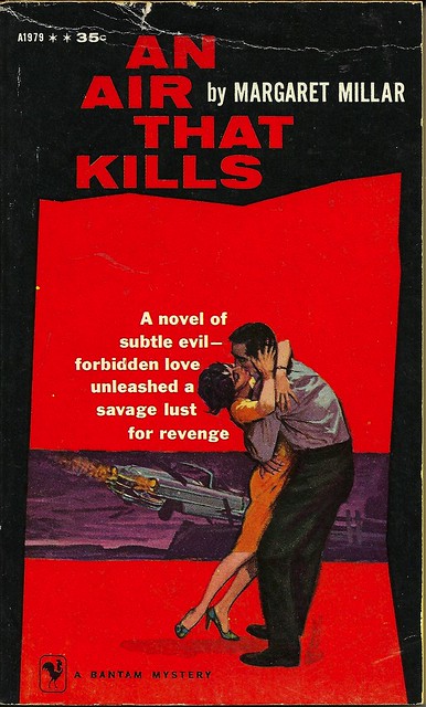
- An Air That Kills, eh? Well, I will say that a car plummeting off a cliff is an interesting way to represent a fart. Bold. I like it.
- That embrace is impressive in its awkward realism and urgency.
- Margaret Millar was a successful mid-century crime writer, married to Kenneth Millar (aka Ross Macdonald)
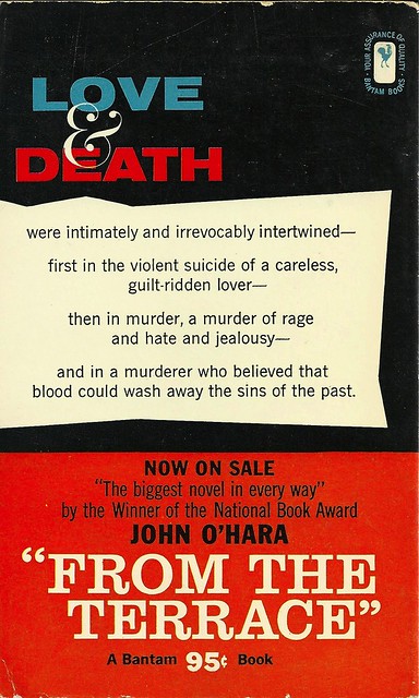
- That's a glamorous ampersand.
- Never did like giving over a third of the back cover to ads for other books. All space for art!
- I'm not sure what's going on with these vaguely rectangular shapes that look like imaginary U.S. states (see white block here, red block on front cover). Odd aesthetic choices.
Page 123~
Harry wiped his face on a corner of the bed sheet, then held it against his mouth to stem the flow of hiccoughs. "My head hurts. I broke something. Did I—broke something?"
I like Harry. Harry seems nice.
~RP
[Follow Rex Parker on Twitter and Tumblr]


3 comments:
One of her best books, I think. Recommended, which is why I point out that the woman depicted should be a heavy blonde. Don't like the idea of a reader wondering when the svelte brunette is going to appear.
This is why I'm glad you're doing this rather than myself. I saw the car and went with the obvious phallic symbol w/ejaculate, never bothering (in my own half-assed way) to get the tie-in with deadly air. Of course it's a fart.
Not quite on topic here, but Harper Collins is releasing a set of Neil Gaiman paperbacks with brand-new McGinnis covers. The man just turned 90 a few months ago and is retired, but was intrigued by the commission and took it. Apparently each book looks like it's from a different era and they brought in a top comic letterer to design fonts for each one. American Gods is out now(ish) because of the high demand coming out of ComicCon and it's very early 70s.
Gaiman discusses the whole thing here.
Post a Comment