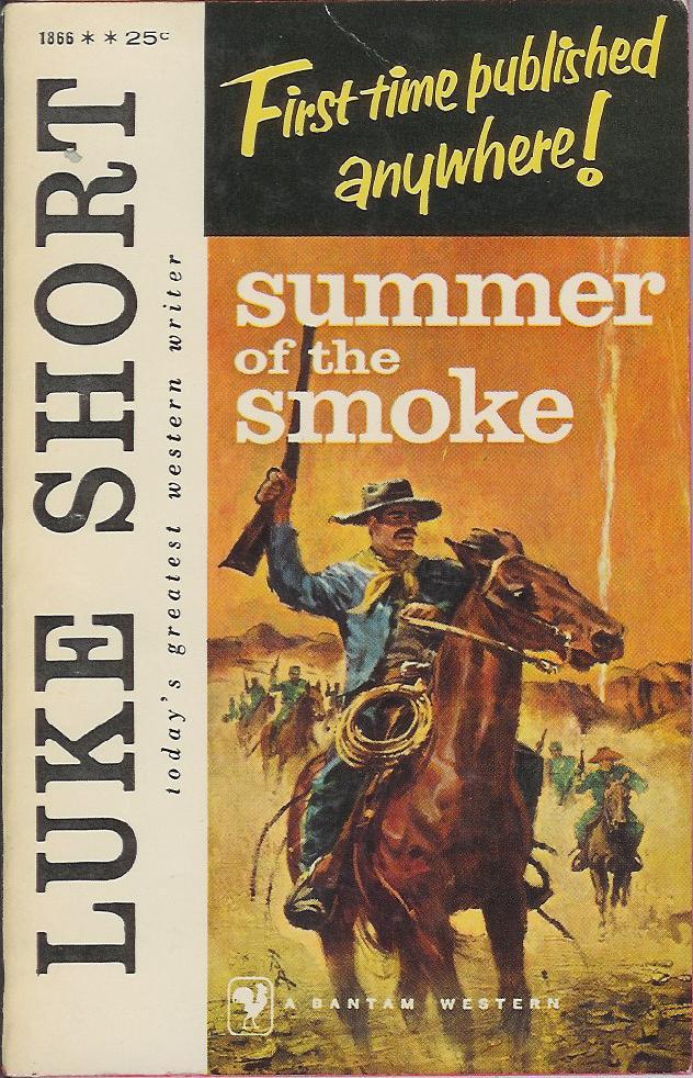
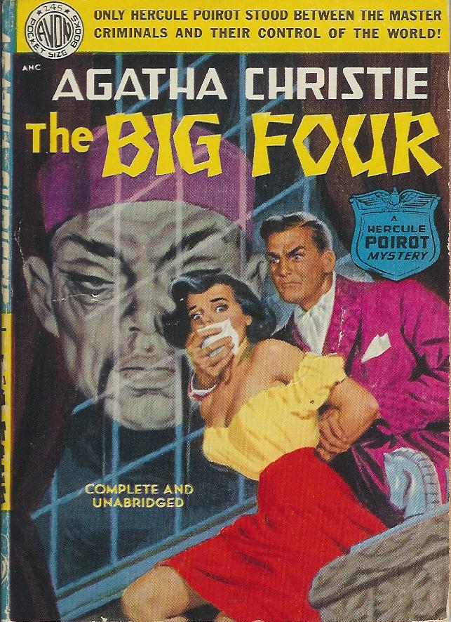
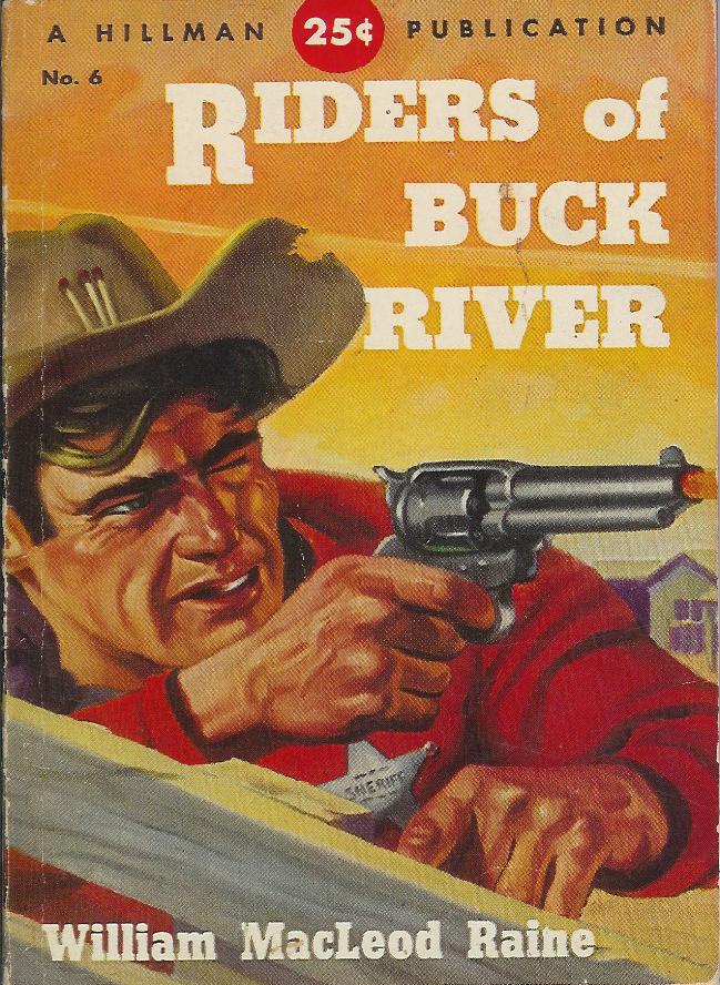
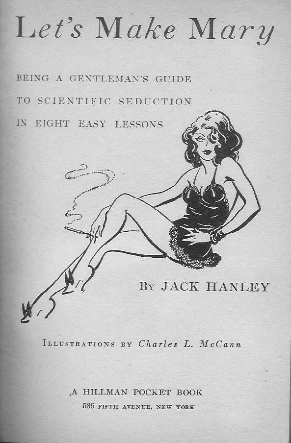
Wednesday, October 31, 2007

Paperback 39: Ace D-478

Paperback 39: Ace D-478 (PBO, 1960)

Title: Spacehive
Author: Jeff Sutton
Cover artist: Uncredited


"Hi honey, it's me. Yeah, can you tell me how to hold these compass thingies again? I'm pinching it between my thumb and forefinger while holding it in midair, but nothing seems to be happening. Uh oh, I gotta go. A miniature Soviet fighter just threw a gigantic numbered spider web over me. I'll see you tonight." [click]


Mmmm, Space Race anxiety. Thank you, Sputnik!

RP

Monday, October 29, 2007

Paperback 38: Pyramid G-665

Paperback 38: Pyramid G-665 (PBO, 1961)

Title: The Ghoul Keepers
Editor: Leo Margulies
Cover artist: John Schoenherr

Yours for: $11


Best things about this cover:
  • So red
  • "I am the eye in the sky, / Looking at you -ou -ou, / I can read your mind..."
  • What kind of title is The Ghoul Keepers? Is it supposed to be a pun on "Goal Keepers?" I hope there is at least one story in here about monsters who play soccer.
  • There is nothing recognizable in this cover painting except the supremely miserable man (possibly bleeding from his eyeballs) who is about to impale himself on the spear-like branches.
  • That man is clearly damned - he has been cursed with an obscenely long thumb on his right hand ... and an exoskeleton.
  • "Seabury Quinn" is the most made-up-sounding name ever ever. Ever. Actually, it's just the "Seabury" part. Unless you are a racehorse, that is not an acceptable name.
This book is so beautiful. I wish you could see it in real life. Pristine. Unread. The kind of book collectors dream of. Several of the featured writers here are top-notch - the top three on the list, specifically. One of my students, whom I'll call Cindy Loo Hoo, is writing her Honors Thesis on short horror fiction. She will undoubtedly want to look at this book. But I am too neurotic a collector freak to let her actually read it.


Best things about this back cover:
  • Here we see the man falling in the opposite direction. And in black-&-white. How interesting.
  • I actually love the cheeky reference to "The Shadow" in the footnote.
  • Answers to the quiz:
1. Mermen
2. Sasquatch
3. a vampire (trick question)
4. Caspar
5. that quiet guy next door
6. Betty & Veronica

RP

Sunday, October 28, 2007

Paperback 37: Doubleday (unnumbered)

Paperback 37: Doubleday (unnumbered) (PBO promo, 1984)

Title: And All Through the House
Author: Ed McBain
Cover artist: Uncredited


"Hello, and welcome to the 87th Precinct. May I help you? ... Yes, I am aware that I am a sheep. What is your point? Baa."

This story was originally published in "Playboy," as far as I can tell. Why individual copies were made and circulated, I don't know. This little paperback version of the story was certainly never for sale - though a far more elaborate, hardback, slipcase edition did sell in bookstores (I own a copy of that too, because I am a book nerd). Did I mention that this book is signed by the author? Well, it is, which is surely the only reason I bought it in the first place (for $9.50 - I've got it priced at $40).


Ed McBain is the most famous pen name of Evan Hunter, a major crime fiction writer whose career began in the height of the paperback revolution (1950's). He wrote under his own name and also many pseudonyms, including most notably Ed McBain and William Marsten. He died in 2005. I have many Ed McBain / Evan Hunter / William Marsten novels in my collection. Stay tuned.

RP

Friday, October 26, 2007

Paperback 36: Gold Medal K1344

Paperback 36: Gold Medal K1344 (3rd ptg, 1963)

Title: Go Home, Stranger
Author: Charles Williams
Cover artist: Uncredited

SOLD 9/18/10


"Back off, ladies! This shirtless swamp drunk is mine!"

Or, how 'bout:

"Go home, stranger! - or I'll drag your shirtless ass home!"


Why not invent your own caption and / or imaginary dialogue.

RP

Thursday, October 25, 2007

Why Book Sales are Like Crack Dens To Me, Part 1

I spent much of the last year getting rid of books - giving them away, throwing them away, recycling them, cutting them up to make art, etc. I just had too many. And I vowed not to acquire anymore books unless they were a. beautiful, or b. written by someone I really wanted to support with my $.

But those vows were made before I encountered the latest University Book Sale, at which point they immediately went out the window. I actually paid money (well, technically my student paid for me... we'll call her "Dondie") to get into the sale, and then got first crack at a ton of books - fiction, instructional, other, etc. I immediately went into super-consumption mode, as nearly every other cover called out to me with its cheesy greatness and awe-inspiring improbability. I am sitting here at my desk with "Dondie" right now - she actively encouraged me to buy many of the following. That's what they call an "enabler." What did I pick up? OK, Where to start ...?

Henry Bridgman, How To Make an Oboe Reed (PBO, 1987)
Cover artist: Some clip art genius


  • I don't know why, but I know that someday this book will come in handy
  • Did you know, and I quote: "The tip is where most of the action is"? Damn, this is hot. And useful.
  • "We are assuming a finished tip length of 4.5mm." Dondie says: "Whoa, low standards!"


  • Woo hoo, First Edition!
  • Dondie says: "I was four when this came out!"
  • Not only did Henry Bridgman write the book ... he then mailed it to himself.

John Updike, Bech: A Book (1st ptg, 1971)
Cover artist: Arnold Roth


  • "Bech, A Book, A Female Book..."
  • More like "Blecch: A Book" [HA ha, I kill me]
  • He has boobs in his hair. Furthermore, he has Boobs in his Hair.
  • Dondie says: "The nipples are ferociously red"
  • Head = phallus? scrotum? squash? zucchini?
  • I have to say, that is the most disturbing head in all of paperback cover art history - even more disturbing than ...

Lawrence Durrell, Clea (1st ptg, 1961)
Cover artist: Unidentified


  • This, my friends, is the Original Floating Head, in that it is LITERALLY FLOATING. In water. Ur-Floating-Head. Totally scary / haunting.
  • The floating head that ate Beirut! Run, women in burkhas, run! The blonde lady is hungry!
  • Dondie says: "You'll never understand .... Clea ... my love [kisses book]"

Edwin Newman, Sunday Punch (1st ptg, 1980)
Cover artist: "Paris"


  • That can't be good for your back.
  • Dondie says: "He farted in the martini ... fartini."
  • Dondie says: "His grimace has an 'I wanna do you / I gotta poop real bad' quality."
  • This is my second "Person-in-a-cocktail-glass" book cover, if you can believe that. Here is the other one. This Sunday Brunch one is far less hot.
  • There is something very wrong about the olive.

"The Walking Asparagus" - "So powerful that he can make your pee smell funny just by looking at you."

James Salter, Solo Faces (1st ptg, 1980)
Cover design: Neil Stuart
Cover photograph: Christina Rodin


The story of the gigantic nose that climbed the Swiss Alps.

And, lastly for today, a gem:

Joan Oppenheimer, Which Mother Is Mine? (PBO, 1980)


  • Novelization of an ABC Afterschool Special! Awesome!
  • Starring Blind Mary from "Little House," and My all-time TV mom crush, Mrs. C from "Happy Days."
  • Is Mary blind in this show too? Is that why she is looking at nothing in particular and using her hands to communicate with Mom 1? It's so "Miracle Worker."
  • Dondie says: Awesome photograph. Mom 2 is so sickened by Mom 1: "I'll kill you, bitch! She's mine!"
  • Dondie also says: Ugliest dress ever. It's a wonder either of them wants to be her mom.
  • I say: I think this is actually an Ugly Dress Pageant, and these are the three finalists. Mom 1 is doing that fake hand-holding "I hope you win" thing that pageant finalists do to fake support each other before the winner is announced.

More - much more - to follow.

RP (with Dondie)

Wednesday, October 24, 2007

Paperback 35: Perma Books M-3036

Paperback 35: Perma Books M-3036 (1st ptg, 1956)

Title
: Visa to Death
Author: Ed Lacy
Cover artist: Robert Maguire


Best things about this cover:
  • Original title = "The Best That Ever Did It" - not sure "Visa to Death" is much of an upgrade
  • I like when cover copy sounds exciting, but, on a literal level, actually makes no sense
  • Is that a gun or a trick lighter?
  • Fedora McTrenchcoat and Drunky Shirtsleeves are perfect meat for the sideways-glancing red-mouth twins
  • Visa-face looks like he's got "Photograph of beaver" written over his head
I hope you can tell from the many covers you've seen so far that, whatever this cover's faults (and there are several), this artist is a master. Robert Maguire is the Caravaggio of paperback cover artists. His people - their faces in particular - seem to be alive, seem to suffer (however melodramatically). Now it's true that the women here seem to be sharing one face between them, so maybe there's not the range or variety one would hope for, but still; I find the artistry here a clear cut above the average covers we've been seeing. Incredibly fine detail combined with a suppleness that makes the whole shebang (even this crowded, oddly-laid-out shebang) very visually compelling.


Best things about this back cover:

  • Can we call it a "Floating Head" if it's got no scene or landscape or hapless soul to "float" over? Judges say ... yes.
  • Nice justaposition of "Double" and "Single" (here, nice = stupid)
  • "Whistle up the murderer"? - Like "[whistle], come here, murderer!" Or "[whistle], lookin' good, murderer!" ???

RP

Monday, October 22, 2007

Paperback 34: Signet 1724

Paperback 34: Signet 1724 (PBO, 1957)

Title: Triple Slay
Author: Adam Knight
Cover artist: [Robert Schulz]

Best things about this cover:

  • Yesterday, I said I'd buy pretty much any vintage paperback that featured a girl with a gun on its cover. I'd like to expand that claim to include girls with knives or other assorted weaponry.
  • She's really holding that knife in the jabby / kill position. Not fooling around...
  • Why do I find her completely unsexy?
  • Unless this novel involves baseball, that title is terrible.


Best things about this back cover:

  • God, the copywriter really goes on a cliché bender in that second paragraph. I also love how much mileage (and perhaps joy) said copywriter is getting out of the "[pregnant pause] MURDER!" line...
  1. "The beautiful brunette has a face and figure that could send a man ... to murder." (front cover)
  2. "LIGHTS ... CAMERA ... MURDER!!!"
  3. "... he discovers that a killer is setting the stage - for murder."
  • "Mari Barstow" ... "Steve Conacher" ... these names are almost as bad as "Barr Breed." Clearly I need to start a running list of the Most Ridiculous Character Names in my collection. I'll get on that soon.
  • What's a "TV singer?"
RP

Sunday, October 21, 2007

Paperback 33: Signet G2569

Paperback 33: Signet G2569 (5th ptg, 1964)

Title: The Body in the Bed
Author: Bill S. Ballinger
Cover artist: Mitchell Hooks

"I said 'Queen Size comforter,' you fool, not 'King!'"

Best things about this cover:

  • False advertising - Technically she's by the bed, not in it.
  • If the cover features a girl with a gun, I buy the book. Almost without exception. Hence my purchase of a 5th printing (!?).
  • Whoever wrote the cover copy has a very tin ear: "When she was alive she was dangerous ... but when she was dead, she was dynamite!" - that's how a pro would have written it. This version clunks / sucks.
  • "SEASON'S TASTIEST DISH" - Hey, S.F. Chronicle: what season!? Autumn? Easter? Hannukah? Could you not even afford to print the definite article?
"Did you think you could get away from me just by turning the book over?! Silly man..."

Best things about this back cover:

  • In case you didn't get enough sickly aquatic-colored comforter on the front cover: reprise!
  • "... favorite pipe and slippers"?? Somehow this image of domesticity doesn't quite seem to go with the idea of banging your secretary.
  • "Barr Breed!" - Awesome. You couldn't invent a cheesier P.I. name if you tried. Go ahead, I dare you. The only thing better than that name is the use of "private eyes" as a verb!
  • "... a disappearing lucky charm" - I wonder if it was the green clover or the blue diamond...

RP

Friday, October 19, 2007

Paperback 32: Dell 144

Paperback 32: Dell 144 (1st ptg, 1947)

Title: The White Brigand
Author: Edison Marshall
Cover artist: Uncredited


Best things about this cover:
  • From the man who brought you "Great Smith" (seriously - same guy) comes ... "The White Brigand!"
  • This book raises the question: What color are brigands normally?
  • This novel appears to be set in China somewhere. I wonder how the natives will be depicted by Mr. Marshall. Hmm ... let's see. Just opened this book to a random page and the first word I saw was: "slant-eyed." Nice.
  • You don't really see the word "Brigand" much these days. I always thought it meant someone who is lawless, violent, at least vaguely piratic - yes, a member of a band of thieves.
  • The floating, glowing, jade pseudo-Buddha alien tiki is more than a little disturbing. First, he has jointless, perhaps even boneless limbs. Second, he has the world's shortest pigtails. That, or his head has both a positive and a negative terminal. Third, he appears to be made of plutonium. Fourth, his toothless grin will haunt my dreams tonight and possibly forever. I could go on.

Best things about this back cover:
  • This is the first of many Dell "mapbacks" that we will see over the course of my paperback project. All early Dell paperbacks (or nearly all) featured a map on the back cover that depicted some scene in the book. This one is pretty crudely drawn, as mapbacks go, but it's still cool.
  • Any book that features both a "reliquary" and a "chasm" can't be all bad, I say.
  • Do we really need to be told that that is a "cliff?"

RP

Wednesday, October 17, 2007

Paperback 31: Bantam 1679

Paperback 31: Bantam 1679 (1st ptg, 1957)
Title: Pal Joey
Author: John O'Hara
Cover artist: Barye Phillips


Best things about this cover:

  • Ring-a-ding-ding, this cover rules in every way.
  • Not the greatest likeness of Frank, but cool nonetheless.
  • Love the cover design - the font, the colors - and love the cocky pose Frank is striking.
  • Even the inside of his trench coat looks cool.
  • I wanna be a "two-bit nightclub heel"! That's a great phrase. Considering that one of my students today sent out a message to the entire class (240 students) saying that I am ugly and look like a monkey ... I would love to be called a "two-bit heel" right about now.

Best things about this back cover:

  • More great design. Love the colors, and the circles diminishing into the background. The chick in fishnets with her hips thrust forward isn't bad either.
  • World's tiniest movie stills.

RP

Monday, October 15, 2007

Paperback 30: Bantam F2817

Paperback 30: Bantam F2817 (1st ptg, 1965)

Title: 13 French Science-Fiction Stories
Editor: Damon Knight
Cover artist: Uncredited

Best things about this cover:

  • I think I had a dream like this once.
  • How can so much skin be so unsexy?
  • "... when French l'amour meets science fiction" = "When French 'the love' meets science fiction" = corny and stupid.
  • "It's the story of a voluptuous naked cat-woman who shoots a rocket out of the back of her head in order to keep a horde of flying sun-angels from stealing her newspaper, and the nearly nude one-armed bald chick in diaphanous tatters who turned her back on the whole ordeal."

Best things about this back cover:

  • If the giant fonts here are to be believed, the French are known for two things: love and wackiness
  • "From the land of Zola and Maupassant ..." - like it's some exotic, far-off world. I like that they chose the authors with the most science-fictiony-sounding names. Zola was a favorite of the mid-century paperback world because he had literary credibility but was also, you know, a little dirty. His paperback popularity in the 40s and 50s is actually pretty remarkable. I have many Zola works in my collection, many of them with lurid covers. The paperback industry could make just about anyone seem like a dirty writer if it wanted to.
  • Why are the three lines in the middle of the page in different colors? Somebody really needed to keep a tighter rein on the design team here.
  • "They gave the world Jules Verne" - perhaps the weirdest claim that's ever been made about the French. "Please, take Jules Verne. We no longer have any use for him."
  • "Imaginative" spelled backwards is Evita Nigami
  • Writing "Imaginative" backwards is not terribly imaginative

RP

Sunday, October 14, 2007

Paperback 29: Dell D209

Paperback 29: Dell D209 (1st ptg, 1957)

Title: Paths of Glory
Author: Humphrey Cobb
Cover artist: Walter Brooks

Best things about this cover:

  • Ugly, pseudo-abstract expressionist cover - though if you look closely, you can see that there are actually little people in the painting: soldiers scampering up a hill. All the gorgeous cover paintings that go uncredited ... and yet this cover somehow merits an artist credit. Life is unfair.
  • Lack of sensationalist cover art, plus 35-cent cover charge, plus blurbs from nearly reputable newspapers, let us know that this is "serious" literature.
  • This is our first movie tie-in - a very collectible subset of vintage paperbacks. Though it's nowhere mentioned on the book, Paths of Glory is directed by Stanley Kubrick (one of his first major films - 1957). The novel is not lying when it tells you that the film is "great."

Best things about this back cover:

  • The stony mug of Kirk Douglas!
  • I wish I knew what "it" was in that blurb by "The Nation" - I'd hammer my students for leaving the referent so ill-defined.

RP

Saturday, October 13, 2007

Paperback 28: Signet Y6638


Paperback 28: Signet Y6638 (1st Signet, 1975)

Title
: The Big Gold Dream
Author: Chester Himes
Cover artist: Uncredited

Best things about this cover:
  • Orange!
  • "Starsky and Hutch"-era font - and fashion!
  • Somebody needs to tell the white woman in the bra and panties that a back alley is no place to play leap frog.
  • Chester Himes rules - despite being a mid-70s reprint, this book is reasonably valuable, both because Chester Himes is the most important black crime fiction writer of the 20th century (sorry, Walter Mosley) and because this particular incarnation of Himes' work is hard to come by.
  • This cover is poorly designed - sometime starting in the late-60s, you begin to see these covers where a single realistic scene gives way to a composite montage, where lots of different pictures are crammed together into a kind of blob in the middle of the cover. Somebody's (bad) idea of artistic. Check out how this cover gets all abstract expressionist toward its edges - like it was finished by Rothko or Rauschenberg.
  • Yet another floating head - this time, an oddly benevolent-looking, kerchiefed young lady is preparing to devour Harlem.
RP

Friday, October 12, 2007

Paperback 27: Bantam 1866

Paperback 27: Bantam 1866 (PBO, 1958)

Title: Summer of the Smoke
Author: Luke Short
Cover artist: Uncredited (but there appear to be initials under the rider's right foot)


Best things about this cover:

Well, they can't all be gems. Still...


Yes, that's it. They've even got the same mustache!

Luke Short is one of the most popular western writers of the 20th century, and from what I can tell, he was pretty competent. This is a PBO (paperback original), which means that it came out originally in paperback (very rare these days, though reasonably common in the 50s). Look how excited the publishers are to tell you that this book is in print for the first time: they even brought out the whimsical excited handwriting font: "First time published anywhere!"

The fact that it's a Luke Short PBO is probably the only reason I bought this book, and I probably didn't pay more than a buck for it. The unusual segmented cover design made it desirable to me as well. Though I've featured many westerns so far from my collection, don't get the wrong idea: I don't really care for westerns, and westerns make up only a small fraction of the collection as a whole. We're simply in a particularly cowboy-ish patch right now.

RP

Thursday, October 11, 2007

Paperback 26: Avon Books 245

Paperback 26: Avon Books 245 (1st ptg, 1950)

Title: The Big Four
Author: Agatha Christie
Cover artist: Uncredited


"Steve Manley really, really hated to lose at chess..."

Best things about this cover:

  • The Floating Head of Fu Manchu! - and check out the Asian-y lettering on the title. You can almost hear the gong.
  • Chloroform - you don't see that on paperback covers nearly enough. Usually it's all guns and knives with these guys. Nice to see someone mixing up the violence.
  • Again, I have to ask, who dresses these people? She's decked out for some kind of fiesta, while he appears ready for Jeeves to bring him his pipe.
  • A pinkish robe with quilted cuffs and collar? And a white handkerchief with matching ascot? His far-off gaze suggests he's being controlled by the Floating Head of Fu Manchu. Maybe he's chloroforming the woman because she dared mock the fancy bedtime garb that is sacred to the Head.

RP

Wednesday, October 10, 2007

Paperback 25: Hillman 6

Paperback 25: Hillman 6 (1st ptg, 1948)

Title: Riders of Buck River
Author: William MacLeod Raine
Cover artist: Uncredited

Best things about this cover:

It's a pretty generic western cover, except...

I love the bullet whizzing through the brim of his hat. If I had to judge by this picture alone, I would say that this man is a dead man. He appears not to know all the rules of a gunfight.

First rule of a gunfight: wear your matches on your head - check!

Second rule of a gunfight: find cover - this man has absolutely no protection. He appears not even to know that for protection, the fence needs to be between you and your would-be assailant.

Third rule of a gunfight: hold your gun properly - first of all, I have no idea what kind of stance he's in, or what he thinks he's doing with his left arm. Second, my theory is that he's not actually squinting with his right eye in order to aim; I think he lost his right eye the last time he tried to fire a gun while holding it six inches from his face.

Fourth rule of a gunfight: make sure your gun is of the bullet-shooting and not the orange popsicle-shooting variety.


The back cover is not really interesting except for its obsession with hyphenated words. If we were to judge the book just by these words, then we'd have to conclude that it's a book about rip-roaring, fast-moving, hard-bitten, small-time cow-punchers and old-timers.

Check out the final sentence:

"The story of the settlement of the difficulties is thrilling told." [sic!]

Note, if you are writing an allegedly action-packed story, you might want to avoid the "Noun-prepositional phrase-prepositional phrase-linking verb" construction. Not too ... thrilling. Also might want to familiarize yourself with the concept of the adverb.

RP

Tuesday, October 9, 2007

Paperback 24: Hillman 1

Paperback 24: Hillman 1 (1st ptg, 1948)

Title: Let's Make Mary
Author: Jack Hanley
Cover Artist: N/A
"Interpretative Illustrations by...": Charles L. McCann

Yours for: $15


"Let's Make Sex As Dull As Possible!"

You wanted it, you got it: Let's Make Mary! This book is so mind-blowing, so implausible, that I'm going to have to go beyond the cover to the book's interior illustrations! I fear there is no way to convey the hilariously bizarre and surreal vibe of this book, but I will try...

Best things about this cover:

  • "Being a Gentleman's Guide..." - What kind of 18th-century syntax is that?
  • "Scientific" - The Kinsey Report had a Massive influence on public discourse about sex, starting in the late 40s, and this book's packaging is definitely a result of that influence. Basically, Kinsey gave scientific legitimacy to public discussions of sex, and paperback publishers exploited Kinsey's success by dressing up their silly sex books (especially novels) as public service / educational publications. This book knows that it's ridiculous (it's clearly intended as humor). Others (which we'll see later) don't seem as aware that their claims of scientific legitimacy are far-fetched and absurd.
  • Love the TV screen design. I would watch a TV show with that title, especially if it were some Cinemax After Hours remake of "The Mary Tyler Moore Show."
Best things about this back cover:

I can't even touch this. Nothing I say could out-funny the book itself. Instead, I'll just compile a "Best Words and Phrases on This Back Cover":

  1. layman
  2. chortle
  3. Jim Dandy Special mustache (that's a band name if I ever heard one)
  4. Fuddle-Duddle
  5. M'Little
  6. consort
  7. primal urges
And now, a special peek at a few of the "Interpretative Illustrations":


Why in the World wasn't this image on the cover!? Grrrrr...

"Oog" I buy, but "Ssskck?" Worst Cavewoman Name Ever.

Oog is the most disturbingly drawn male figure I've seen in a while. I'm just glad I can't see his face.
"Disturbing" doesn't even begin to describe this. I find myself wondering how the drink got spilled. Then I find myself not wanting to know.
"What's Wrong," you ask? Well let's start with the fact that your lady friend has No Nipples. Then there's the fact that she is a noseless space alien. Then there's your @#$#-ing top hat, you jackass. Your facial expression isn't helping matters either. Is that enough?

RP

PS sincere thanks to Bill Kristol and the folks at powerlineblog.com for plugging my site yesterday. Never thought my first major link would come from a political blog, but I'll take support wherever I can find it.

Saturday, October 6, 2007

Paperback 23: Hillman 18

Paperback 23: Hillman 18 (1st ptg, 1949)

Title: Collusion
Author: Theodore D. Irwin
Cover artist: N/A

Yours for: $12

Best things about this cover:

  • Jazz hands!
  • "What a scoop!" - that giant flashbulb is hilarious
  • That headboard! Where do you get something like that? Versailles? Goes great with the cheap red veloure bedspread and motel-grade bedside table and lamp.
  • Her hair! (so tightly coiffed)
  • Her eyebrows! (so highly arched / obviously penciled)
  • What's the story here? "Woman Found in Bed ... Alone!"


Best things about this back cover:

  • "... but divorces are made on earth?" Not where I thought you were going.
  • "Night years," cute
  • "A sincere plea for more liberal divorce laws" - 'cause nothing says "sincere plea" like a lingerie-laden paperback
  • Check out the other authors in the Hillman stable: lots of nobodies with three names ... and Balzac.

RP

Thursday, October 4, 2007

Paperback 22: Graphic 87

Paperback 22: Graphic 87 (PBO, 1954)

Title: Homicidal Lady
Author: Day Keene
Cover artist: Unknown

Yours for: $12


Best things about this cover:

  • More terrible cover art from Graphic. Her face is fantastic, but everything else is a complete mess. Smeary, indistinct, off-model. Plus, she has man hands. Homicidal ... Lady?
  • Why is there an old cheeseburger wrapper just inside her overcoat?
  • What is that arc by her face that kind of looks like a cross between a smudge and a dust bunny? Smoke?
  • The lettering on the title - again, it's subprofessional. Like an apprentice, or an apprentice's monkey, did the lettering
  • Lady on the cover looks just like Rita Hayworth in Gilda

RP

Monday, October 1, 2007

Paperback 21: Graphic Giant G-216

Paperback 21: Graphic Giant G-216 (1st Graphic ptg, 1956)

Title: The Private Life of Helen of Troy
Author: John Erskine
Cover artist: Unknown :(

Yours for: $8

Best things about this cover:

  • This is one of the worst cover paintings - in terms of pure artistic quality - that I've ever seen. Mucky, awkward, poor in detail. Just a mess. And yet...
  • Nice rack. Seriously. Her bangs are terrible, but her boobs ... are not. There is another, earlier version of this same book (which I own) that is famous for its "nipple cover" - but you'll have to wait for that one.
  • If the background is to be believed, Troy was destroyed by a nuclear holocaust of some kind
  • This is a wraparound cover, where the painting continues onto the spine and then the back of the book...


Best thing about this back cover:

  • First word: GAY!
  • Boats make every cover better
  • If I'm counting correctly, there are a total of 4 Helens on this book's front and back covers. That is almost certainly a record for appearances of one character on a single cover

RP