
Title: The Three Roads
Author: Ross Macdonald
Cover artist: Uncredited

Best things about this cover:
- The story of one woman's feverish nightmares about her missing pink pump with matching pom pon ("Rosebud...")
- Is this a picture of the "stolen passion" or the "brutal murder?"
- Why does her left leg disappear in a smoky mist? Did she forget to take something off the stove?
- Ross Macdonald was a writing star in the mystery world until he was caught using steroids. Now his name is forever haunted by the dreaded asterisk.
- I love the magical sheets, which defy physics in order to give her ass the barest of cover and thus prevent us from enjoying an unbroken line of head-to-toe nudity. Cursed sheets!
Best things about this back cover:
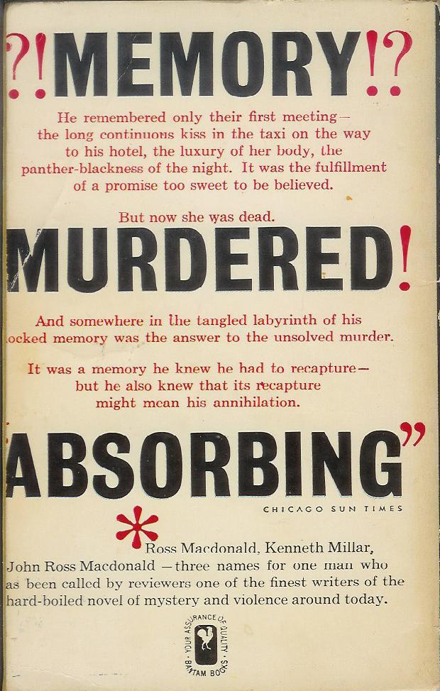
- If you liked this book, you'll love the sequel: MEMORY MURDERED ABSORBING!
- This is what a book looks like when it's designed by someone with a punctuation fetish. For god's sake, it's not Spanish - why are there punctuation marks before the word "MEMORY?"
Here we find out the real reason for the asterisk on the front cover. Kenneth Millar (his real name) wrote under his own name, then John Ross Macdonald, until John D. MacDonald started to make a splash, and then people got confused. This book was published at the height of that confusion, clearly. Eventually, he'd stick with Ross Macdonald (the first "d" is not capitalized). I have written about this guy. Spent days working through his correspondence and other papers at UC Irvine. The best time I ever had being an academic. It was like being ... well, a detective. Hot.
RP


2 comments:
Actually, in Spanish it would be:
¿!Memory!? which looks better - but obvious the cover designer doesn't care either about good design or proper punctuation.
--Tony
I think she's dead. That doesn't look like a natural angle for the neck to be in.
This is the first time I've seen text and footnote where the asterisk in both spots is larger than the letters in the words. What is that, a 96-point font for the top asterisk? That is out of control.
Post a Comment