Sunday, January 29, 2012

Paperback 494: The Meandering Corpse / Richard S. Prather (Pocket Books 50292)

Paperback 494: Pocket Books 50292 (1st ptg, 1966)

Title: The Meandering Corpse
Author: Richard S. Prather
Cover artist: Uncredited

Yours for: $8


PB50292.Meandering

Best things about this cover:
  • "I feel like I've got something on my back, but I can't see it, and can't quite reach it. Do you see anything?"
  • This is how they mark blondes after a flood so that you know there's no one left living inside.
  • I'll buy that she's a corpse, but I see nothing that suggests meandering. Primping topless while seated in a spotlight is not "meandering."
  • Shell Scott was so popular he got his own Head icon. He and Mike Shayne are the only dicks I can think of who got this honor, though I'm sure there are more.


PB50292bc.Meandering

Best things about this back cover:
  • You had me at "Zazu."
  • I did not know that birds climbed ladders.
  • I'm unsure of the implications of this conversation. Is he saying she oughta be 18 before skinny-dipping? Are women more inclined to skinny-dip as they get older? Shell seems oddly judgmental. Either that, or he just likes 'em a bit more mature. "Call me when you're 45, toots."

Page 123~

"I squeezed the steering wheel tight in my fists and jammed my foot down on the accelerator, jammed it all the way down and left it there."

"Must get home .... can't ... miss ... 'America's Next Top Model'!"

~RP

[Follow Rex Parker on Twitter and Tumblr]

Thursday, January 26, 2012

Paperback 493: Atoms and Evil / Robert Bloch (Gold Medal s1231)

Paperback 493: Gold Medal s1231 (PBO, 1962)

Title: Atoms and Evil
Author: Robert Bloch
Cover artist: Uncredited [Richard Powers?]

Yours for: $11


GM1231.Atoms

Best things about this cover:
  • I like how the title functions like a form-fitting dress on ... whatever that one-eyed creature waving its arms at us is. Now put an all-text dress on your average paperback cover girl, and you've got something.
  • There was probably a time when the title "Atoms and Evil" was evocative of ... something. Considering "atoms" are just the basic building blocks of, well, everything, the title doesn't have quite the situation-specific punch it oughta.
  • Is crazy multi-armed cyclops supposed to be some kind of anthropomorphic approximation of a mushroom cloud. More like a tree-trunk cloud.


GM1231bc.Atoms

Best things about this back cover:
  • Acrostic time!
  • OMG I *love* love love the test tube motif on the left. Brilliant design feature.
  • "Prefontal robotomy!" Rich.
  • If I had to read only two of these, I'd go with Vorm and Mr. Goofy, hands-down.

Page 123~

"I don't really want the world to revert to neurotic or psychotic behavior just so I can have a practice. But damn it, I can't stand to see the way things are going. We've done away with stress and privation and tension and superstition and intolerance, and that's great. But we've also done away with ourselves in the process. We're getting to the point where we, as human beings, no longer have a function to perform. We're not needed."

Anson's right. Futuristic dystopias are for the 'bots.

~RP

[Follow Rex Parker on Twitter and Tumblr]
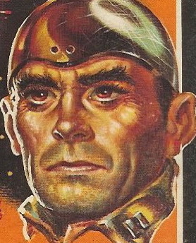
Sunday, January 22, 2012

Paperback 492: Alpha Centauri or Die! / Leigh Brackett (Ace 01770)

Paperback 492: Ace 01770 (1st ptg, 1970)

Title: Alpha Centauri or Die!
Author: Leigh Brackett
Cover artist: Uncredited [Carlos Ochagavia]

Yours for: $5


Ace01770.AlphaC

Best things about this cover:
  • "Uh ... I don't think they're home." "Did you ring the doorbell?" "Of course I rang the doorbell. What did you think, I'm just gonna stand here and ... wait, I hear something. Someone's in there. 'Hello! Hello?!'" "This is ridiculous. Who needs this much security?" "Don't be rude. 'Hello!' Maybe there's a dress code or something. I told you not to wear that stupid egg costume..."
  • Space Station Security—powered by Simon and some reel-to-reel tape.
  • I went through a Leigh Brackett phase in the late '90s, after I found out that she a. co-wrote "The Big Sleep" screenplay (with William Faulkner), and b. wrote the screenplay for "The Empire Strikes Back." She's a very competent writer who should probably be better known.


Ace01770bc.AlphC

Best things about this back cover:
  • Wow, that is some stain. I think that stain is now home to some microbial life forms. Appropriate for scifi.
  • I thought the dude's name was "To [rhymes with 'Bo'?] Kirby"
  • In space, no one can hear you complain about the tryranny [sic!]

Page 123~

They sweated it out crouched under their tarps, and after it was over they wallowed on through the mud to make a camp where they had stopped before, clear of the forest.  Damp and tired, they huddled around a hopeless little fire and chewed a cold supper.

Lollapalooza is the same no matter what planet you're on.

~RP

[Follow Rex Parker on Twitter and Tumblr]

Thursday, January 19, 2012

Paperback 491: 24 Hours to Kill / James McKimmey (Dell First Edition B169)

Paperback 491: Dell First Edition B169 (PBO, 1961)

Title: 24 Hours to Kill
Author: James McKimmey
Cover artist: Robert McGinnis

Yours for: $10


DellFE169.24hrs


Best things about this cover:
  • Dishevelment, thy name is this lady.
  • I like the double entendre of this title: "She had 24 hours to kill ... everyone in the room!"
  • Let me answer the obvious question: yes, Robert McGinnis painted everything in sight from about 1957-64. Every paperback cover, every magazine cover, every line on every freeway, etc.
  • Her slip is behaving oddly ... in relation to gravity, I mean. It's somehow coming together in a lacy, snowflaky formation to prevent us from getting the upskirt view we all so richly deserve.
  • Her smirk is killer.

DellFE169bc.24Hrs


Best things about this back cover:
  • Paradox! The back cover copy writer's second-best friend after HYPERBOLE!
  • I want a business card that states my occupation as "Killer-hero of the state's young punks."
  • "Teen-age" my eye. I mean, look at her feet. Those bunions say a hard-worn 28, minimum.

Page 123~

He blinked, stunned. Then he said, "I'll be right down, Rod." He hung up and picked up the machine gun. "Stay here, Sue. Lock the door and don't leave this office under any circumstance." He strode out and down the marble steps, trying to control the wild anger surging in him. . . .

I find that when I'm trying to control my wild, surging anger, I'm more often successful when I'm *not* holding a machine gun.

~RP

[Follow Rex Parker on Twitter and Tumblr]

Friday, January 13, 2012

The P. Morrison Donations #11: TCOT Demure Defendant / Erle Stanley Gardner (Cardinal C-323)

The P. Morrison Donations #11

Cardinal C-323 (2nd ptg, 1959)

Title: The Case of the Demure Defendant
Author: Erle Stanley Gardner
Cover artist: Charles Peitz


Card323.Demure

Best things about this cover:
  • Once again, the breasts act as if the dress weren't even there.
  • How much vaseline is on this lens? Everything looks like it's been coated in margarine.
  • "Sorry, your honor, I didn't hear you. I was just playing with these marionettes here, and, well ... yes, OK, I'll stop."
    That is one George Washington turkey leg tornado of blond hair.
  • This title reminds me that I get "demur" and "demure" confused, which may be why I never use either.


Card323bc.Demure

Best things about this back cover:
  • Fewer things are sexier than residuary legatees.
  • Mosher Higley, who earned his name for his exuberance at '90s punk concerts.
  • Erle Stanley Garnder has the signature of an insane person.

Page 123~

"The prosecution expects to prove that the defendant deliberately became a poisoner, a murderess, a blackmailer and became ensnared in the toils of her own iniquity."

Somehow "ensnared in the toils of her own iniquity" is a mess, metaphorically, but it's still awfully fun to say.

~RP

[Follow Rex Parker on Twitter and Tumblr]

Wednesday, January 11, 2012

The P. Morrison Donations #10: Tickets for Death / Brett Halliday (Dell 8884)

The P. Morrison Donations #10

Dell 8884 (1st ptg, 1965)

Title: Tickets for Death
Author: Brett Halliday
Cover artist: Robert McGinnis


Dell8884.TixDeath

Best things about this cover:
  • "Tickets for Death ... I mean Raffle! Tickets for Raffle. Forget what I said about Death. We are raffling off this lovely couch. You like?"
  • When throw pillows attack!
  • What is that amorphous green splotch in the right foreground? Another throw pillow (suspended in mid-air)? A very very puffy ottoman? The back of a man who is doubled-over and heaving on the carpet (head toward the center, out of frame)?
  • I love how she was clearly painted nude and then some purple came along and hopped on as a kind of afterthought. It's a rare evening gown that allows you to see every contour of the navel area.


Dell8884bc.TixDeath
Best things about this back cover:
  • So is that MAME or MAMIE, pronunciation-wise?
  • "This racket, she is encrusted with diamonds and rubies. You like?"
  • "But with a girl like Mayme, you just want her to shut the hell up and do the sex."

Page 123~

His belly shivered gently, like a protuberant bowl of jelly, each time he breathed.

A nice hard-boiled riff on "'Twas the Night Before Christmas"

~RP

[Follow Rex Parker on Twitter and Tumblr]

Sunday, January 8, 2012

The P. Morrison Donations #9: Blood on the Stars

The P. Morrison Donations #9

Dell 0626 (1st ptg, 1967)

Title: Blood on the Stars
Author: Brett Halliday
Cover artist: Robert McGinnis


Dell0626.BloodStars

Best things about this cover:
  • This is one of the most horrifying covers I (now) own. Seriously, every time I look at it I recoil in "oh my god" fright. It haunts my dreams.
  • It's like her face is floating, its spatial relationship to both the equine mass of hair and the torso seemingly coincidental. You know at, say, a carnival, when there are scenes painted on large pieces of wood and you can step behind them and put your face through a hole, and then your mom or whoever can take your picture ... whimsical stuff ... well, it looks like that's what's happening here, only for "carnival" substitute "utility closet in hell" and for "your mom" substitute "Satan himself." 
  • What. Is. The. Background? Cork meets mangled animal pelt meets feathers meets dirty rug meets barber shop floor sweepings meets sadness.
  • Was McGinnis depressed when he did this? Angry? Going through a bad break-up? All I know is: it's the ugliest damn thing I've ever seen. 
  • Lastly: where's the blood? Where are the stars?


Dell0626bc.BloodSt

Best things about this back cover:
  • Aaaagh. Jebus, quit scaring me like that, lady?
  • Good tagline, or Greatest Tagline Ever Written?

Page 123~
Shayne said, "Go ahead. And keep your mouth buttoned up. This is a Secret Service investigation."

"Secret Service? Jeez. Is he one of them communist spies or somethin'?"

"Something like that." Shayne stepped back and waited until the milk truck had made one more stop, then turned the corner.
Mike Shayne did not consider his morning complete until he had impressed at least one milkman.

~RP

[Follow Rex Parker on Twitter and Tumblr]

Friday, January 6, 2012

The P. Morrison Donations #8: The Seven Deadly Sisters / Pat McGerr (Dell 412)

The P. Morrison Donations #8

Dell 412 (1st ptg, 1950)

Title: The Seven Deadly Sisters
Author: Pat McGerr
Cover artist: Paul C. Burns


Dell412.7Deadly

Best things about this cover:
  • "Hey, man, have you ever looked at a spider web? ... I mean really looked at it man? ... it's crazy."
  • No matter how her more "modern" peers mocked her, Sheila preferred to ride her bed sidesaddle.
  • Honestly, this cover is a conceptual mess. I have no way of understanding how any of the parts (title, lady, letter, killer list) are supposed to relate to each other. It's like a grab bag of stock mystery features.


Dell412bc.7Deadly

Best things about this back cover:
  • Wow, this is the least ambitious mapback I've ever seen. Lazy-ass illustrator unintentionally invents the street-view map!

Page 123~
"The doctor says I'll get my full strength back. And if he touches my wife while I'm out here, I'll make what happened to him before look like a dress rehearsal."

Why do you continue to employ the services of a doctor who is hitting on your wife? Why!?

~RP

[Follow Rex Parker on Twitter and Tumblr]

Wednesday, January 4, 2012

The P. Morrison Donations #7: Steve Bentley's Calypso Caper / Robert Dietrich (Dell First Edition B182)

The P. Morrison Donations #7

Title: Steve Bentley's Calypso Caper
Author: Robert Dietrich (pseud. of E. Howard Hunt)
Cover artist: Tom Miller


DellFEB182.Calypso

Best things about this cover:
  • Quite a nice female figure, but unfortunately crowded and partially obscured by garish text.
  • Her hair is gorgeous, from a painting perspective. I mean, you wouldn't want hair that actually looked like that (the "color" alone is frightening), but that's some nice, fine, confident brushwork.
  • The more I look at that title font, the more it looks like it was created by a toddler with dull scissors. Terrible.
  • Who gets this made up and spangled while also getting practically naked? Seems like a lot of work.
    I should start tagging books that use the hackneyed "—to murder!" / "—of murder!" / "—by murder!" finish.


DellFEB182bc.Calypso

Best things about this back cover:
  • "They found the naked body of Victor Polo!" Oh sure, tease me with the near-naked body of that woman on the cover and then bait-and-switch me with the naked (and dead) body of some guy named Victor Polo. He's probably not even hot.
  • "And me, Steve Bentley." HA ha. Least meaningful name drop ever.  "And me—Steve Bentley ... [cough] ... [tumbleweed] ... you know. Steve Bentley! ... come on! ... [crickets] ..."

Page 123~
The bartendress uttered a laugh like the caw of a robber crow.
First, some words were not meant to have feminine forms. Second, I wondered for a split-second what a rubber crow was supposed to sound like.

~RP

[Follow Rex Parker on Twitter and Tumblr]

Monday, January 2, 2012

The P. Morrison Donations #6: Beware the Curves / Erle Stanley Gardner (Pocket Books 75598)

The P. Morrison Donations #6

Title: Beware the Curves
Author: Erle Stanley Gardner ("writing under his famous pen name A.A. Fair")
Cover artist: Well, hello there ... aren't *you* a tall drink of water ...


PB75598.Curves

Best things about this cover:
  • Sometime in the mid-60s, the quality of pb covers started to go downhill—art gave up its real estate to text, usually the author's NAME or a detective's NAME. Cover paintings get smaller and then eventually disappear, leaving only stock photos behind.
  • This cover is designed to do one thing: make you wonder "is that her nipple showing through the lacy dress, or just a shadow...?"
  • Gardner was exceedingly prolific and, in part because of that prolificness, artistically underrated. He writes a good story, and I prefer these Lam and Cool detective stories (for which he used the pseudonym "A.A. Fair") to anything else he did.

PB75598bc.Curves
Best things about this back cover:
  • What design! ... is what I'd say if I were looking at a different book. As I say, the '60s bring about the slow uglification of paperbacks until we're left with ... this.

Page 123~
She pursed her lips. "I can usually size up character," she said. "And if I can't, well, if anyone gives me a double cross, Donald, I'm ruthless, absolutely, utterly ruthless."

"Most women are," I told her, "but few of them admit it."
"Dames," he added with a shrug. "Whaddyagonnado? ... Seriously, what do I do? They keep walking away from me every time I try to talk to them. Ruthless bitches, why won't you talk to me!?"

~RP

[Follow Rex Parker on Twitter and Tumblr]