Monday, October 25, 2010

Paperback 365: Drawn to Evil / Harry Whittington & The Scarlet Spade / Eaton K. Goldthwaite (Ace D-5)

Paperback 365: Ace Double D-5 (PBO / 1st ptg)

Title: Drawn to Evil / The Scarlet Spade
Author: Harry Whittington / Eaton K. Goldthwaite
Cover artist: Norman Saunders / Norman Saunders??? (Uncredited)

Yours for: $65

AceD5.Drawn2Evil

Best things about this cover:
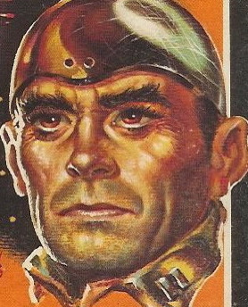
  • "Hey, tiger, whaddya think of this cami-" "Aw, shut yer yap, you loony dame!"
  • Hazel was afraid to tell Bill that his Vulcan salute still needed a lot of practice.
  • "Hey, babe, I just found a buyer for this stolen VHS tape I've got in my coat pocket! Gimme a high five! ... Up top? ... Aw, c'mon, don't leave me hangin', babe!"
  • "I will karate chop your ass, so help me God, woman!"
  • Norman Saunders was a cover painter in the great days of pulp fiction. His flair for the sensational and overdramatic is strongly in evidence here.

AceD5.ScarSpade

Best things about this back cover:
  • In my head, she is making the worst, whiniest, most horrible noise in her throat.
  • "Can someone please inflate the blow-up doll the rest of the way! Tom's gonna be here any second ..."
  • Are those gigantic ice cubes in the background?
  • "Nope, the spade's still black, sweetheart. Try again."
Page 123 (from The Scarlet Spade)~
Denver Calhoun's eyes smoldered in his broad, white face as he watched the full progress of O'Moriarty's exit.

So, some fat-faced white guy named Denver has the hots for some super-Irish guy. So what's new?

~RP

[Follow Rex Parker on Twitter]

Friday, October 22, 2010

Normal services will resume on Wednesday

Sorry for the lack of new paperbacks this week. I'm on Long Island, at Hofstra, where I just gave a talk about my beloved paperbacks, so I figure that's a pretty good excuse for the delay.

You can use this image to tide you over:


~RP

Sunday, October 17, 2010

Paperback 364: Cycle Fury / Reggie Car (Chevron 124)

Paperback 364: Chevron 124 (PBO, 1967)

Title: Cycle Fury
Author: Reggie Car
Cover artist: Uncredited

Yours for: $20

Chev124.Cycle

Best things about this cover:
  • They don't look very "frenzied." They look pretty laid back. I mean, that one dude us calmly enjoying a smoke. Also, it appears he bought his kelly green Nazi t-shirt at Old Navy. Old German Navy.
  • Take away the Nazi paraphernalia and the bike and put him next to Annie Lennox and the guy in the foreground really looks like Dave Stewart from Eurythmics.
  • That girl's outfit is kind of cute.
  • Is that a *black* Nazi biker in the background??? This must be from some future time when the Nazis get big into the idea of diversity.

Chev124bc.Cycle

Best things about this back cover:

  • Given the front cover, I would not have expected whatever kind of abstract painting is going on up top there on the back cover. The subtle interplays of blue and gray do not exactly scream "lust-crazed motorcycle gang!"
  • There's really no reason for type this tiny.
  • "Zipper Hardy" — is there a pun in there that I'm missing? Also, I think his description is missing a dash between "mob" and "and"...
  • "Ham!" That's the name of the "giant Negro!?" Oh, that's not racist at all.
  • If you merged "Cycle Fury" and the musical "Cats" into yet another musical, "Cycle Cats," I would be first in line to see it.
  • This back cover has the word "pedagogical" on it!!!!! I thought only academics who think the word "teaching" is too declassé used variations on the word "pedagogy." Now it appears those academics and trashy novels about Nazi bikers have something in common. Did Not see that coming.

Page 123~

Then she remembered the aphrodisiacally-centered cigarette she had shared with him.

I literally cannot pronounce "aphrodisiacally."

~RP

[Follow Rex Parker on Twitter]

Thursday, October 14, 2010

Paperback 363: Fantasy & Science Fiction (Oct. 1957)

Paperback 363: The Magazine of Fantasy & Science Fiction, October, 1957

Includes stories by: Fritz Leiber, Richard Matheson, Lewis Carroll, L. Sprague de Camp, Jane Roberts, Anthony Boucher, Poul Anderson, H.P. Lovecraft, etc.

Cover artist: Ed Emshwiller

Yours for: $20

F&SFOct57.EMSH

Best things about this cover:
  • ... featuring the controversial story, "Anorexic Chicken Whores of The Mogron Valley!"
  • Monster designs on this are Fabulous. Emshwiller is a cover art hero.
  • Trying to understand, from an evolutionary standpoint, why the bird (background) should require an oxygen helmet while everyone else apparently easily breathes the miasma of peach atmosphere. Also wondering why giant deformed Gumby monster should have to brush his teeth.

F&SFOct57bc.Bkclub

Best things about this back cover:
  • People were apparently Really excited about satellites in the late '50s.
  • We're not really comfortable using slang, so ... we'll just put "top-drawer" in quotations, so you won't think you're actually supposed to store the books in the top drawer of your dresser.
  • "Handsome, permanent bindings," to prevent annoying fall-apart.

Page 123~ (from "Full Pack (Hokas Wild)" by Poul Anderson & Gordon R. Dickson)

He was not a bad felino-centauroid at heart.

Can't believe that line is buried at the back of a F&SF Magazine. Should be the first line of some epic space opera.

~RP

[Follow Rex Parker on Twitter]

Tuesday, October 12, 2010

Paperback 362: Bury Me Deep / Harold Q. Masur (Pocket Books 558)

Paperback 362: Pocket Books 558 (1st ptg, 1948)

Title: Bury Me Deep
Author: Harold Q. Masur
Cover artist: William Wirts

Yours for: $20

PB558.BuryMe

Best things about this cover:
  • A quintessential keyhole cover (yes, it's a thing) — and an early one. Turns reader into an implied voyeur / peeping tom.
  • 1948 (or thereabouts) seems to be a turning point in cover art — covers start to become more sensational, more sexual, more lurid ... If you click on "1947" or earlier in the tags for this site (sidebar), you'll see what I mean. Not sure why 1948 should be that year [the year of the first Kinsey Report!] ... but by the '50s, lurid and sensational will be the norm.
  • I wish I could hear her undoubtedly learned disquisition on the merits of half-naked whisky-drinking.
  • That underwear looks painted on, like she was drawn naked but then repurposed for this cover.
  • Something about her face is off-kilter and strange, and her thumbless whisky-claw is mega-disturbing.

PB558bc.BuryMe

Best things about this back cover:
  • Even the tagline is sensational. Sweet.
  • "The lawyer in him" has the better cliché—hey, "inner man," who looks at a sexy woman in her underwear and thinks "gift horse!?"
  • "Newest detective sensation," HA ha. How did that turn out, Scott Jordan?

Page 123~

Another shot exploded. I saw a spurt of flame from the muzzle spit luridly into the darkness beside a tree not fifty yards away. I arched my back, screamed like a frightened horse, threw out my arms and tumbled drunkenly to the ground.

Mmm, manly.

~RP

[Follow Rex Parker on Twitter]

Sunday, October 10, 2010

Paperback 361: The Heart Is a Lonely Hunter / Carson McCullers (Penguin 596)

Paperback 361: Penguin 596 (1st ptg, 1946)

Title: The Heart Is a Lonely Hunter
Author: Carson McCullers
Cover artist: jonas

Yours for: $12

Peng596.HeartIs

Best things about this cover:
  • This looks like scraps from the picture file for a Monty Python animation sketch
  • A rebus! I love these. OK, I'm going to say ... "Your heart cannot soar if your hands are chained ... and a kid sells fruit." Powerful stuff.
  • Good example of the more abstract cover style of the '40s (jonas is legendary, and prolific)

Peng596bc.HeartIs

Best things about this back cover:
  • It's just a bio, so ... not much to say.
  • Interesting how much focus is on her apparently surprising ability to treat "Negro" characters as if they were (news flash!) human beings. I guess that's all just in the Wright quote, but it stands out.
  • This is my third "Heart Is a Lonely Hunter" cover. See also here and here.

Page 123~

Portia took up the Bible from the table in the center of the room. "What part you want to hear now, Grandpapa?"

"It all the book of the Holy Lord. Just any place your eye fall on will do."

~RP

[Follow Rex Parker on Twitter]

Friday, October 8, 2010

Paperback 360: The Big Bust / Ed Lacy (Pyramid X-2037)

Paperback 360: Pyramid X-2037 (PBO, 1969)

Title: The Big Bust
Author: Ed Lacy
Cover artist: F. Pfeifer

Yours for: SOLD! (10/8/10)

Pyr2037.BigBust

Best things about this cover:
  • [Insert joke about connection between title and woman's rack here]
  • For a woman who's tied up, gagged, and carrying a tiny drowning man in her stomach, she's awfully concerned about those guys behind her. Lady, you've got your own problems.
  • I have reluctantly tagged this post with "Redhead" label, though honestly I don't know what you call that color.

Pyr2037bc.Bigbust

Best things about this back cover:
  • Geek observation #227: "Supercharged" is just "surcharged" with "P.E." inside it. . .
  • So the woman is like good pancakes. Well, who wouldn't want to tail that?
  • If the boardwalk is "bikini-filled," does that mean the ocean is filled with naked women (who, presumably, all left their bikinis on the boardwalk)? I hope so.
  • One of these paragraphs should immediately be countered with "That's what she said!"

Page 123~

Walter awoke me at one-fifteen and watching for snakes, back of a crumpling wall, I changed into the woolen underwear and rubber suit, Rhoda's $60,000 bra doubling as a jock strap.

[Speechless]

~RP

[Follow Rex Parker on Twitter]

Wednesday, October 6, 2010

Paperback 359: The Drowner / John D. MacDonald (Gold Medal k1302)

Paperback 359: Gold Medal k1302 (PBO, 1963)

Title: The Drowner
Author: John D. MacDonald
Cover artist: Stanley Zuckerberg

Yours for: $25

GM1302.Drowner

Best things about this cover:
  • Lesson: brackish, green water—not for swimming.
  • Fantastically creepy cover. That dude pulling her down must have one powerful set of lungs. or SCUBA equipment.
  • Love the bubbles—nice touch to make sure they're coming from him (I assume it's a "him") as well as her. Also love the way the words cascade down the side of her struggling body. Accentuates the scary verticality of the whole cover.

GM1302bc.Drowner

Best things about this back cover:

  • This I like less.
  • Without the struggling lady to complement them, the vertically arranged words here just look stupid and purposeless.

Page 123~

If the fork hesitated on its way to the healthy mouth, it was a faltering so minor he was unable to detect it. But she looked considerably less friendly.
~RP

[Follow Rex Parker on Twitter]

Sunday, October 3, 2010

Paperback 358: The Heart Is a Lonely Hunter / Carson McCullers (Bantam A1091)

Paperback 358: Bantam A1091 (1st ptg, 1953)

Title: The Heart Is a Lonely Hunter
Author: Carson McCullers
Cover artist: Uncredited [faint signature on crease in bottom right corner looks like that of Mitchell Hooks]

Yours for: $8

Bant1091.HeartLone

Best things about this cover:
  • Wow, that guy is selling it. Least appreciative audience Ever.
  • I read this book twenty years ago and though I largely forget the plot I remember really liking it. I do, however, remember the first line, verbatim. "In the town there were two mutes, and they were always together." I think those are the mutes there: Tevye and the Undertaker.
  • Little girl demonstrates that peculiar paperback phenomenon whereby people appear to be looking at things they could not possibly see from that angle—that man is both behind her *and* blocked by a man's belly.
  • I like how the human beings are painted naturalistically but the surroundings are kind of surreal. I mean, look at that gray and white smear of a sidewalk. And that fire&brimstone sky.

Bant1091bc.HeartLon

Best things about this back cover:
  • "Easy, girls, there's enough of me for both of you."
  • LOVE her "Holy F*&^" expression.
  • Not generally a fan of the multiple-scene cover—pick a scene and depict it, dammit, don't try to cram so much action into such a little space. Here, however, the paintings are discrete enough, and large enough, that there's not the usual feeling of chaos.
  • No Pasadena Star-News blurbs here. All top tier publications.

Page 123~

"No. There was some definite thing you did that for. We been knowing each other a pretty long time, and I understand by now that you got a real reason for every single thing you ever do. Your mind runs by reasons instead of just wants. Now, you promised you'd tell me what it was, and I want to know."

~RP

[Follow Rex Parker on Twitter]

Friday, October 1, 2010

Paperback 357: Night Train / Kenneth Millar (Ross Macdonald) (Lion Library LL40)

Paperback 357: Lion Library LL40 (2nd ptg / 1st thus, 1955)

Title: Night Train
Author: Kenneth Millar
Cover artist: Samson Pollen

Yours for: $22

LL40.NightTrain

Best things about this cover:
  • I think there is a single scene in this book that is set in a jazz club. Why they have completely de-crime-fictionized this cover, I don't know ("A Bold Story of Fierce Desire"??), but I'm glad they did—the painting is fantastic: vibrant and chaotic. You rarely see a black woman in the position of sexy dame on these covers—very nice.
  • I like the guy right behind her—the guy you are very likely to miss if you're sucked into either the playing/dancing or the steamy glance between Ms. Bar Lady and Mr. Ne'er-Do-Well. The guy behind her—he's the one I want to know. He's either tailing that guy, or he's just thinking "Really? That guy? She must be working some angle..."
  • Love the guy in the foreground with the cigar! He is sooo happy to have that cigar!
  • What is up with the letter spacing on the tagline? Letters get closer together as title moves left to right. It's like a 3rd grader wrote it by hand and ran out of room as she approached the right margin

LL40bc.NightTrain

Best things about this back cover:
  • This is (pretty much) the cover of the original Lion edition of this book (which I own ... hey, wait, I've already blogged it—it's here! Check out the art parallels)
  • Ross Macdonald was (understandably) saddled with the "Chandler/Hammett" mantle early on in his career, and despite a period of phenomenal fame (peaking around 1970), he just wasn't the artist either Hammett or Chandler was, and hasn't had their longevity. I know I am in the minority here, but I'm not a big Macdonald fan; I especially don't care for the Lew Archer stuff. Archer's just a smarmy, dull, self-righteous Marlowe. A Not-Marlowe. A Marl-faux. Sadly, he's also the model for virtually every P.I. that came after him.
  • There is more than a "trace" of Freud in Macdonald's work; when reading Macdonald, I often feel like I'm reading a novel whose sole purpose is to illustrate some concept from Psychology 101. If I remember correctly, though, this pre-Lew Archer stuff is pretty tight and entertaining.

Page 123~

Mrs. Tessinger was extraordinarily vivacious. Her bosom seemed higher than ever, and her waist tighter.

That's a nice, lecherous eye the narrator has there.

~RP

[Follow Rex Parker on Twitter]