
Title: Fools Die on Friday
Author: A.A. Fair (aka Erle Stanley Gardner)
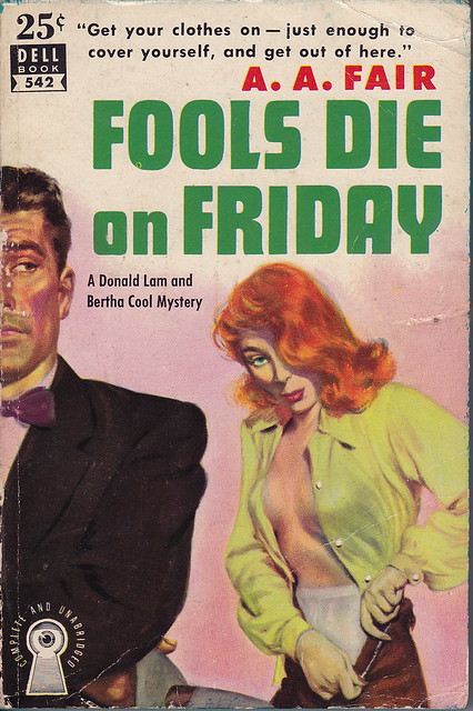
Cover artist: Robert Stanley
Yours for: not for sale (donation to the collection), but FYI, it's prolly worth about $30
- Reader K. Harvey was helping clean out the house of a friend's aunt and she came across a treasure trove of old paperbacks. She offered to send them to me. I accepted. So a couple days ago I got a box crammed full of Fair/Gardner books (as well as some Leslie Charteris / "Saint" stuff), all of which are in good-to-great condition. There must be 35-40 books in all. A generous donation, from which we will all benefit—I'll try to post all the covers here, sometimes 2 or 3 at a time (to highlight certain stylistic trends) over the course of the summer, while still moving steadily through my collection (don't want to overdose on Gardner).
- I lead with this cover because it is legendary. Future editions of this book will button her shirt and hide her panties, making her look far more elegant, far less slatternly. I.e. yawn. Behold:

- "... just enough to cover yourself ..." Well, I guess she's ready then.
- I love old half-face there on the left. In particular, his tie. And his eyes. He's doing that "I can magically see behind me" thing that people on paperback covers and in soap operas sometimes do. He looks like every man Robert Stanley ever drew, i.e. like Mike Shayne.
- If it weren't for the boobs, I'd have to say "cross-dresser."

Best things about this back cover:
- Mapback!
- "Real clues" — none of the fake stuff for us, thanks.
- BALLWIN looks allllll kinds of wrong.
- Love the building cutaway—like a giant just tore the top half of the apartment off.
Page 123~
She pushed back her stenographic chair, walked over to a shelf, whipped out a map, and placed it on the counter.
I am slightly in love with the phrase "stenographic chair," which I did not realize until just now was a thing.
~RP
[Follow Rex Parker on Twitter and Tumblr]


6 comments:
Why are her/his hands an odd color compared to the rest of her/his skin?
Also, those are the most unsexiest granny panties.
"He looks like every man Robert Stanley ever drew, i.e. like Mike Shayne."... i.e. like Robert Stanley. He was forever painting his wife and himself onto book covers. (not his wife in this case, unless she went downhill fast).
Not only do I echo Random White Guy's comments, but her claw-like man-hands freak me out.
I have a feeling almost everyone wore granny panties back then. Not that I'd know for sure, but it just seems that women's underwear has gotten so much better in the past 30 or 40 years....
And those are some seriously narrow hips. Those are, like, Kate Hepburn hips.
There was a reason they called them "foundation garments". Seriously not sexy. It doesn't help that she looks like she has tuberculosis or a meth addiction or maybe both.
The guy is great, though. I'm pretty sure I have some 60s/70s era SF covers with him on it making exactly that face. Probably humorous stuff like Keith Laumer or Ron Goulart. I wonder if that was Stanley or just somebody he influenced.
Yes sir, that is one seriously unattractive lady-face. World's longest upper lip too. Bleh.
Post a Comment