Paperback 1092: Avon 20 (PBO, 1942)
Title: The League of Frightened Men
Author: Rex Stout
Cover artist: I.N. Steinberg
Condition: 6.5/10 (well worn but tight and sturdy)
Value: $25
- That's a honey of a cover, Mrs. Dietrichson (since this lady's hair is almost as bonkers as Barbara Stanwyck's in Double Indemnity, I had to make the reference; had to)
- Lacquered. That is how I believe you'd describe ... well, everything about this woman. Those eyebrows are ready for battle. And that is the side-iest sideeye I ever saw. Lethal.
- Dig that spooky, wavy title font. Man, they do not make 'em like they used to. This is a swell-looking book, stem to stern
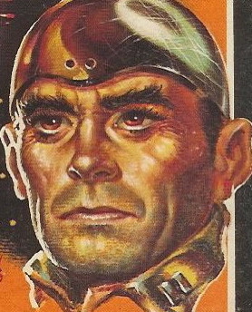
- Floating heads! I live for the floating heads motif, especially when the woman surrounded by the heads is completely untroubled by the heads, like "what do you suckers want?" See also ...
Best things about this back cover:
- Meh. Your standard Shakespeare-head stuff. Boilerplate.
- "Shakespeare! Get yer hot pink Shakespeare, here! Just two bits!'
- "GOOD BOOKS" but merely "Great Authors"; even capital letters were subject to war rationing
- Wait, did books used to be hard to open??? "How do you work this thing!!?"
Page 123~
"For God's sake keep still. Don't move your head." I looked at Wolfe and said, "Somebody's tried to cut her head off. I can't tell how far they got."
She spoke to Wolfe. "My husband. He wanted to kill me."
Well, she's talking, so as attempted beheadings go, you gotta put this one down as a failure. Still, she does bleed every time she moves her head, so it had dramatic results, at least. I found the last Stout I read (Fer-de-Lance) a little (lot) ridiculous, despite the great characterization, but I gotta say this p. 123 bit has got me re-interested in Wolfe World. Might give it another go.
~RP


4 comments:
I collect baseball cards. The 'floating heads' genre is a favorite of mine.
Floating heads are great, but some of these guys seem insufficiently frightened. Bottom left is giving his own side-eye while the dame is looking the other way, and I have no idea what top left is thinking.
The wavy title font is good, but there are three other fonts here and that's too many. Author and publisher seem to be the same font, but it's not the same or a chunkier version of the font that "A Nero Wolfe" is in. I guess I'm mostly bugged by "Mystery" being in that cursive font. Doesn't fit. Also, why is it on a police badge?
I guess that's supposed to be Shakespeare on the back (Avon, right?), but it doesn't look much most depictions of him. Doesn't look like any of the usual suspects claimed by those who say Willy the Shake didn't write his own material either.
And, yeah, books were hard to open. You had to break their spines to be able to read the half of the page near the gutter. When they said "crack open a book," they meant it. I think Avon is claiming it's easier to get their books open wide enough to read properly that those of their competitors.
I'd definitely give Wolfe another try. Yeah, Fer-de-Lance's plot is a bit goofy, but I think you'd enjoy some of the later novels. I've read them all. :) "Black Orchids" and "Some Buried Caesar" are a couple of my favorites.
You might want to check out the floating heads group on Facebook Rex.
It's right up your alley.
Post a Comment