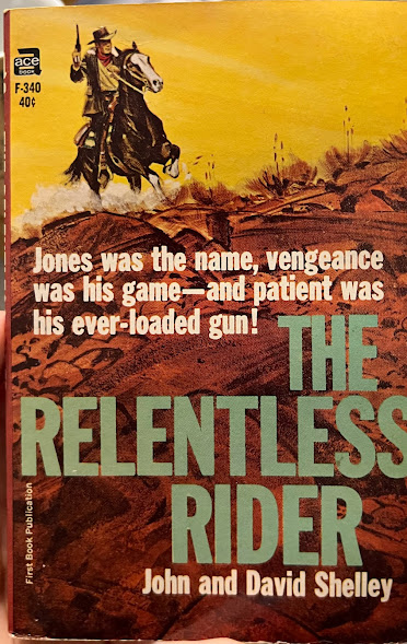
Paperback 1061: Ace F-340 (PBO, 1965)
Title: The Relentless Rider
Author: John and David Shelley
Cover artist: Uncredited
Condition: 8/10
Value: ~$10
Best things about this cover:
- Seems like it should be "the name / the game" or "his name / his game"; the mix-and-match reads awful
- Not sure why you'd name your gun "patient" but I like a cowboy with the guts to be different
- This cover is not that interesting, though I love how RELENTLESS goes hard, end to end, no margins, and I love that pop of yellow up top
- Got this as part of a completely unexpected library sale haul—didn't even know the library was having a sale. I was just there to check out some J.G. Ballard, as one does
- The book is bright, square, and unread. It's mildly warpy—not sure what the term is for that
Best things about this back cover:
- OK, just a block of text, yellow-orange on red-brown, hang on, just let me put my glasses on here and ... Booger? Really?
- The "eat. Booger" juxtaposition midway down the page is really making it hard to see anything else
- "Carving teeth for a rangeland dentist" well there it is I have discovered the most whimsical western occupation ever
Page 123~
"Wrong on number one," Booger said, "so you might as well quit guessin'." He went on to tell Kinney what had happened, and Kinney sat shaking his head, his brows describing ups and downs and curlicues as the story unfolded.
Kinney's legendarily acrobatic brows got him steady work in carnival freak shows, though he kept this part of his life to himself, fearing, rightly, that his cowboy friends would not understand
~RP
[Follow Rex Parker on Twitter]


Booger Jones. My inner twelve-year old is sniggering, loudly, at this.
ReplyDeleteI always forget that Ace didn't publish just science fiction.
ReplyDeleteThe front cover art isn't bad, but there's something about the way the ground is done that screams early to mid 60s. I can't quite explain it. It has to do with the strong dark lines used to suggest roughness and texture.
The thing that gets me the most about the back cover is the kerning. It's mostly OK at first (not really happy about the spacing around that em-dash, though) and then you get the line that starts "villains" and everything is smooshed together. It happens again a bunch of times in the second paragraph.Full justification should really be left to experts, not apprentice typesetters.
@DX I know what you mean about the mid 60s texture— I associate the whole period with the diminution of figurative art (look at the wee man!) and the rise of semi-sloppy semi-abstraction
ReplyDeleteRP
Carving teeth for a rangeland dentist. Lesage wishes he'd come up with that.
ReplyDeleteRegarding names that acquire new and sometimes amusing associations, there's a Stoner branch in my family. The name Stoner never seemed funny to me until the late 60s. Now I proudly display a flyer announcing a concert by the Stoner Family Orchestra on one of its grand tours of Kansas and Oklahoma in 1903.