Paperback 1060: Lion Library LL 128 (1st ptg, 1956)
Title: The Troubled Midnight
Author: Rodney Garland
Cover artist: Charles Copeland
Condition: 7/10
Value: ~$15
Best things about this cover:
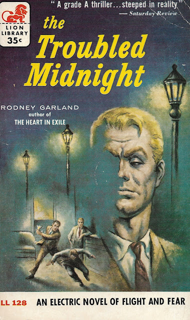
- Satan Had Yellow Eyebrows!
- Love this dude's "sneering supercilious billionaire face." Too bad half of it got blown off somehow.
- "Look at the little worms, fighting over nothing, doomed to fail ... pathetic. I regret that I have but one eye to glower at them with."
- If there aren't airplanes involved, you cannot call it a "novel of flight." That's the rule.
- For a grade A thriller, make sure you steep your novel in reality for at least three but no more than five minutes. Any longer and it loses that delicious cheesy taste.
Best things about this back cover:
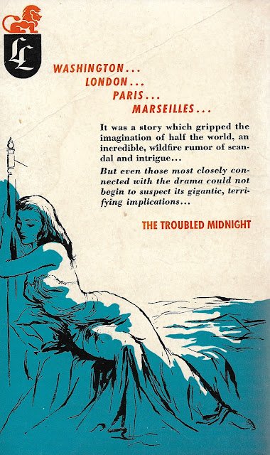
- The searing tale of a woman's forbidden love for her bedpost! "When her midnight became troubled, she turned to the one solid, upright thing in her life ..."
- Wow, they really don't want you to know anything about the plot, do they?
- Marseilles? Huh. Did not see that coming. With that build-up, I was thinking maybe "Rome" or "Moscow" or something, but no, Marseilles, sure, let's go with that.
Page 123~
The shop was full of people, some trying out fountain pens or buying postcards, others, like a girl I noticed with hairy legs like a deer, and obviously from the Midi, browsing.
Dude needs to go back to Comma School. Also, "like a deer?" Like a deer's legs ... are hairy? Like a deer browses? Like a browsing hairy deer from the Midi browses? I honestly don't know what I'm supposed to be picturing here. Some kind of sexy bibliophilic satyress? Maybe just buy your mystery novel and go back to your garret, Pierre.
~RP


Forget the bed post and the sneering dude. What I want to know is why do the tiny fighting men have lamp posts in their living room? Or conversely--why have they put their living room furniture (armchair, drinks cabinet) on the street underneath the lamp posts?
ReplyDeleteHa, yes, I had to save one observation for the promo tweet LOL. It's a bizarre layering of visuals for sure.
ReplyDeleteRP
Conceptually, having the fog obscure half of the guy's face is fine, but the execution is terrible. It's too opaque and the edges match up too perfectly with is brow line and nose. It looks like the artist spilled some paint and tried to work it into the composition.
ReplyDeleteAlso the cover designer doesn't seem to fully understand the rule about not capitalizing "the" in title case.
So glad this blog is back in action. LOVE this blog and look forward to more fantastic books and wit. Thanks!
ReplyDeleteSomtimes, em dashes are you friend. Or just rethink your sentence order.
ReplyDeleteReally gonna try to do at least one a week now, thanks so much to you few loyal readers / commenters!
ReplyDelete~RP